
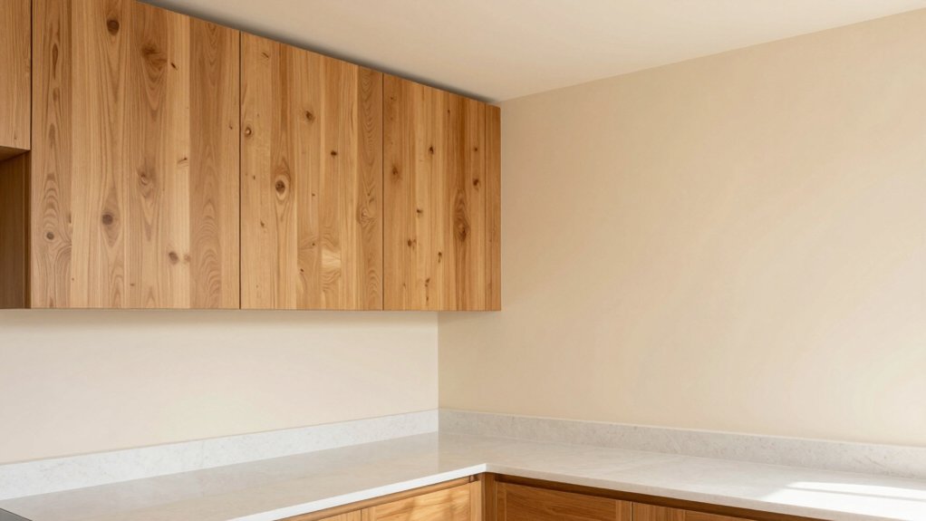
For a kitchen with oak cabinets, choose timeless, oak-friendly tones that warm, deepen, and unify the space. Start with soft creams or warm beiges to highlight grain without washing it out, then consider clean whites to brighten without stark contrast. Add muted greens or taupe-sand combos for depth, and reserve charcoal or navy as bold accents for balance. Aim for cohesive finishes and natural textures to maintain warmth; you’ll discover practical pairings and schemes as you continue.
Soft Creams That Warm Oak Cabinets
Soft creams are a reliable way to warm oak cabinets without overpowering the natural grain. You’ll control tone by selecting paints with subtle yellow or beige undertones, avoiding stark whites that wash out grain detail.
In practice, opt for matte to low-sheen finishes to minimize glare while preserving depth. Pair these creams with complementary wall textures—e.g., a soft plaster or linen-look wallpaper—to add dimension without competing with wood tones.
In lighting design, prioritize lighting to enhance warmth: warm LEDs, dimmable fixtures, and wall washers that softly illuminate cabinetry edges.
Keep the palette cohesive by tying countertop and backsplash hues to the cream family, ensuring a unified, approachable kitchen environment. This approach delivers timeless warmth while preserving oak’s natural character.
Warm Beiges for Cozy Kitchen Vins
You’ll explore Soft Beige Harmony as the base note that pairs with a Cozy Oak Backdrop, creating warmth without washing out grain details. This approach keeps your kitchen feeling cohesive and inviting.
While letting natural oak tones stay the star. We’ll compare how these warmth-focused beiges support both light and shadow across cabinets, counters, and fixtures.
Soft Beige Harmony
Choosing a soft beige palette can warm a kitchen with oak cabinetry without overwhelming its natural grain. This harmony relies on carefully balanced undertones to keep the space cohesive. You’ll aim for mid-range beige tones with subtle gray or warm yellow undertones to prevent yellowing over time.
In practice, select shades that read as neutral at 60% light, avoiding stark contrasts with the wood. Pair these hues with clean, refined surfaces and restrained accents to maintain clarity. For decorative wall finishes, prefer subtle textures like light plaster or a matte glaze that doesn’t compete with oak’s grain.
Kitchen lighting options should emphasize even illumination—soft whites around 3000K to 3500K—to preserve warmth without washing out detail.
Cozy Oak Backdrop
Cozy Oak Backdrop: warm beiges create a welcoming canvas that complements oak’s amber grain without competing with it. You select creamy, light-tan walls to preserve brightness while softening contrast with honey-burnished cabinetry.
This backdrop coordinates with natural textures—linen textiles, unpolished stone, and subtle wood accents—maintaining a cohesive, timeless feel.
Consider decorative backsplash options that add texture without overpowering the grain, such as subway tiles in a warm ivory, or a plastered finish with a gentle sheen.
For lighting, lean toward kitchen lighting ideas that enhance warmth: dimmable fixtures, under-cabinet LEDs, and daylight-balanced bulbs near 2700–3000K to keep the space inviting.
The result is a balanced, practical palette that elevates oak cabinets through restraint and clarity.
Clean Whites to Brighten the Space
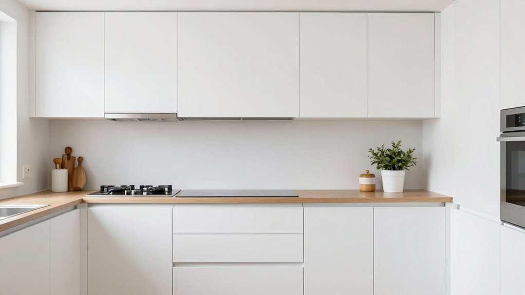
Clean whites bring a crisp, reflective backdrop that makes oak cabinets read brighter. You’ll emphasize Crisp White Appeal with clean, uncluttered surfaces and precise finishes. Keeping contrast subtle yet impactful is key.
Pair these whites with neutrals to brighten the space evenly. This approach helps avoid stark starkness and maintains a cohesive, updated kitchen look.
Crisp White Appeal
White walls and bright whites create a crisp contrast against oak cabinets, making the kitchen feel larger and more open. Crisp white appeal thrives when you balance cleanliness with warmth, avoiding sterile tightness.
You’ll notice that pure whites reflect light from windows and fixtures, maximizing perceived space without repainting every surface. Focus on purposeful accents rather than overwhelming abundance.
Start with decorating with white accessories that add texture—ceramic bowls, linen towels, and matte ceramic jars—these keep the look tactile. Choose white kitchen fixtures with clean lines: sink, pulls, and shelving brackets in satin or gloss finishes that resist fingerprints.
Maintain consistency across trim and cabinetry to preserve cohesion. Preview potential contrasts against subtle woods and stone to ensure the space remains inviting, not clinical.
Brighten With Neutrals
Neutrals beyond pure white can brighten the kitchen without sacrificing warmth, leveraging clean whites as a foundation to reflect light and enlarge the space. You’ll notice subtle shifts in tone from cool to warm neutrals, each influencing oak cabinet contrast and perceived room size.
Choose matte or satin finishes to minimize glare while keeping cohesion with cabinetry. Implement decorative backsplash options that reinforce brightness without overwhelming grain, such as light glass, travertine-look ceramic, or pale subway tiles.
Pair these with kitchen lighting ideas that maximize task clarity and ambience: under-cabinet LEDs, dimmable ceiling fixtures, and strategic wall washers.
Maintain balance by limiting color variety to two neutrals plus an accent, ensuring architectural features remain central. This approach delivers a cohesive, airy, and practical kitchen environment.
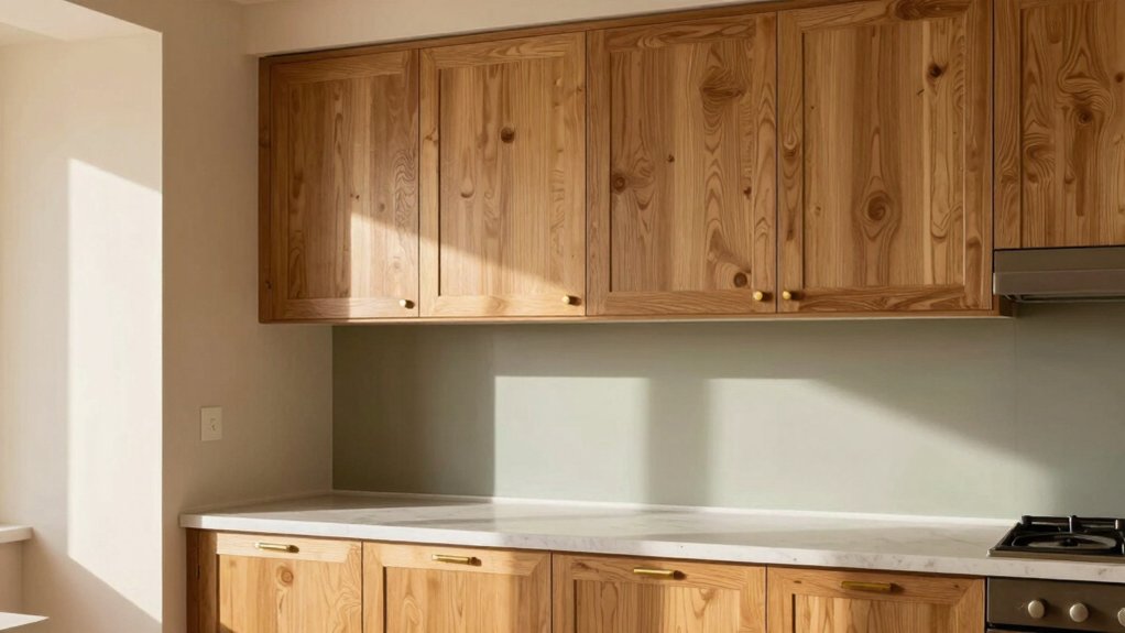
Muted Greens for Subtle Contrast
Muted greens offer subtle contrast against oak cabinets by introducing a cool, earthy undertone without overpowering the wood’s warmth. You’ll achieve balance by selecting muted greens with low saturation and soft undertones, ensuring the hue recedes rather than competes with grain patterns.
Pair these walls with complementary wall textures, such as a flat or lightly brushed finish, to maintain a cohesive look that reads refined rather than busy. Consider muted green accessories—tea towels, rimmed mugs, or vases—to reinforce the palette without dominance.
For counters and backsplashes, keep neutrals like warm beige or taupe to preserve contrast without sharpening it. Test swatches under both daylight and artificial light, ensuring color stability across your workflow zones and storage areas.
This approach yields calm, durable resonance with oak.
Pale Blues for Freshness and Calm
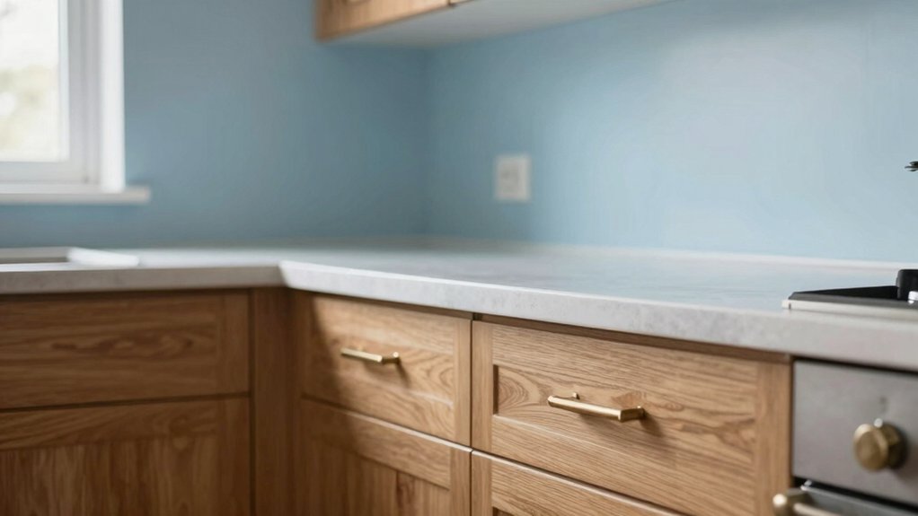
Pale blues bring an invigorating counterpoint to oak cabinets, infusing the kitchen with light, cool energy without overpowering the wood’s warmth. You’ll select pale blue tones that reflect natural daylight, preventing glare while preserving warmth.
Apply these hues on walls, ceilings, or cabinetry accents to cultivate calm, not coldness, and to highlight grain rather than conceal it. Pair with neutral trims and white undertones to sustain contrast without harshness.
Consider finishes described as calming coastal palettes to evoke seamless sightlines and easy maintenance, especially under kitchen lighting. To achieve balance, introduce subtle textures through subway tiles, glass, or matte ceramics in serene seaside hues.
This approach ensures a cohesive space that feels open, fresh, and functional for daily tasks.
Greige Tones That Bridge Wood and Modernity
Greige tones offer a practical bridge between oak’s warmth and modern design cues, delivering a versatile backdrop that adapts to both traditional and contemporary kitchens. You’ll use greige as a neutral foundation that respects wood’s grain while allowing high-contrast elements to stand out.
Pair with metallic accents to introduce sheen without overpowering oak, and choose textured finishes for depth that reads as tactile rather than flat. In cabinets, walls, and backsplashes, opt for balanced undertones—slightly warm or cool—so the space remains cohesive as you layer accessories.
Lighting should reinforce the gray-beige spectrum, avoiding stark white glare. Test swatches in your kitchen’s natural and artificial light to confirm consistency.
This approach yields a sophisticated, enduring palette that remains adaptable to evolving styles.
Sage and Olive Hues for Timeless Appeal
Sage and olive hues offer timeless appeal for kitchens with oak cabinets, delivering a refined, organic backdrop that complements wood’s warmth without overpowering it. You’ll achieve balance by pairing these greens with clean, neutral surfaces and restrained hardware.
In practice, choose sage walls for a soft foundation and olive accents in cabinetry or decor to echo natural textures. For decorative backsplash ideas, opt for subtle glass or ceramic tiles in muted greens or warm beiges to maintain cohesion.
Lighting fixture choices matter: select fixtures with warm metal finishes and understated profiles to enhance the organic mood without shouting. Keep countertops light and cool to preserve contrast, ensuring the oak grain remains a focal point rather than a distraction.
Taupe and Sand Combinations for Depth
Taupe and sand offer subtle depth for kitchens with oak cabinets, creating a layered, sophisticated backdrop that enhances wood tones without overpowering them. You’ll achieve visual interest by pairing mid-tone taupes with warm sands, avoiding high-contrast extremes.
Begin with a neutral base wall in taupe, then introduce sand accents through cabinetry accents, open shelving, or a backsplash tile with subtle variation. This approach softens the oak’s grain while maintaining architectural clarity.
Consider lighting that leans daylight-to-warm, which preserves the understated warmth of taupe and sand combinations for depth. Implement consistent undertones across decor, hardware, and textiles to prevent dissonance.
Avoid saturated hues; instead, prioritize restrained, cohesive elevation that supports the cabinetry. This strategy delivers timeless sophistication and functional balance in your kitchen design.
Bold Accents: Charcoal and Navy Details
If you want kitchen personality without overpowering oak cabinets, charcoal and navy provide strong contrast while keeping warmth intact. Bold accents elevate a traditional base by anchoring lighter wood tones with depth.
Use charcoal for essential elements like cabinetry accents, vent hoods, or hardware surrounds to create a grounded feel without darkening the room. Introduce navy details sparingly in islands, backsplashes, or seating to add color rhythm and visual interest.
Pair these tones with warm whites or creamy neutrals to preserve airiness and doorframe clarity. Consider finish consistency: matte for walls, satin for furniture, and a subtle gloss for metallics to avoid glare.
Balance is key; let bold accents reinforce structure, not overwhelm the oak’s grain. Bold accents, charcoal and navy details guide a sophisticated, durable palette.
Frequently Asked Questions
How Do Lighting Choices Affect Oak Cabinet Paint Reads?
Lighting choices shift oak cabinet paint reads: bright, cool light makes colors read crisper; warm, dim light softens hues. Aim for balanced lighting mood to maintain accurate cabinet contrast and avoid muddy tones in the space.
Which Undertones Pair Best With Oak Under Warm Lighting?
Example: in a hypothetical kitchen, you notice warm undertones read better under amber lighting. You should pair warm undertones with oak, and reserve cool undertones for contrast, especially under cooler fixtures; avoid mixing too many hues.
Can Painted Ceilings Change Kitchen Color Perception With Oak?
Yes, ceiling paint effects can alter perception of space in kitchens with oak. You’ll notice brighter ceilings open the room, while darker tones recede. Consider subtle hues and consistent lighting to optimize the ceiling’s impact on color perception.
Do Painted Backsplashes Alter Oak Cabinet Color Too Much?
A painted backsplash can alter oak cabinet color, often noticeably, but you control the shift. You’ll achieve a cabinet makeover that’s cohesive; choose a hue that harmonizes with oak’s warm tones, avoiding stark contrast or muddiness. You’ll proceed thoughtfully.
What Finish Helps Oak Cabinets Look Cohesive With Bold Accents?
A satin finish helps oak cabinets look cohesive with bold accents, offering subtle sheen without glare. For color consistency, pair neutral tones with careful undertones, and consider matte clear coats to maintain finish options while preserving color accuracy.