
To pair with oak cabinets, lean into soft, warm neutrals like warm ivory, creamy beige, or soft greige, using low-sheen finishes to honor the grain. Gentle greens such as sage or soft olive and airy blues in light to mid tones also work well, preferably in matte or satin. Balance undertones—cool paints can recede warm oak, while warm neutrals enliven it. Layer lighting and test swatches under real kitchen light to confirm harmony; you’ll discover more soon.
Embracing Soft Neutrals With Oak Cabinets
Soft neutrals are a natural pairing for oak, keeping warmth upfront while toning down the grain. You’ll want hues that harmonize with the wood’s warmth without overpowering its texture. Think color wheel relationships: adjacent neutrals or subtle complements that preserve sophistication while broadening space.
For paint finish, choose a low-luster option—eggshell or satin—to minimize reflections and emphasize the grain’s depth. In practice, a warm ivory, soft greige, or creamy beige works well with oak’s undertones, creating cohesive contrast without harsh delineation.
Avoid stark whites or cool grays that can clash with the wood’s warmth. Test samples side by side, under both daylight and artificial light, to confirm the final balance. Your goal: calm elegance that lets oak remain the story.
Gentle Greens to Complement Honeyed Wood
Gentle greens offer a fresh, natural complement to honeyed wood without overpowering its warmth. You’ll find greens work best when aligned with the color wheel’s subtle shifts—soft olive, sage, and moss avoid muddy contrasts with oak.
In practice, pick mid-tone greens that read as organic, not clinical, and pair them with warm whites or creamy neutrals to maintain balance. Consider finishes that suit the space: matte or satin paints minimize glare and show depth without looking flat.
When applying, test swatches on cabinet sides and adjacent walls under the kitchen’s lighting to confirm harmony. For durability, choose appropriate paint finishes—matte for a modern feel, satin for easier cleaning.
This approach yields calm, timeless versatility.
Airy Blues for Fresh Kitchen Vibes
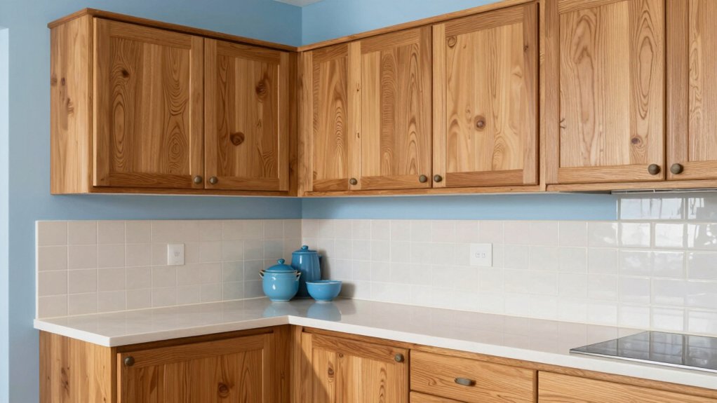
Airy blues brighten oak cabinets without overpowering their warmth, creating a fresh, breezy backdrop for busy kitchens. You’ll notice that lighter blues feel spacious, while mid-tones add a calm, inviting mood.
In practice, choose hues with low to moderate saturation to prevent glare on sunny days. Color psychology supports blues as tranquil anchors, helping focus during meal prep without cooling the room.
For durability, select a high-quality enamel or satin finish; these options resist scuffs and clean up easily, preserving the shade as you scrub splashes or dust. Test several samples on a hidden area to confirm brightness under your lighting.
Pair airy blues with warm neutrals or soft whites to balance oak’s warmth while maintaining modern clarity.
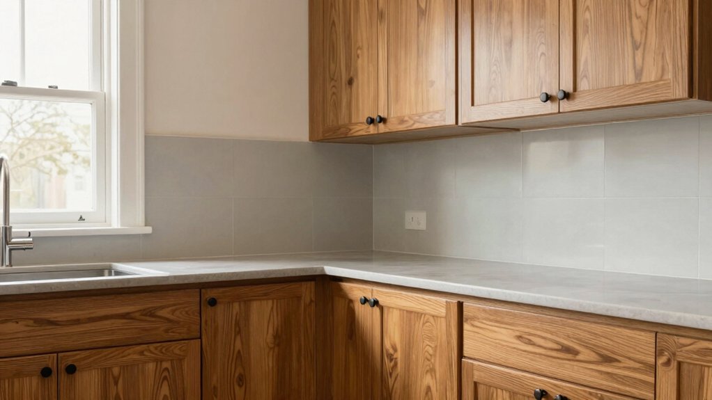
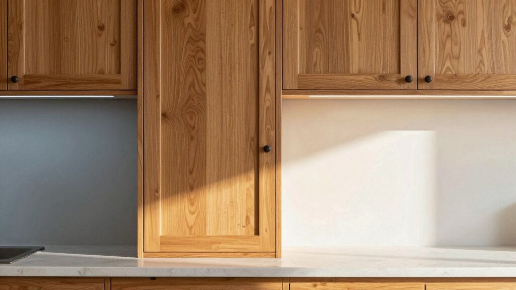
Undertones and Sheen: Making Colors Work With Oak
To pair colors with oak cabinets effectively, focus on undertones and sheen rather than just hue. You’ll align undertones across walls, cabinetry, and fixtures to achieve color harmony, so subtle shifts don’t clash.
Warm oak often leans yellow or orange, so cool paints can recede the grain and create balance, while warm neutrals reinforce the wood’s natural glow. Sheen matters: satin or eggshell reduces glare and reveals depth without harsh reflection.
If you want contrast, choose a cooler undertone for walls to accentuate the oak’s warmth, or select a warm gray to unify tones with minimal contrast. Be deliberate with material contrast: matte countertops and reflective hardware can alter perceived shade.
Test swatches in light at different times to confirm the final harmony.
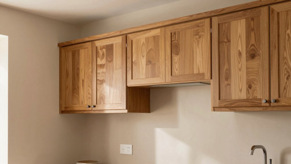
Lighting Tips to Enhance Color Choices
Lighting is a powerful ally for color choices with oak cabinets: the right lighting can reveal undertones, deepen grain, and shift perceived warmth. You’ll want a balanced mix of natural lighting and artificial lighting to test hues accurately.
Start by observing daylight at different times; warm mornings vs. cool afternoons will show how a color breathes with oak. Use color-accurate bulbs (CRI 90+) to avoid skewing your perception. Layer lighting with ambient, task, and accent sources so you can compare shades from multiple angles.
For warmer tones, opt for soft white; for cooler palettes, choose daylight or bright white. Dimmer switches help you gauge how colors respond to intensity changes. In practice, preview swatches on cabinets under representative lighting before committing.
Quick Decor Tweaks to Refresh an Oak Kitchen
Refreshing an oak kitchen starts with a neutral paint base to brighten the space without clashing with the wood. Layer in warm accents—soft textiles, warms-toned décor, or brass hardware—to add depth and cohesion.
Keep the palette cohesive and let the neutral foundation anchor bold or subtle touches for an instantly revitalized look.
Refresh With Neutral Paint
If you want a quick, budget-friendly refresh for oak cabinets, neutral paint is your smart move. You’ll soften the wood’s warmth without overpowering it, creating a clean, timeless backdrop.
Choose lowsheen or satin finishes to reflect light and reduce glare on busy grain. Pair neutral walls with minimal trim for a cohesive look, and select a shade that harmonizes with existing counters and floors.
To keep the space feeling refreshed, avoid heavy contrast; instead, lean into subtle, cohesive tones like warm greige or soft taupe.
When you want visual interest without complexity, consider bold accent walls or contrasting countertop colors as strategic accents—kept small and deliberate.
This approach preserves oak’s character while modernizing the overall palette.
Add Warm Layering Accents
To warm up an oak kitchen quickly, layer in cozy textures and small accents that you can swap seasonally. Add warm layering accents by mixing textiles, ceramics, and greenery to create tactile depth without overpowering grain.
Choose textured finishes on accessories—matte ceramics, linen runners, and woven baskets—to subtly echo the wood’s warmth. Bring in color layering with small, cohesive swatches: throw pillows, lamp shades, and artwork that echo your wall or cabinet tones, then deepen with a single accent hue.
Keep metallics restrained: brushed brass or antique bronze add glow without glare. Swap seasonal pieces to refresh the mood, ensuring the palette stays harmonious with oak. This approach preserves honesty in the wood while inviting inviting coziness.
Frequently Asked Questions
How Do Oak Cabinets Influence Paint Color Longevity in Kitchens?
Anachronism: you, a whiteboard-wielding detective, uncover that oak cabinets influence paint longevity by stabilizing tones through warm undertones. You’ll consider color matching, stain compatibility, and lighting, ensuring durable hues that stay true under daily wear and aging.
Can Bold Colors Work With Oak Without Overpowering It?
Yes, bold colors can work with oak if you balance them with neutrals and emphasize color harmony; use bold accents sparingly to keep warmth. You’ll create contrast without overpowering the wood’s grain and character.
Which Finishes Best Protect Painted Walls Near Oak?
You should pick durable finishes like semi-gloss or satin for painted walls near oak, since wall textures and paint sheen resist moisture and fingerprints. These options keep durability high while preserving color, reflecting light without glare or heavy wear.
Do Oak Cabinets Affect Ceiling Color Choices?
Oak cabinets don’t force ceiling colors, you can choose based on contrast needs. Aim for cabinet stain compatibility guidance and paint color contrast, balancing warmth with brightness to keep the space cohesive and visually open.
How Do Lighting Types Alter Perceived Paint Tones on Oak?
Yes, lighting shapes tone: natural light reveals warmer oak under cool paints; artificial lighting shifts hues. You’ll notice muted neutrals glow under daylight, while warm bulbs enhance honey tones, and cool LEDs emphasize grays in Natural Light and Artificial Lighting.