
Choose pale, warm neutrals like soft beiges and off-whites to reflect daylight and push walls apart. Cool tones recede, so blues, greens, and grays can feel larger when used as accents or on ceilings. Keep a single dominant color with layered textures for depth, and consider a high-gloss finish to bounce additional light while pairing with matte surfaces to curb glare. Use lighter trims to lift edges and create visual height. Want more precise, room‑specific tweaks? You’ll learn more below.
Lighten the Space: How Bright Paint Reflects More Light
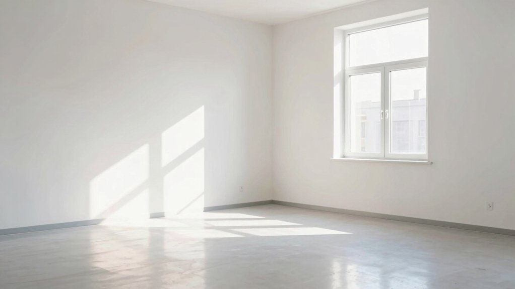
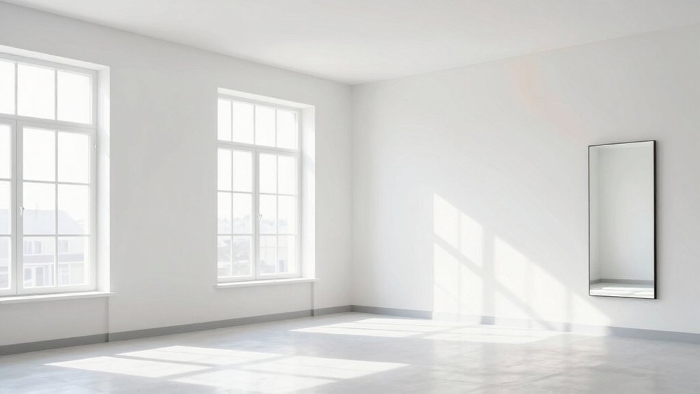
Light paints bounce more light around a room, making walls feel farther apart and spaces appear larger. You’ll notice how brighter walls reflect more of the incoming light, reducing shadows and creating a sense of airiness.
From a color theory standpoint, high-value neutrals and pale shades maximize contrast against darker furnishings, guiding the eye outward and enhancing perceived depth. You’ll want to optimize furniture placement to keep sightlines open, preventing clutter from absorbing light.
Choose window treatments that admit ample daylight—sheer panels or light fabrics work best, since opaque drapes can trap glow and flatten space. Aim for a cohesive palette that supports brightness without glaring at eye level, ensuring the room reads larger while staying comfortable and visually coherent.
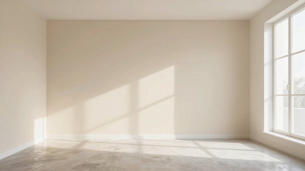
The Warmth Factor: Undertones That Enhance Perception of Size
Undertones matter because warmth can trick the eye into perceiving more or less space, depending on how you pair colors with your furnishings. You’ll optimize size perception by selecting undertones that carry the room’s perceived lightness.
Cool undertones pull back, while warm ones advance, subtly altering perceived depth. In color psychology terms, mid-range warm neutrals can soften edges, creating a cohesive sense of openness without flattening dimension.
Use a restrained palette to avoid competing cues that interrupt furniture placement and sightlines. Prioritize undertones that harmonize with natural light and existing textures, then test swatches in situ.
Your goal isn’t loud color, but balanced warmth that expands perceived space. Pair warm neutrals with strategic contrast accents to guide the eye toward architectural features, not clutter.
Neutral Neutrals: Soft Beige and Off-White Hues for Airiness
Soft beige tones and off-white brightness work together to widen perception by bouncing natural light and creating cohesive walls.
You’ll notice how these neutrals read as expansive rather than heavy, especially when paired with clean trim and minimal contrast.
Use them to anchor furniture and let subtle shifts in undertone support the room’s airiness without stealing focus.
Soft Beige Tones
Neutral neutrals—soft beige and off-white hues—create airiness by reflecting natural light and minimizing contrast, which helps make a room feel larger and calmer.
In this subtopic, you’ll learn how soft beige tones support cohesion while preserving depth. From a color theory standpoint, these hues lean toward warm neutrals that brighten without dominating, so you can pair them with cooler accents for visual balance.
Your goal is legibility of space, not distraction, so select shades with low saturation and subtle undertones to maintain continuity across walls, trim, and ceilings.
Consider color psychology: softer beige reduces perceived clutter and invites relaxed, open conversations.
And yes, think about paint durability—choose durable, washable finishes for busy zones to sustain the airy effect over time.
Off-White Brightness
Off-white brightness adds lift to a room without sacrificing cohesion. You’ll see how subtle tonal shifts affect perceived space: choose off-whites with a touch of warmth for ceiling and trim to keep ceilings visually higher, while the wall color remains light enough to bounce light around.
In practice, aim for low-contrast pairs so interior textures stay tactile without causing visual clutter. Favor cooler undertones if you’re balancing a dark floor, or warmer undertones when wood tones dominate, and test samples at different times of day.
Align wall art choices with the neutral backbone—minimal, airy pieces that read as part of the light field rather than focal interrupts. This approach supports cohesive room expansion and crisp, intentional design.
Cool Tones That Expand: Blues, Greens, and Grays Without Cavities
Cool tones naturally recede, making Blues, Greens, and Grays a smart choice when you want a space to feel larger and calmer. Their lighter values reflect more light and prevent visual clutter, so walls read as expansive canvases rather than heavy barriers.
You’ll use blue-leaning neutrals to slow the eye and create air, while greens bring nature’s calm into the room without overpowering existing furniture. Gray undertones balance warmth and coolness, supporting color psychology goals like serenity and focus.
Apply these hues in dominant walls and select lighter trims to maintain rhythm, not contrast. Consider room feng shui by aligning tones with natural light and flow, promoting ease of movement.
Clinically simple palettes reduce visual noise, helping clients perceive space as open, balanced, and welcoming.
Monochromatic Magic: Keeping a Consistent Palette for Depth
A monochromatic approach tightens depth by keeping only one family of hues across walls, trim, and cabinets, so the eye moves with fewer breaks and reads space as continuous rather than fragmented. You benefit by aligning base tones with accents through subtle variations in value and saturation, which creates perceived depth without clutter.
Color psychology guides intensity: cooler neutrals feel expansive, while warmer tints invite coziness at the same time. So, you select a dominant color and layer complementary textures for dimension. Prioritize paint durability in high-traffic zones, choosing finishes that resist wear without reflecting too much light.
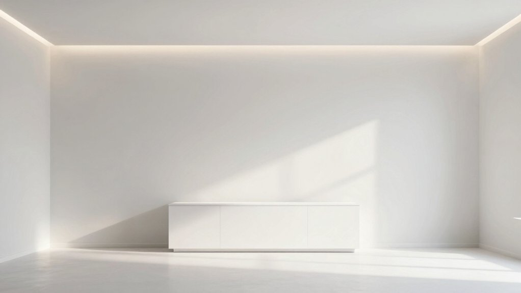
High-Gloss Vs Matte: Finish Choices to Boost Brightness
When you’re aiming for brighter spaces, your finish choice matters as much as color. High-gloss surfaces reflect more light and can make a room feel larger, while matte tones diffuse glare for a calmer dimension. The trick is balancing gloss with color value to maintain perceived depth.
I’ll help you pick finishes that align with your lighting, furniture, and color theory goals for a room that reads as more open.
Glossy Brightness Boost
Glossy finishes reflect more light, so high-gloss surfaces can visually expand a room by increasing brightness; however, contrast and cleaning considerations matter. You’ll weigh brightness gains against glare and fingerprints, aiming for a balanced, lasting result.
In color theory terms, glossy surfaces amplify the perceived value of lighter hues, nudging warmth toward inviting, airy spaces. Your goal is consistent light dispersion, not harsh reflections that distort color.
Consider how lighting fixtures interact with paint texture: a gloss topcoat can bounce ceiling and wall light, yet textures like fine grain or subtle pebble can soften glare while preserving luminance.
For small rooms, test swatches under ambient and task light, ensuring reflections enhance depth without overpowering accuracy of color perception.
Finish Light Diffusion Tricks
If you’re aiming to brighten a space, choosing finish matters as much as color. You’ll weigh how light diffuses off surfaces: high-gloss reflects, can bounce brightness around, while matte soaks some glare and steadies color blending for even walls.
Think of diffusion as a tool for perception: glossed surfaces push highlights into corners, making ceilings feel higher; matte textures soften contrast, reducing focal glare and expanding perceived depth. Your client wins when you match finish to the room’s light profile and color plan.
Use lighter pigments with a semi-gloss for brightness without harsh speckle, or go flat on larger walls to prevent hot spots. In practice, test swatches under actual lighting, compare how light moves, then decide on the finish that supports cohesive color blending and a bigger feel.
Accent Walls Strategically Placed: Tip to Visualize More Space
Accent walls placed strategically can visually expand a room by drawing the eye toward depth and proportion. You guide perception by choosing a wall color that contrasts softly with the adjacent tones, creating a subtle boundary that adds spatial rhythm without breaking harmony.
Leveraging color psychology, pick hues that feel expansive—cool neutrals or muted blues can calm the eye and recede, while a slightly warmer accent may push forward focal points without shrinking the space. Consider luminance: a high-contrast edge between wall and adjacent surfaces sharpens depth cues, yet avoid harsh borders that cut sightlines.
Think visual perception: the accent wall shouldn’t dominate, it should support flow, reflect natural light, and anchor furniture groupings. Your result: a room that reads larger through purposeful color strategy.
Trim and Ceiling Tricks: Using Lighter Edges to Enlarge
Light trim and ceiling edges can visually lift a room when you keep them lighter than surrounding surfaces. You’ll create a boundary that recedes, letting walls read wider. Use a cool or neutral white or a soft, warm tone only slightly lighter than walls to maximize color contrast without harsh delineation.
This lighter edge acts as a halo, enhancing perceived height while maintaining cohesion. Consider shadow play: subtle shifts along trims or crown molding add depth, reinforcing space without aggressive contrast. Keep finishes consistent to avoid busy reflections; satin or matte helps edges glow without glare.
In practice, choose trims a notch lighter than walls, and ceiling edges at the same or one shade lighter, for a seamless, airier feel.
Practical Application: Step-by-Step to Test and Implement
To test and implement these color strategies, start with a simple, controlled test in a single space: paint a key wall and a nearby edge (trim or ceiling) in a slightly lighter shade than the others, then observe for a week under different lighting.
Begin with color psychology goals: note how mood, perceived depth, and space openness shift as light changes. Track how nearby furnishings read against the edge and wall, adjusting accordingly.
Choose lighting fixtures that complement the chosen palette, avoiding harsh shadows or glare.
Record observations in a brief grid: wall color, edge shade, lighting condition, and perceived size.
If results align with your goals, scale the approach to additional rooms, preserving contrast balance and consistent light quality.
End with a concise maintenance plan for longevity.
Frequently Asked Questions
How Many Colors Should I Test Before Choosing?
To pick wisely, test 3–5 colors and compare them side by side. You’ll see subtle shifts in light and space. Use color testing tips and visual perception tricks to gauge depth, mood, and harmony for your room.
Do Ceiling Heights Affect Color Choices for Space Perception?
Yes, ceiling heights influence color choices: higher ceilings invite lighter shades and brighter tones to expand perceived space, while lower ceilings benefit cooler, cohesive colors. Consider ceiling design and lighting effects when planning to optimize proportion and mood.
Can Color Contrast Alter Perceived Room Dimensions?
Yes, color contrast can alter perceived dimensions. Like a room’s doorway appearing wider when walls soften to cooler tones, you leverage color psychology and visual illusions to expand space while keeping client goals in focus.
Is Matte Finish Always Better for Space Expansion?
Matte finish isn’t always better for space expansion, but it’s a solid choice. You’ll gain softer reflections with matte finish benefits, supporting space enhancing paint finishes by reducing glare and creating perceived depth through color nuance.
Do Rug and Furniture Colors Impact Wall Color Choice?
“Yes, your rug and furniture colors impact wall color choice.” You, you’ll pair neutral palettes with vibrant accents to balance light, contrast, and flow, ensuring cohesive perception; consider how textures and scale guide the final wall hue for clients.