
Pair white cabinets with soft neutrals and warm textures for a calm, versatile backdrop. Think warm beiges, taupes, or greiges on walls and countertops, with natural grain wood or stone to add depth. For contrast, introduce bold accents—deep blues, charcoals, or black hardware—sparingly to keep the white glow intact. Greenery or brass touches finish the look with warmth. Curious about more ways to refine the balance? You’ll uncover even more options as you continue.
Pairing White Cabinets With Soft Neutrals
Pairing white cabinets with soft neutrals creates a calm, flexible backdrop that keeps your kitchen feeling bright without shouting. You’ll balance purity with warmth by choosing neutrals like warm beige, taupe, or greige for walls, countertops, and textiles.
This approach preserves lightness while adding depth, so your space stays welcoming rather than sterile. Introduce subtle contrast through materials—matte wood, stone, or limestone—rather than bold color blocks. Keep lines clean and finishes restrained to maintain sophistication.
In practice, limit your palette to three to five complementary tones, then let texture do the work. For visual interest, consider bold patterns in textiles and accessories, paired with statement lighting to anchor the look without overwhelming it. Focus on cohesion, balance, and purposeful accents.
Bold Contrast: Dark Blues and Charcoals
Dark blue accents bring a crisp, modern punch to white cabinetry, while charcoal elements provide depth and sophistication. Consider pairing these tones with strategic white surfaces to keep the room bright and balanced. Use the contrast to highlight features like islands, shelving, and hardware, and let bold blues or charcoals guide the overall mood.
Dark Blue Accents
Bold contrast can elevate white kitchen cabinets with a few well-chosen dark blue accents. You’ll create focal points without overpowering the room by using saturated navy or muted midnight tones on select surfaces. Think dark blue pendant lights or cabinet hardware to anchor sightlines, and a small island or bar stool in the same family for cohesion.
Keep balance by pairing these accents with lighter elements—white backsplashes, pale countertops, or natural wood. Lighting fixtures matter: choose fixtures that cast crisp, even illumination to prevent blue from feeling heavy.
Wall treatments can reinforce the look without crowding it; consider a subtle blue-tlecked glaze or a restrained wallpaper pattern only on a single wall. Aim for refined contrast, not drama overload.
Charcoal Contrast Ideas
Charcoal brings a grounded, modern heft to white kitchen cabinets, especially when paired with bold blue accents. You’ll see how charcoal contrasts sharpen edges without overpowering, clarifying lines and defining zones.
For wall treatment, consider a charcoal backsplash ideas that hits mid-tone density, resisting fingerprints while adding depth. Keep the pattern sleek—large tiles or a matte slab keeps the look crisp rather than busy.
In your accessories, opt for charcoal kitchen accessories that read as a cohesive trim rather than focal points; think slender bar pulls, a durable surface, and a soapstone or cast-iron finish for cookware.
Pair with bright whites and chrome hardware to elevate contrast. Use thoughtful cycling of textures to prevent flatness while maintaining a refined, contemporary feel.
Balance With Whites
If you want bold contrast without overwhelming, pair white cabinetry with deep blues and charcoal accents to create a clean, high-definition balance.
You’ll anchor the room with charcoal cabinetry lines or a charcoal island, then pull depth through deep blue accessories.
Use lighting fixtures to sculpt contrast: select fixtures with warm metal tones or matte black to emphasize the whites without muddying the palette.
Decorative hardware should stay sleek and purposeful—think minimalist pulls in brushed nickel or blackened brass that echo the blues.
Balance is achieved by spacing color blocks; reserve the strongest blues for a single focal wall or a cabinet run, and keep the rest white.
This approach preserves brightness, while the dark elements provide sophisticated, readable contrast.
Warm Wood Tittings: Natural Grain Integrations
You’ll notice how natural grain brings warmth to a white backdrop, tying the room to real, tactile texture.
Soft, warm wood accents reinforce the Organic Grain Focus while keeping the palette crisp and modern.
This approach invites how your surfaces age beautifully, adding character without overwhelming the clean cabinet lines.
Natural Grain Focus
Natural grain brings warmth and texture to white kitchens, and a focused approach to warm wood fittings means selecting tones that harmonize with the cabinet paint without overpowering it. You’ll notice that natural grain signals depth, not distraction, when you choose boards with restrained patterns and even color.
Prioritize wood textures that read softly against matte or satin white finishes, letting subtle contrasts do the talking. Avoid high-contrast grains that compete with cabinets; instead, select species with consistent movement and gentle swirls.
Consider light-to-medium browns or honey undertones that align with your backsplash and countertops. This measured integration keeps spaces calm, cohesive, and visually refined, while preserving the clean, modern feel you want from white cabinetry.
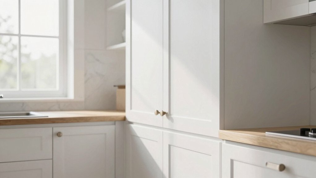
Warm Wood Accents
Warm wood accents softly warm up white kitchens without stealing the spotlight. You’ll pair light cabinetry with walnut, oak, or maple trims to add depth while preserving brightness.
Opt for eco-friendly finishes that highlight grain without hazing color, so you retain clarity and a modern edge. Textured surfaces—think vertical butcher blocks, brushed veneers, or rift-cut panels—give tactile variation you can see and feel.
Use warm wood as an anchor for seating, open shelving, or a small island accent, keeping major surfaces white to maintain that airy vibe. Balance is key: too much wood quiets the space; too little dulls its character.
Choose a consistent grain pattern and finish to achieve cohesive, refined warmth.
Timeless Greige: Balancing Warmth and Modernity
Greige, a blend of gray and beige, offers a timeless balance of warmth and modernity for white kitchen cabinets. You’ll notice it reads as warm enough to feel inviting, yet cool enough to stay current.
The trick is dialing tone with undertones—creamy, stone, or greige-blue—so your space doesn’t veer muddy. Pair it with crisp white ceilings and natural light to maximize brightness without sacrificing depth.
Focus your decisions around texture over trend: matte walls, satin cabinetry, and subtle, earthy textures in countertops.
When you select decorative hardware, choose brushed nickel or satin brass to keep the look cohesive and refined.
For lighting fixtures, opt for soft, ambient fixtures that enhance the warmth without overpowering the clean lines of the cabinetry.
Subtle contrast keeps the balance intact.
Black Accents for Elegant Drama
Black accents inject instant drama, giving white cabinets a couture edge without overpowering the space. You’re after a refined contrast that reads crisp and intentional, not busy. Start with sleek hardware in matte black to anchor profiles, then add black fixtures or a bold pendants cluster for focal impact.
Combine navy blue accents for a nuanced, sophisticated counterpoint that stays grounded rather than shouting. Keep surfaces clean; avoid overdoing textures to preserve that modern edge.
Charcoal contrast ideas—think a charcoal island or chimney hood—offer depth without drifting into heavy. Balance is essential: allow white to glow around the dark elements, so every touch reads deliberate.
With restraint, these black accents for elegant drama elevate your kitchen without overwhelming it.
Muted Pastels for Subtle Flair
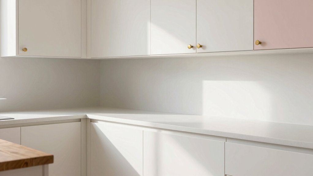
Muted pastels soften white kitchen cabinets without fading their crispness, delivering subtle flair that feels intentional rather than faddish. You’ll find muted pastel palettes tame glare while preserving legibility of surfaces and details.
Think soft blues, sage greens, and buttery pinks used as accents rather than dominant tones. Pair them with cool neutrals or warm wood to keep contrast measured, not muddy.
Subtle color accents can come through cabinet interiors, glass-front doors, or under-cabinet lighting, reinforcing depth without visual noise. Use small doses to guide the eye toward architectural features or display shelves.
The goal is refined warmth, not novelty; the palette should harmonize with fixtures, countertops, and hardware, enhancing cleanliness and perceived simplicity.
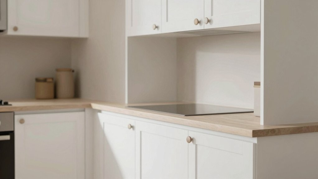
Crisp Whites: Monochrome Harmony
Crisp whites lean into monochrome harmony, creating a clean, timeless backbone for your kitchen. You’ll notice how subtle texture—think matte paint, brushed metal, or a cropped grain—adds dimension without breaking the purity.
In this palette, contrasts stay deliberate: a satin backsplash next to eggshell cabinetry, or a glass rack reflecting soft light. Your goal isn’t drama; it’s clarity, readability, and restfulness.
Use consistent white tones across surfaces to reinforce the monochrome harmony you’re after, then introduce controlled warmth with natural wood or a hint of creamy glaze on trim.
Lighting matters: choose neutral LEDs that reveal true whites without yellow bias.
Finally, keep hardware refined and minimal so the room breathes, rather than competes, with its own brightness.
Deep Forest Greens for Rich Depth
Deep forest greens inject unexpected depth into white cabinetry by grounding the space with rich, earthy tones. You’ll notice how these hues create contrast without overpowering light shelves and countertops, letting the white stay crisp.
In practice, choose a mid-to-dark green with a subtle blue undertone for versatility across seasons. Apply it on cabinetry for a statement or as accent panels to maintain balance.
The color pairs decisively with decorative crown molding, which adds architectural interest without competing with the cabinetry.
For surfaces, consider a clean backsplash tile options that echo the green’s coolness—think slate, ceramic with charcoal veining, or glass subway tiles.
Finish with warm hardware to unify the palette and keep the look cohesive.
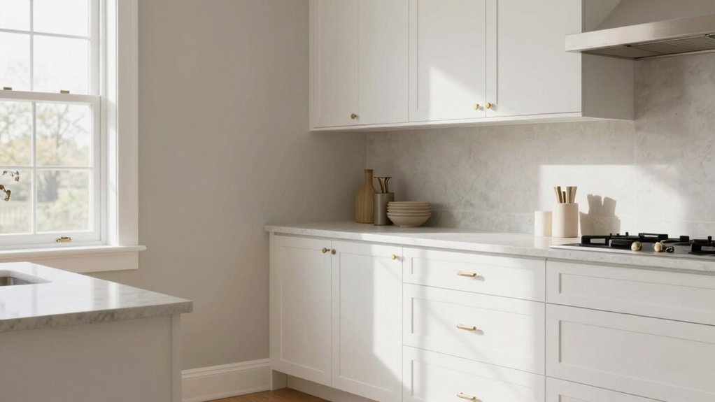
Metallic Accents: Brass, Gold, and Stainless Highlights
Brass, gold, and stainless highlights bring warmth, sparkle, and modern edge to white kitchen cabinets. In this subtopic, you’ll see how metallic accents elevate contrast without overpowering the room.
Choose brass highlights for a timeless glow that reads warm and inviting, especially against cool white surfaces. Gold offers a luxe touch, catching light in the morning and evening to create subtle drama. Stainless steel adds crisp, contemporary reflectivity that works with sleek appliances and minimalist hardware.
When mixing metals, limit to two tones and balance with matte finishes to avoid clutter. Incorporate metallic accents as cabinet hardware, lighting fixtures, or a backsplash edge for cohesion. This approach keeps your space bright, chic, and thoughtfully curated.
Frequently Asked Questions
How Do Lighting Choices Affect White Cabinet Perception?
Lighting choices shape perception: you’ll notice white cabinets appear warmer with soft lighting, and crisper under bright task lighting. Lighting ambiance matters; you’ll maximize glow. Natural light impact adds freshness, making whites feel airy, even, and inviting.
What Countertops Best Complement White Cabinets?
You’ll pair white cabinets with marble countertops or quartz options for timeless contrast and brightness, highlighting subtle veining and modern appeal, while avoiding busy patterns that compete with fixtures, lighting, and hardware.
Do White Cabinets Show Wear and Fingerprints Easily?
Yes, white cabinets show fingerprints and wear, but you can manage them. Use microfiber cloths and gentle cleaners; wipe daily. Opt for stain-resistant finishes and sealants, and follow cleaning tips to keep surfaces bright longer.
Which Finishes Pair Well With White Cabinetry?
A modern kitchen case study shows brass cabinet hardware elevates white cabinetry. You pair it with warm wall paint colors like greige or creamy taupe, and you’ll keep cabinets timeless while highlighting textures and hardware details.
How Can White Cabinets Affect Kitchen Resale Value?
White cabinets can boost resale value, but you’ll need solid finish choices to maximize appeal; consider paint durability and stain options to keep them looking fresh, resist wear, and maintain a modern, timeless look for buyers.