
The best color for white kitchen cabinets isn’t purely white; it’s about a clear undertone that harmonizes with your space. Pair soft grays for a calm, contemporary vibe, warm beiges or creams for cozy warmth, or deep blacks and navies for modern contrast. Consider natural wood accents and the right sheen to balance brightness with texture. Test swatches under your lighting to confirm depth and cohesion, then you’ll understand how to achieve that timeless look—and you’ll see what else you can refine.
Understanding Undertones: What Works With White Cabinets
Understanding undertones is essential when pairing colors with white cabinets. You approach undertones by comparing warm and cool cues in nearby elements, then testing them against the color wheel and your space’s lighting.
Your goal is precision: identify whether whites lean toward ivory, beige, or stark snow, and match those notes with intentional accents. When you examine paint swatches, start with broad families—warm, cool, and neutral—and narrow to chips that reflect true undertones in natural and artificial light.
Don’t rely on surface impressions alone; observe at multiple times of day. You’ll find that subtle shifts alter perceived brightness and harmony. Decide with confidence, documenting each tested option and how it interacts with hardware, countertops, and flooring.
This method yields coherent, purposeful color strategy.
Soft Gray Pairings to Keep Things Calm and Contemporary
Soft gray pairings offer calm, contemporary contrast without overpowering white cabinets. You’ll notice how cooler and warmer grays create warmth and depth, shaping a balanced, sophisticated mood.
Use these tones to guide warmth and contrast thoughtfully, keeping your space clear and cohesive.
Soft Gray Pairings
When you pair soft grays with white kitchen cabinets, the result is a calm, contemporary backdrop that enhances natural light and clean lines.
In this pairing, choose grays with subtle undertones to prevent muddy outcomes and maintain clarity. Color psychology guides you to favor cooler or neutral grays for a tranquil feel, while warmer grays can add welcome warmth without overpowering the whiteness.
Apply consistent tones across walls, islands, and shelving to reinforce cohesion. For furniture coordination, select pieces in mid-tone woods or matte metals that echo the gray palette rather than compete with it.
Consider textures—matte surfaces, linen textiles, and glazed ceramics—to deepen interest without crowding the space. The goal is refined restraint, not overload.
Calm Contemporary Tones
Calm contemporary tones emerge when you pair soft grays with white kitchen cabinets to preserve clarity while adding subtle depth. You create a serene backdrop that remains versatile across seasons and trends.
Choose grays with cool undertones to maintain a crisp, clean look, avoiding muddy blends that disrupt the palate. Keep contrast understated by selecting cabinet finishes and countertops that echo the gray’s neutrality.
Decorative hardware should be minimal and refined, offering texture without visual noise. For lighting fixtures, favor streamlined silhouettes in brushed metal or matte nickel to reinforce modern simplicity.
This approach permits artful accents elsewhere, such as textiles or cabinetry details, without overwhelming the space. In sum, soft gray pairings deliver calm, contemporary clarity with deliberate restraint.
Contrast and Warmth
To introduce contrast without disrupting calm, pair soft grays with warmer whites or creamy neutrals to create depth that remains serene. In practice, you’ll notice how subtle shifts in shade alter perception without shouting contrast.
Choose a midtone gray for cabinetry accents and reserve the warm white for walls to maintain cohesion. Selections of decorative hardware should reinforce the balance—matte nickel or brushed brass anchors the palette without overpowering it.
For paint sheen, opt for a satin finish on cabinetry to reflect light softly while preserving refinement; use eggshell on walls to maximize warmth. This approach yields a contemporary mood that feels intentional, not stark, with contrast that enhances architectural lines and ensures enduring calm in daily use.
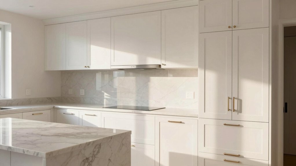
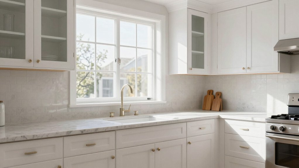
Warm Beige and Cream Tones for Cozy Kitchens
Warm beige and cream tones create a welcoming, timeless backbone for white kitchen cabinets. You gain warmth without sacrificing brightness, and the result remains versatile across evolving styles.
Choose soft, warm neutrals as wall and backsplash foundations, then layer with lighter cabinetry for airiness. In this palette, you maintain clarity while inviting texture through materials like natural stone, brushed brass, or matte ceramics.
Use deliberate contrast to define zones without overpowering—the goal is cohesion. Decorative hardware becomes a purposeful accent, guiding the eye and signaling style, from traditional to transitional.
Select fixtures with warm metal tones and clean lines to sustain refinement. Complement with tasteful Kitchen accessories that reinforce the calm, unified look, ensuring performance aligns with aesthetic intent.
Enduring, practical elegance defines this approach.
Rich Black and Navy Accents for Modern Contrast
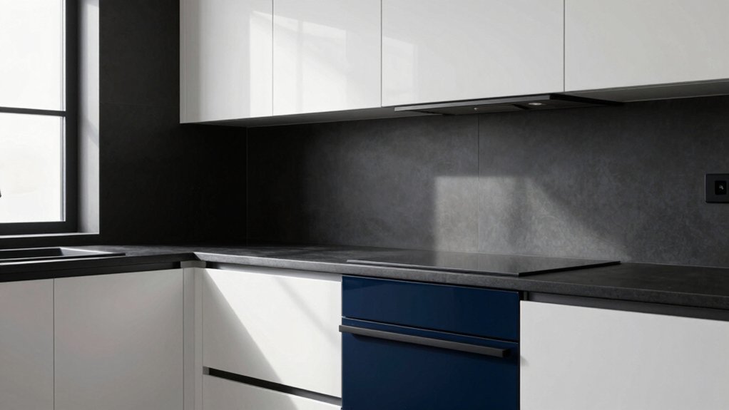
Rich black and navy provide strong, contemporary contrast against white cabinets, grounding the space with sophistication. You’ll explore how these deep tones draw attention to hardware, fixtures, and trim without overwhelming the brightness.
Start by evaluating where a pop of navy or a matte black finish can create focal points and balance throughout the room.
Rich Black Accents
Dark, inky cabinets create a striking contrast against white kitchen walls and countertops, underscoring a modern, sophisticated aesthetic. Rich black accents introduce definition without overpowering light surfaces, maintaining balance in your space.
You should pair these tones with crisp hardware and matte finishes to emphasize clarity and depth. Bold accents, strategically placed, guide the eye through the layout, highlighting architectural features and storage zones.
Choose materials with subtle texture—sleek granite, charcoal quartz, or treated wood—to prevent flatness and add tactile interest. Navy undertones can appear in textiles and backsplashes, reinforcing contrast while remaining cohesive.
Vintage hues, incorporated in small doses, soften the palette and prevent severity. This approach supports a timeless, refined kitchen that feels deliberate and polished.
Navy for Contrast
Navy serves as a precise counterpoint to white cabinets, delivering depth and contrast without overwhelming the space. You create a modern balance by using navy as an accent rather than the dominant shade, ensuring the room feels grounded rather than heavy.
Pair navy with marble countertops to introduce a crisp, timeless contrast that stays refined. The result is a sophisticated flow that highlights architectural lines and textures without shouting color.
Keep stainless appliances in a polished finish to echo the cabinetry’s clean, contemporary vibe. Use navy on selective features—open shelving, an island base, or a statement range hood—to preserve airiness while defining zones.
This approach achieves deliberate contrast, clarity, and enduring elegance in a white kitchen.
Timeless Blues: Subtle to Bold Blue-Gray Alternatives
Blue-gray tones offer a timeless alternative for white kitchen cabinets, blending warmth with modern restraint. You’ll find subtle blues create calm airiness, while bolder blues-to-blues-gray hues deliver confident contrasts.
This spectrum supports thoughtful color psychology: lighter tints feel expansive, deeper shades anchor the room without overpowering lighting. When you select blue-gray, prioritize undertones that harmonize with your fixtures, countertops, and flooring.
You’ll notice that the practical choice hinges on paint durability; opt for high-quality, washable finishes designed for kitchens. In high-traffic zones, a durable enamel or satin sheen resists splashes and fingerprints while preserving nuance in color.
Aim for balanced saturation—neither washed out nor overly intense—to maintain timeless appeal alongside white cabinetry.
Natural Wood Elements That Complement White Panache
Natural wood elements offer a warm counterpoint to white panache, grounding the room with tactile richness and timeless appeal. You integrate wood accents to balance brightness with substance, ensuring clarity and permanence in design. Choose species with restrained grain to preserve a clean palette, then let texture do the talking.
Wood grain patterns introduce subtle movement without overpowering the cabinetry, preserving legibility of lines and forms. Consider live-edge shelves or a butcher-block island to establish focal points, while maintaining functional simplicity. Keep finishes matte or satin to emphasize natural textures, avoiding glare that undermines cohesion.
Pair wood elements with cool, neutral surfaces to enhance contrast, and use cabinetry hardware sparingly. This approach yields sophistication, durability, and balanced warmth.
Glossy Vs Matte Finishes: How Sheen Shifts Perceived Warmth
Glossy and matte finishes don’t just alter appearance; they reshape how warmth reads in a white kitchen. In practice, gloss amplifies reflected light, making color notes feel crisper and cooler, while matte softens glare, inviting coziness.
Your choice shifts perceived temperature: choose glossy for a brighter, more energetic ambiance; select matte to cultivate a subtler, warmer mood.
When evaluating cabinet hardware, consider how metal finishes interact with sheen—polished chrome or brass can enhance contrast in glossy settings, whereas brushed tones harmonize with matte surfaces.
Lighting choices become pivotal: brighter, cooler LEDs amplify glare on gloss, while warmer, diffused lighting complements matte textures.
Decide based on desired atmosphere, then align cabinetry with your hardware and illumination strategy for cohesive warmth.
Practical Tips for Balancing Light, Texture, and Color
Building on how sheen affects light and warmth, practical balance hinges on mixing shade, texture, and brightness with intention. To achieve harmony, select a primary white tone and layer it with subtle contrast in textiles and surfaces.
Use decorative hardware to add definition without overpowering the cabinets; choose finishes that echo or gently counter the cabinet’s hue. Incorporate varied textures—matte, satin, and tactile woods or stone—to create depth without clutter.
Position lighting fixtures to emphasize depth and reflectivity, ensuring shadows enhance the space rather than flatten it. Limit busy patterns and rely on restrained accents to avoid visual fatigue.
Finally, test color progressions under both daylight and artificial light, adjusting tone and texture until balance feels purposeful and cohesive.
Frequently Asked Questions
Is Pure White the Best Choice for Small Kitchens?
Pure white can work, but it isn’t inherently best for small kitchens. You should consider color harmony and material durability, balancing brightness with warmth. You’ll create a cohesive, durable space that feels larger and refined through thoughtful choices.
How Do Lighting Conditions Affect Cabinet Color Perception?
Lighting conditions dramatically alter perception: you’ll notice color shifts as much as 2–3 delta E units, affecting color accuracy. When you assess cabinets, consider lighting impact on warm versus cool tones for precise color fidelity.
Can White Cabinets Clash With Stainless Steel Appliances?
Yes, white cabinets can clash with stainless steel if tones diverge; you mitigate by coordinating cabinet hardware and wall color. Choose chrome or brushed nickel hardware and a wall color that harmonizes with stainless, avoiding stark contrasts.
Do Off-Whites Show More Dirt or Yellowing Over Time?
Off-whites tend to show dirt visibility more than pure whites, and exhibit a yellowing tendency over time. You’ll notice dirt more readily, so clean promptly; consider a durable finish to mitigate discoloration and maintain a fresh appearance.
Which Undertone Should I Choose for a Classic Look?
Warm undertones give you a classic look; choose them for timeless warmth, while cool undertones suit a refined contrast. You’ll notice that 60% of designers prefer warm undertones for traditional kitchens, creating inviting, durable light.