
For a gaming room, you want a calm, midtone backdrop that stays stable across screens. Choose cool neutrals with deep greens or charcoals to curb glare and boost depth, then add subtle blues for calm under pressure. Use warm accents sparingly to energize zones without overwhelming the eye. Favor matte finishes to minimize reflections, and plan accent walls to enhance visual layering. With the right balance, you’ll sharpen focus and immersion—and there’s more to fine‑tune as you go.
Best Neutral Hues for Focus and Contrast
Neutral hues create a focused backdrop that balances visual calm with readable contrast. You select neutral tones to reduce combatting echoes of bright lights, letting game visuals pop without fatigue. Start with soft grays and warm beiges to anchor rather than distract, then introduce cool or warm undertones via accents to control mood.
Your color palette inspiration comes from testing swatches under typical screen brightness, ensuring hue stability across time. Consider color consistency between walls, trim, and shelves to prevent visual noise during long sessions.
For paint application techniques, use a flat or matte base for depth with minimal glare, and roll in even, overlapping passes to avoid streaks. Pair neutrals with a restrained accent so details remain legible during high-contrast scenes.
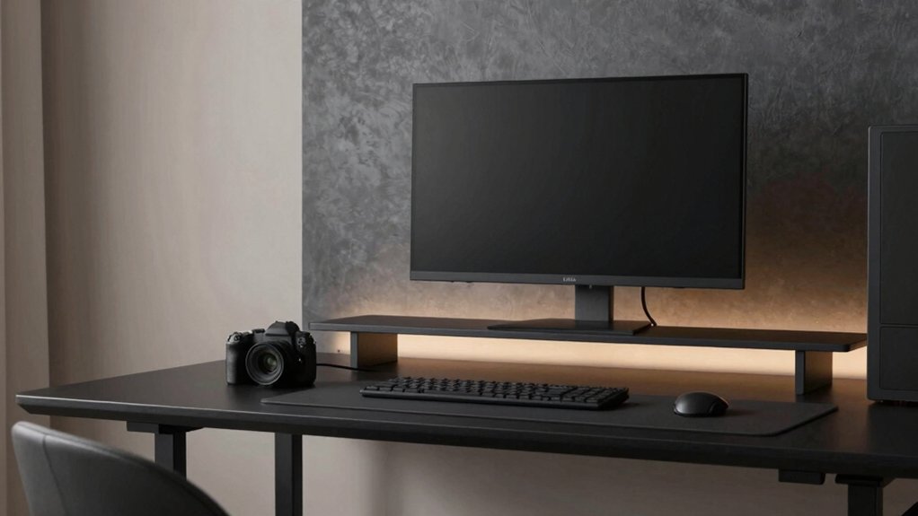
Warm Tones to Enhance Immersion and Comfort
Warm tones wrap a gaming room in coziness while boosting perceived depth, making scenes feel more immersive without overpowering brightness. You’ll notice how balanced warmth reduces eye strain during long sessions and guides attention toward on-screen details.
Color psychology suggests amber, peach, and soft terracotta hues evoke comfort without saturation fatigue, promoting steadier focus and smoother progressions between bright UI elements and dark backgrounds. Use these tones as wall accents or ceiling surfaces to create a cohesive backdrop for dynamic lighting.
Ambient lighting should harmonize with the warm base—soft white or warm LEDs layered with rises and dimming options. Avoid high-contrast shifts that disrupt immersion.
When tuned correctly, warm tones enhance presence, preserve clarity, and sustain comfort across extended play, while remaining adaptable to varied genres and screen setups.
Deep Murky Greens and Charcoals for Reduced Glare
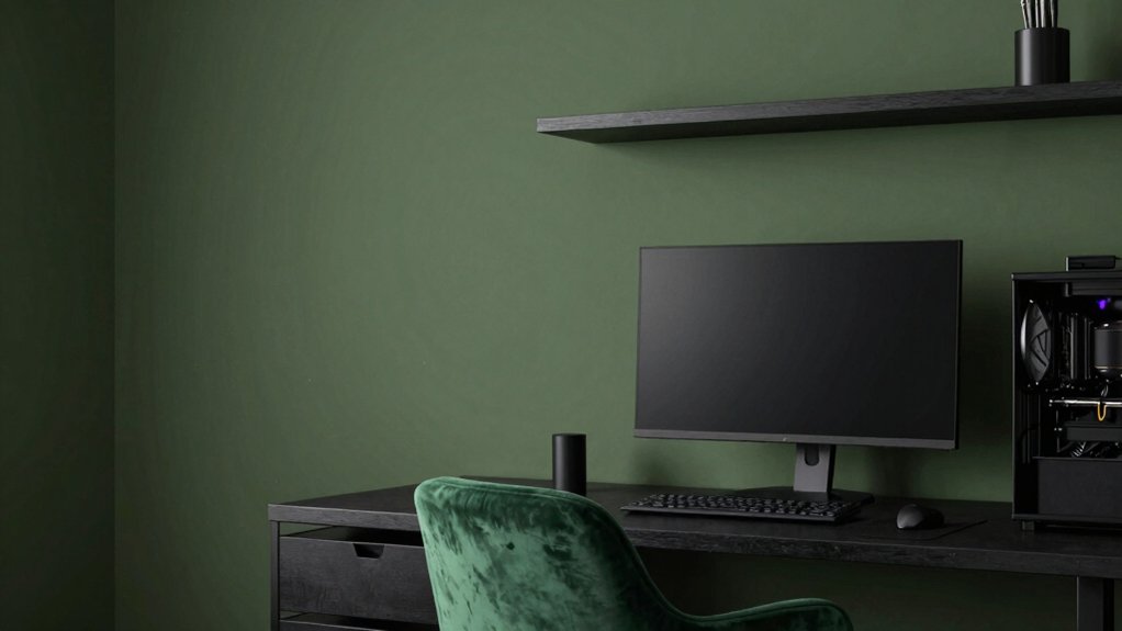
You’ll notice glare is minimized when you favor deep murky greens and charcoals that soak up reflections without dulling detail.
These hues leverage glare-reducing psychology and steady contrast to sharpen focus during late-night sessions. Pair subtle greens with charcoal accents to guide your eyes and sustain immersion without sacrificing clarity.
Glare-Reducing Hues
Glare is minimized when you deploy deep murky greens and charcoals as wall and accent colors, because their low luminance values reduce reflective surface area without sacrificing depth. You’ll notice less stray light bouncing off glossy screens or glossy trims, which keeps your focus on the gameplay.
Choose matte or low-sheen finishes to maintain this effect and preserve texture. Ambient lighting should complement the hues, not compete with them, so aim for soft, diffuse sources rather than harsh spots.
Color temperature matters: cooler whites can add sharp contrast, but warmer tones blend better with charcoal and green, reducing eye strain during long sessions.
Pair with controlled blinds or dimmers to sustain consistent glare control across a session.
Deep Tone Psychology
Deep murky greens and charcoals shape a disciplined visual field that reduces glare by absorbing excess light rather than reflecting it. In color psychology terms, these tones dampen sensory input, easing eye strain during long sessions. You’ll notice a calmer ambient mood that supports steady focus without competing hues.
You’ll notice a calmer ambient mood that supports steady focus without competing hues. Texture and finish matter: matte or satin surfaces help maintain the muted effect, while subtle warmth from underlayers prevents clinical coldness.
Pairing with restrained accents preserves cognitive bandwidth, so you stay within a narrow, efficient spectrum. This approach prioritizes perceptual clarity, letting you track detail, motion, and contrast without distraction.
Contrast for Focus
When you pair deep murky greens with charcoal, contrast becomes a precise tool for focus: it sharpens edges and reduces glare without sacrificing ambiance. You’ll notice how this tonal pairing guides the eye to critical elements, creating a visual hierarchy that supports quick decision-making during play.
Use charcoal on dominant surfaces to anchor the room, letting the greens recede for depth and calm. Limit glossy finishes to avoid hot reflections; instead, opt for matte textures that absorb stray light. Lighting fixtures should emphasize task zones with controlled spill, not ambient glare.
Wall art can punctuate without overpowering, using subtle contrast rather than bright focal points. This approach yields a composed, legible field ideal for extended sessions and strategic thinking.
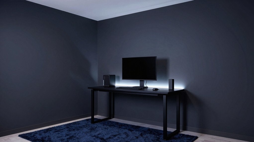
Subtle Blues for Calm Under Pressure
Subtle blues calm the mind under pressure by signaling safety and focus without overpowering the senses. In gaming rooms, you’ll benefit from hues that reduce cognitive load while preserving visual sharpness.
Subdued blues support color psychology aims—lower arousal, steadier attention, and quicker recovery between rounds—without stealing warmth or personality. Pair these tones with balanced lighting design: diffuse ambient light keeps walls from feeling cold, while task lighting at desks preserves contrast for framing enemies and maps.
Avoid overly saturated blues that fatigue eyes during long sessions. Instead, choose slate, powder, or slate-leaning teals for depth without glare. The result is a perceptual calm that preserves peripheral awareness, aiding decision speed and accuracy under pressure.
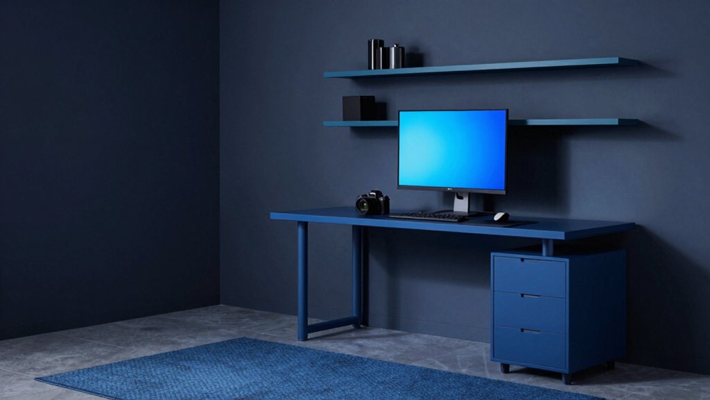
Accent Wall Strategies to Maximize Visual Depth
Accent walls can sharpen depth perception in a gaming room by creating a focal plane that enhances perceived distance and spatial layering. You harness this by selecting a wall that naturally reads as the room’s backdrop, then orchestrating contrast with adjacent surfaces.
Color blocking techniques let you delineate zones—a deeper hue on the primary wall, lighter shades on surrounding planes—to push and pull visual cues, guiding the eye toward key gameplay zones. Keep palette limited to two to three tones to avoid discordance while preserving depth.
Textured wall finishes add tactile dimension without overpowering color logic, subtly catching light and creating variation as you move. Use clean lines and precise edges to maintain the sense of structured depth during high-velocity play.
Finishes, Sheens, and Lighting Effects That Help Setup
Finishes, sheens, and lighting effects shape how a gaming setup reads under pressure and in long sessions. You choose paint sheen options that minimize glare on screens and reduce eye strain, while preserving depth and contrast in shadows. Matte finishes quiet reflections in competitive moments, but may show fingerprints; satin balances washability with subtle glow. Semi-gloss highlights architectural edges without competing with monitors.
For lighting, apply lighting placement strategies that evenly illuminate desks, walls, and backdrops, avoiding hotspots and color casts. Use dimmable LEDs to modulate mood and focus, and consider color temperature aligned with screen content. Zoning white walls with cooler temps around monitors prevents fatigue, while warmer accents near peripherals add comfort.
This setup supports clarity, focus, and aesthetic cohesion.
Pairing Colors With Monitors and Room Layouts
Pairing colors with monitors and room layouts starts with contrast and flow. You want scenes where screens don’t glare and walls don’t clash, so choose a base that anchors both monitors and furniture.
Consider monitors color harmony by picking tones that reflect or complement your display’s brightness and hue, then mirror those cues in accents or trim for coherence.
For room layout flow, align seating, desks, and shelving to minimize strain and maximize sightlines; cool hues can push depth, while warmer shades energize zones.
Use a midtone backdrop to reduce reflected glare and keep color perception stable across devices.
Fine-tune with small pops of color for personality, ensuring the overall palette remains harmonious rather than chaotic.
Frequently Asked Questions
How Do Different Monitor Setups Affect Chosen Paint Undertones?
Monitor setups subtly shift undertones: brighter monitors emphasize cooler tints, while dimmer displays pull warmer hues; you’ll notice wall texture and monitor brightness interplay, so choose undertones that harmonize rather than clash with reflections.
Can Accent Walls Hinder Color Accuracy Under Gaming Lighting?
Sure thing: yes, accent walls can affect color accuracy under gaming lighting. Wall color contrast and paint surface texture influence perceived hues, so you’ll want neutral, matte textures to minimize shifts and maintain consistent, crisp color rendering.
Do Paint Finishes Influence Screen Glare in Long Sessions?
Yes, matte paint sheens minimize screen glare during long sessions, while higher sheens reflect more ambient light; choose a balanced sheen. Consider wall texture as subtle, avoiding rough surfaces that intensify reflections and disrupt color perception.
Are There Color Guidelines for RGB Keyboard and Mouse Reflections?
Yes, there aren’t fixed RGB keyboard/mouse reflection rules, but aim for RGB color harmony and balance with ambient lighting effects. Studies show higher contrast reduces eye strain; keep reflections subdued to maintain accurate on-screen color perception.
How Often Should Wall Color Be Updated for Evolving Gear?
Wall repaint frequency depends on wear and taste, but you should consider seasonal color updates to keep the room cohesive with evolving gear, lighting, and mood. You’ll refresh every 1–2 years, aligning with updates and aesthetics.