
For your best media-room look, choose a matte, deep hue that absorbs light and sharpens contrast. Think warm grays, taupes, or a rich graphite to keep glare down and colors vibrant without washing out. Avoid ultra-flat finishes in high-traffic zones and opt for velvety textures that add depth. Pair with neutral fabric panels to dampen sound and keep the focus on the screen. Curious how the right finish ties it all together? There’s more to explore.
Understanding How Color Affects Media Viewing
Color shapes what you perceive onscreen. You notice hues altering perceived brightness, contrast, and mood, so you pick colors that support your viewing goals rather than distract from them. In practice, you tune the room’s palette to balance ambient light and screen glow, using cooler tones to reduce glare and warmer accents to cue comfort during long sessions.
Your choices influence perceived depth, helping you enjoy sharper details and truer blacks without straining eyes. Acoustic treatment matters, because properly placed panels and absorbers lessen reverberation that mutes dialogue and effects, keeping sound clean and focused.
Consider furniture placement that minimizes reflective surfaces and aligns seating with the ideal listening axis. Aim for a cohesive system where color, acoustics, and layout reinforce immersive viewing.
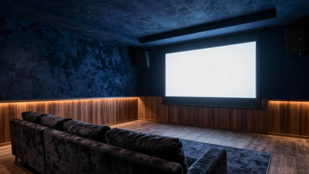
Best Neutral Tones for Dark Home Theaters
Choosing the right neutral tones sets the stage for deep, distraction-free viewing in a dark home theater. You’ll want matte neutrals that absorb stray light without washing out contrast. Think warm grays, soft taupes, or gentle greiges that recede rather than reflect.
Avoid stark whites and overly cool hues, which can feel clinical in a dim room. The goal is serenity that nudges your screen forward. Consider how undertones interact with lighting to prevent color shifts during scenes.
Acoustic treatments matter; choose fabric-wrapped panels in matching neutrals to dampen sound without visual disruption. Plan your furniture placement to keep sightlines clear and walls uncluttered, enhancing immersion.
Pair with the right trim and fixtures for a cohesive, unobtrusive backdrop.
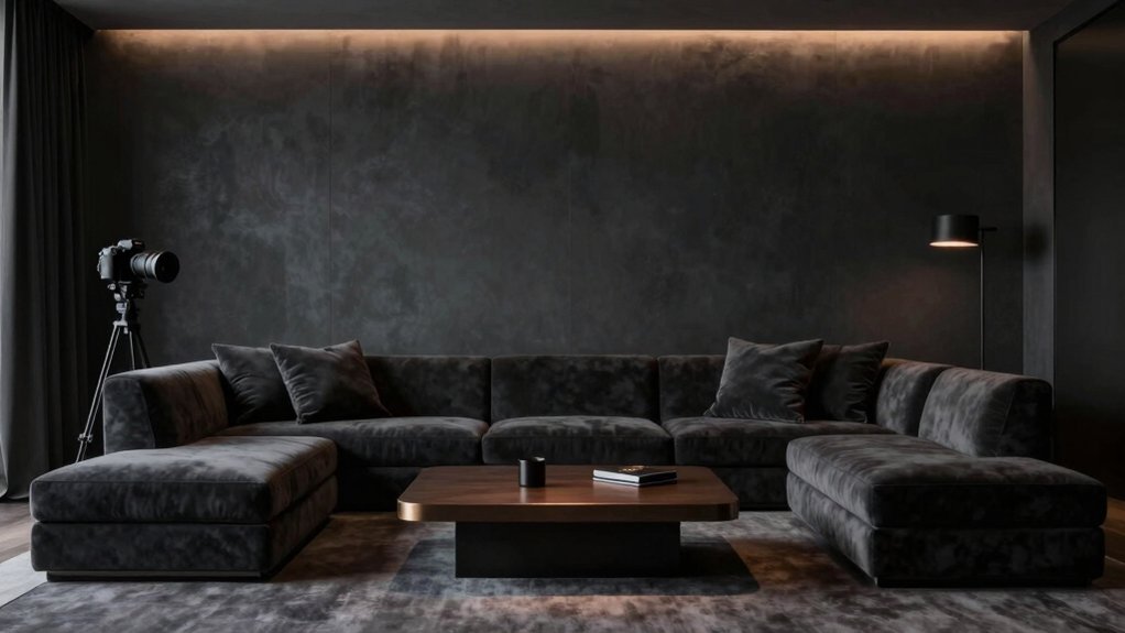
Deep, Rich Hues for High-Contrast Experiences
If you crave drama, plunge the room into deep, wine-reds, graphite blacks, and mossy greens that punch up contrast without overpowering the screen. Deep hues sharpen perceived blacks and heighten color pop, creating a cinematic frame you can feel.
Choose colors with subtle undertones to keep skin tones natural under dim lighting. To avoid glare, opt for matte or low-sheen finishes that absorb ambient light rather than reflect it. Wall textures matter: a velvety finish or a fine stipple adds depth without washing out contrast.
Paint application techniques matter too; plan multiple thin coats, feathered edges, and a precise cut-in around screens and recesses. Pair bold walls with dark, neutral ceilings and restrained accent furnishings to maintain balance.
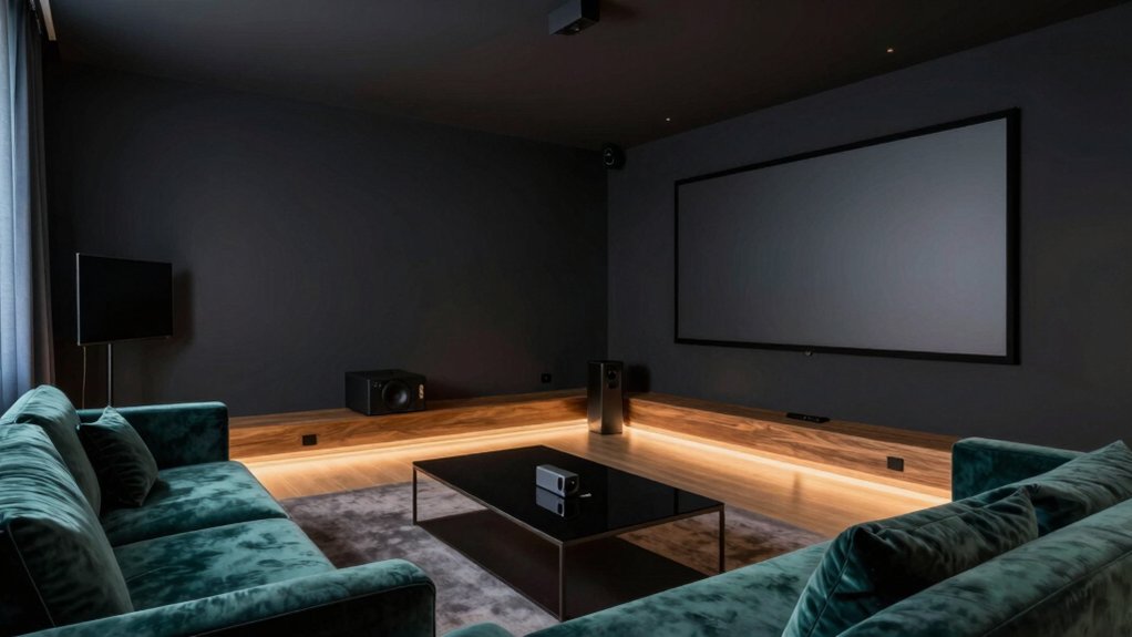
Soothing Grays and Blues for Minimal Distraction
Muted tones create focus: grays and blues calm the eye and reduce glare, so you watch without distraction. In this zone, you’re choosing soothing neutrals that recede, letting the content take center stage. Pick grays with warm undertones to avoid chilly reflections, and pair them with soft blues that echo twilight without dominating the scene.
You’ll notice how wall textures matter: matte finishes minimize shine, while subtle textures add depth without creating visual noise. Keep ceiling colors lighter than wall tones to push light upward, preserving contrast without harsh hotspots.
The goal is a balanced backdrop where equipment and actors pop naturally, not compete. When in doubt, test swatches on different wall textures and under your screen’s glow to confirm seamless, distraction-free immersion.
Lighting Considerations That Influence Paint Choice
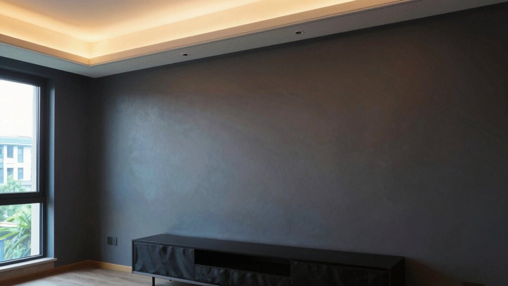
Lighting can make or break your paint choice, so assess how natural and artificial illumination hits walls at different times of day. In a media room, ambient lighting should be deliberate, not accidental; it defines mood and perception of color.
Consider natural light shifts: bright sun can wash out warm tones, while a dim overcast day may deepen them. Choose hues that read well under both conditions, avoiding extreme contrasts that strain eyes when screens glare. Test with samples on multiple walls and at various angles during peak daylight and late evening.
Dimmer controls help you tailor tone, reducing glare and preserving color integrity. Prioritize paints with low reflectivity if you want deep blacks or rich hues without washout.
Color Swatch Picks for Different Screen Sizes
When choosing color swatches for different screen sizes, start by aligning wall hues with the viewing distance and scale of the room. For large screens, opt for mid-tones that don’t fight glare, letting the image pop without washing out.
Medium screens benefit from cool neutrals that sharpen contrast, while smaller displays respond to warmer accents that add depth without overpowering detail.
Consider color psychology: calmer tones reduce perceived brightness, while subtle desats boost perceived saturation, guiding mood without distraction.
Paint durability matters too; choose flatter or eggshell finishes to minimize reflections, then seal high-traffic walls with a washable matte if you expect wear.
Always test swatches on different walls at multiple times of day to confirm harmony across screen sizes and lighting.
Practical Decorating Tips to Complement Your Paint
To start, tune your light and color so they balance with your screen’s glow. Keeping the room comfortable to view for long sessions is essential.
Consider accent halftones that echo your palette, adding subtle texture without crowding the space.
Keep audio in harmony with visuals, so the mood stays cohesive rather than competing with the artful paint.
Light, Color, Audio Balance
You’ll want a careful balance among light, color, and sound so the room feels cohesive when you’re watching, listening, or chatting. Use dimmable layers: ambient, task, and accent to control mood without washing color.
Pick wall color that recedes slightly under mixed lighting, so screen content stays vibrant without glare. Consider wall texture as a subtle absorber or reflector, depending on your screens’ brightness; smoother walls keep reflections down, while a whisper of texture adds depth.
For audio, place speakers where sound travels unobtrusively, avoiding corners that boom or fade. Furniture placement should frame the screen and listening zones without crowding cables.
Align seating with viewing angles and ensure rugs and textiles dampen echoes for crisp dialogue.
Accent Halftones for Style
Accent halftones quietly elevate a media room by layering tonal depth without stealing focus from the screen. You can use this technique by pairing a main color with two lighter or darker shades for walls, trim, and ceilings, creating subtle contrast that reads as texture.
Choose halftone tones that harmonize with your upholstery and media furniture, so the room feels cohesive rather than busy. Introduce wall art in understated frames and soft matting that echoes your palette, letting the artwork serve as focal accents without overpowering the screen.
When selecting furniture accents, opt for pieces in slightly varied intensities—think a charcoal throw, oatmeal ottoman, or slate shelving. The result: a refined, dimensional space that supports viewing pleasure.
Choosing a Finish and Maintaining the Look
When you pick a finish, you’re shaping both mood and upkeep, so start with the space’s light and sound needs. Consider matte for glare control and cozy mood, or satin for easier cleaning and subtle sheen.
Then map out a simple care plan to keep that look intact. We’ll cover finish options and practical care tips to help you maintain that polished cinema feel, without adding extra chores.
Finish Options Overview
Choosing a finish sets the mood for your media room, guiding not just color but texture, sheen, and upkeep. Finish options influence acoustics, glare, and perceived depth, so pick intentionally.
Matte finishes absorb light, minimize reflections, and hide flaws for a seamless backdrop. They pair well with bold colors, creating a calm theater-like vibe.
If you crave a bit more resilience, consider semi-gloss options for trim, doors, or focal walls; they offer wipeable surfaces without overpowering the room’s tone.
For high-traffic zones, avoid ultra-flat sheens that dull over time.
Remember, consistency matters: maintain a coherent sheen plan across surfaces to keep visuals cohesive.
Test swatches under your lighting, then commit to a finish that supports your viewing experience and maintenance routine.
Maintenance and Care Tips
Care for your media room hinges on a deliberate finish and a simple routine. Choose a durable finish that suits lighting and damping, then seal the look with smart maintenance.
For wall texture, select a finish that hides minor imperfections while staying easy to wipe down after movie nights. Satin or eggshell balances sheen and durability without glare.
Prioritize a proven paint primer selection; a quality primer improves adhesion, blocks stains, and ensures even color.
When cleaning, use a soft cloth and mild detergent; avoid abrasive scrubbers that dull the surface. Touch up chips promptly to preserve cohesion.
Refinish every few years if you notice yellowing or wear, aligning with changes in lighting or furniture. Consistency in products simplifies upkeep and preserves the room’s mood.
Frequently Asked Questions
How Often Should I Repaint After Screen Tech Upgrades?
You should repaint about every 5–7 years after screen tech upgrades. Think of it as seasoning your room’s wall texture, aligning paint finish with new lumens, so your cinema remains immersive and fresh, not dusty or mismatched.
Can Wall Color Affect Screen Glare Under Projectors?
Yes, wall paint can affect projector glare; choose matte, neutral tones to reduce reflections and preserve contrast, and avoid glossy finishes that mirror light onto the screen, minimizing distractions and improving image clarity for you.
Do Ceiling Colors Impact Perceived Room Depth?
Ceiling colors impact perceived room depth by creating a ceiling illusion that can either lift or compress space, subtly altering room height perception as you look upward or downward. Choose lighter ceilings to enhance openness, darker for cozied intimacy.
Are Bold Colors Better for Sound Absorption?
Bold colors aren’t inherently better for sound absorption; you’ll want acoustic treatments tailored to your space, plus you’ll consider color psychology to shape mood. Use targeted panels and treatments, not paint, for ideal acoustic results.
Should I Match Wall Color to Furniture or Screen?
Yes, you should match wall color more to furniture than the screen. Prioritize wall matching with nearby furniture, ensuring subtle contrasts, while screen color stays neutral to avoid distracting reflections. This furniture coordination keeps depth and cohesion intact.