
For a media room, you’ll want a deep, neutral base—near-black gray or charcoal—with a matte finish to maximize contrast, cut glare, and keep colors accurate as lighting shifts. Pair it with cool neutrals and restrained accents so your screen remains the hero. Think subdued blues or warm taupe for balance, and textures that add depth without competing with content. If you keep going, you’ll discover tips that tie paint to lighting, furniture, and comfort.
Understanding How Light Affects Media Room Colors
Light shapes how a media room feels and performs, so start with the basics: the direction and quality of your light matter as much as the walls you paint. You’ll notice color temperature shifts as light changes, influencing how colors appear on screen and in decor.
When you compare natural vs artificial light, you’ll see daylight brings true-hue accuracy, while artificial sources can skew tones toward warmer or cooler tints. Your color choices must respond to these cues: choose hues that remain legible under both kinds of light, and test samples at viewing distance and screen brightness.
Consider coatings with low reflectance to reduce glare. In practice, map your lighting plan to your paint strategy, ensuring consistency across morning, day, and evening viewing windows.
The Psychology of Color and Viewing Comfort
Color sets the mood and can ease or strain viewing, so choosing hues with psychology in mind matters as much as any screen setting. You’ll notice color influences focus, fatigue, and mood, so the palette you pick should support steady viewing sessions.
Color psychology informs how long you stay immersed without discomfort; cooler neutrals reduce glare and promote calm, while muted blues or greens can lower heart rate and preserve contrast without washing out images.
Accents matter too: small, purposeful pops that guide eye movement without competing with on-screen content. Consider a midtone base that absorbs harsh light yet reflects enough to prevent shadows.
Prioritize consistent lighting, low saturation, and balanced contrast to maintain viewing comfort throughout extended viewing.
Best Base Hues for Dark Room Cinematic Vibes
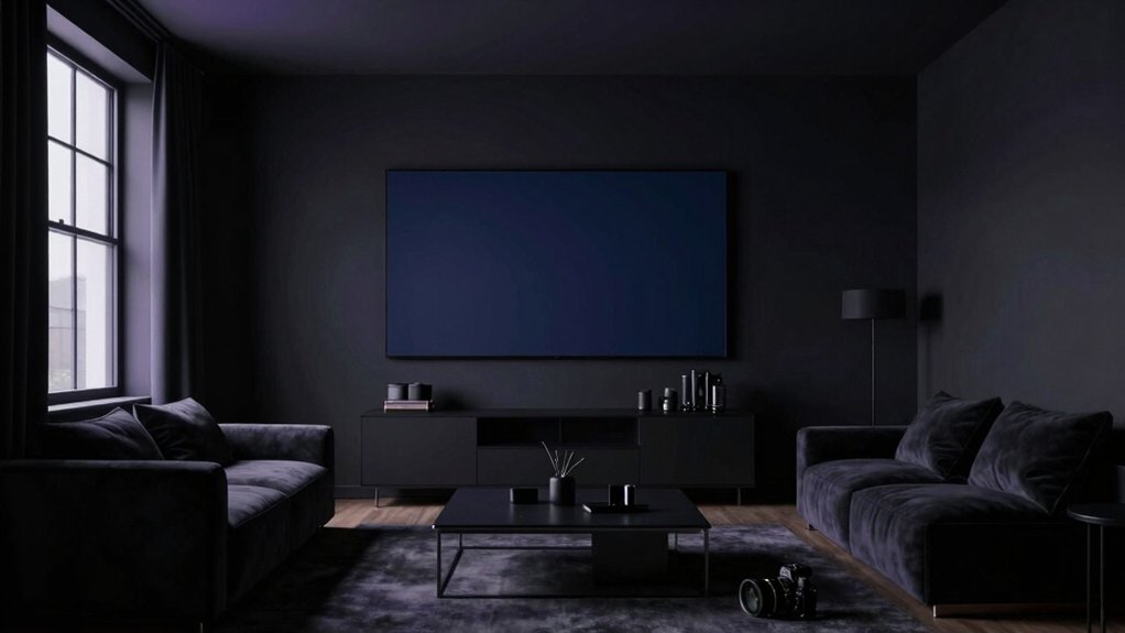
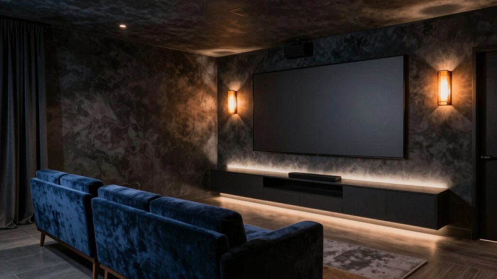
Your base hues set the room’s rhythm, so choose tones that melt into the shadows while still keeping images crisp; in a dark-room cinema, deep neutrals and subdued chroma prevent glare and preserve contrast.
For base hues, lean into near-black grays, charcoal, and cool navy as foundation colors. These shades minimize light bounce, helping maintain cinematic depth without washing out scenes.
Add warmth subtly with a velvet-like undertone or a whisper of taupe near seating to avoid sterility. Consider wall texture that collects matte or satin finishes to reduce glare while boosting realism.
Prioritize paint durability in high-traffic media spaces; choose primers and finishes that resist scuffs and fingerprints. The result? Rich, lasting ambiance tailored to immersive viewing.
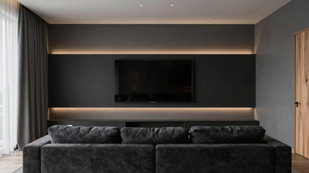
Neutral Palettes That Reduce Screen Glare
Neutral palettes can calm the glare without muting detail, pairing cool neutrals with just-warmed undertones to balance image sharpness and room coziness. You’ll find that color temperature matters: cooler tones reduce harsh bloom, while gentle warmth prevents a flat look on screen scenes.
Opt for mid-light shades with subtle gray or beige undertones to preserve contrast without washing out detail. When selecting paint, consider durability as well as finish; a satin or matte sheens can help diffuse reflections without creating hotspots.
Test samples under your typical lighting and viewing angles to confirm glare reduction. Choose color blocks that complement furniture and screen tint, ensuring the palette remains cohesive over time.
Prioritize color temperature alignment and paint durability for enduring comfort.
Bold Accents That Enhance Contrast Without Strain
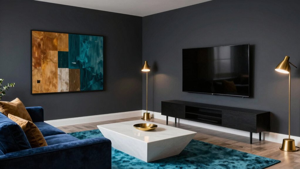
Bold accents can sharpen contrast without stressing the eyes. You’ll pick bold accents that punch up detail without overpowering screens or lighting. Think deep navy trim against pale walls, or a charcoal sofa with bright cushions to cue focus during action scenes.
Contrast enhancement works best when you keep a deliberate rhythm: one dominant wall color, one accent hue, and a couple of steady neutrals to breathe. You’ll avoid busy patterns that fight for attention; instead, use solid tones with subtle textures to add depth.
Consider metallic tweaks—brushed brass or copper—sparingly to guide the eye toward the center stage. The goal is clear, readable edges that reduce eye fatigue while elevating mood and perceived depth.
Suited Finishes and Sheens for Screen Rooms
Finishes and sheens matter just as much as color when you’re shaping a screen room’s mood and readability. In this space, you’ll prioritize options that minimize glare while enhancing detail. Opt for matte or eggshell paints to keep walls from reflecting too much light, preserving contrast during daytime viewing.
For ceiling and trim, choose satin or pearl finishes to add subtle lift without competing with the screen’s glow. If your room treats light unevenly, a satin sheen on side walls helps bounce ambient light softly.
Consider paint finishes that resist fingerprints and smudges in high-traffic areas. Remember: sheen options should support clarity, not distraction, so pick consistent levels across walls for cohesive immersion.
Pairing Wall Color With Furniture and Acoustics
Pairing wall color with furniture and acoustics starts with purpose: choose hues that reinforce the room’s function without fighting the sound or the lines of your furniture.
You’ll want a palette that respects furniture silhouettes while supporting clear viewing angles and motion. Seek furniture harmony by selecting colors that echo wood tones, fabric textures, or upholstery accents, creating a cohesive, undistracted backdrop.
For acoustics, apply colors that don’t visually exaggerate space or reflect glare but pair with your acoustic treatment plan; darker tones can hide shadows while lighter walls foster brightness around screens.
Balance is key: avoid high-contrast clashes that pull attention from media content. Test samples under your typical lighting, then refine until the wall color quietly supports immersion and comfort.
Lighting Setup Tips to Complement Your Paint
Good lighting completes your paint choice, so plan around three layers: ambient, task, and accent.
In a media room, ambient lighting sets the mood without washing color. Use ceiling fixtures to provide even coverage, avoiding hotspots that skew hue. Pair dimmable options with your wall tone so you can shift from bright daytime clarity to cinematic evenings.
For task needs, place focused lighting near seating for reading or controller use, keeping glare off screens.
Add accent lighting to emphasize artwork or architectural features without altering the room’s color perception. Choose lighting with a color temperature that harmonizes with your paint—warm for cozy rooms, neutral for modern palettes.
Test brightness at different angles, ensuring reflections don’t compete with the screen.
Practical DIY Tips for Testing and Implementing Color
Testing color in a real room takes hands-on steps you can trust. First, sample large swatches on different walls and observe under your usual lighting during both day and night. Track how the color changes with ambient light, and note which tones feel warmer or cooler to you.
Then test with a simple grid: neighbors’ colors, trim, and a focal wall. Evaluate color psychology by how the hue affects mood and focus—avoid high-contrast combos that tire the eye.
Next, apply your final pick on a small area, finish with two coats for accurate depth, and confirm paint durability by checking sheen, patch resistance, and how it copes with traffic.
Finally, commit to a sealed, breathable topcoat for long-lasting performance.
Frequently Asked Questions
What Colors Reduce Motion Blur on Screens?
Colors that reduce motion blur on screens lean cool and muted: you’ll want wall textures that absorb glare and ceiling colors that brighten without contrast spikes. Pair matte finishes with soft neutrals for less eye strain and steadier perception.
How Do Paint Finishes Affect Sound Absorption?
Paint finishes affect sound absorption: higher sheen reflects more, while matte absorbs better. You’ll notice paint sheen effects on room acoustics, and surface reflectivity impacts speaker and mic accuracy, especially with glossy walls influencing flutter echoes and clarity.
Which Shades Pair Best With OLED Black Levels?
You should favor cool, near-black tones with OLEDs, as they maintain true blacks; pair them with soft, diffuse media room lighting and matte wall texture choices to reduce glare and enhance contrast.
Do Paint Colors Impact HDR Color Accuracy?
Yes, paint colors affect HDR color accuracy because reflectance, color temperature, and surround luminance influence perceived tones; use paint psychology to guide choices, keeping mid-range color temperature and neutral walls to minimize color shifts and glare.
How Often Should You Repaint for Media Room Changes?
You should repaint every 5–7 years, adjusting for wear and room changes. You can track paint maintenance by noting fading, chipping, or color shifts. Repainting frequency may shift with lighting tweaks and media room renovations.