
For a north-facing room, start with warm neutrals—mid-toned beiges or warm grays (greige) with matte or eggshell finishes—to counteract cool light and add depth. Test large swatches on all walls under actual north light to gauge undertones, depth, and warmth throughout the day. Pair with complementary trims and natural wood tones for cohesion. Soft creams can brighten without yellowing, while taupe/greige balance cool reflections. If you keep exploring, you’ll uncover more precise pairing and testing steps.
Warm Neutral Base Options for North-Facing Rooms
For north-facing rooms, warm neutral base colors help counteract the cool, blue-tinted light you get throughout the day. You’ll want pigments that read warm under artificial and daylight cycles, supporting balanced interior lighting design without washing out texture.
Choose bases with subtle yellow or peach undertones, avoiding stark grays that skew cold. A mid-toned beige or warm greige provides depth, while still reflecting ambient light efficiently. Test samples on all wall areas for accurate perception under your fixtures and windows.
Consider matte or eggshell sheens to minimize glare and enhance color saturation. Prioritize paint durability in high-traffic zones and around moisture-prone surfaces.
Pair with complementary trim to maintain tonal cohesion, ensuring long-term stability and consistent finish across seasons.
Soft Creams That Read Bright Without Yellowing
Soft creams that read bright without yellowing strike a balance between warmth and clarity, keeping interiors lively while preserving true textures. You’ll surface this with light-reflective qualities that prevent dulling in north-facing spaces. Look for hues leaning toward ivory or biscuit rather than vanilla; this avoids warm cast under low winter sun while maintaining depth.
In practice, test samples across walls, trim, and adjacent fabrics to confirm true tint under your specific daylight pattern. Color psychology guides choices: these tones support calm energy without overpowering architectural details, aiding perceived spaciousness.
For durability, select formulations with stable base pigments and excellent washability to resist fading from daily exposure. Consider matte or eggshell finishes to enhance texture while minimizing glare, ensuring long-term paint durability in your north-facing environment.
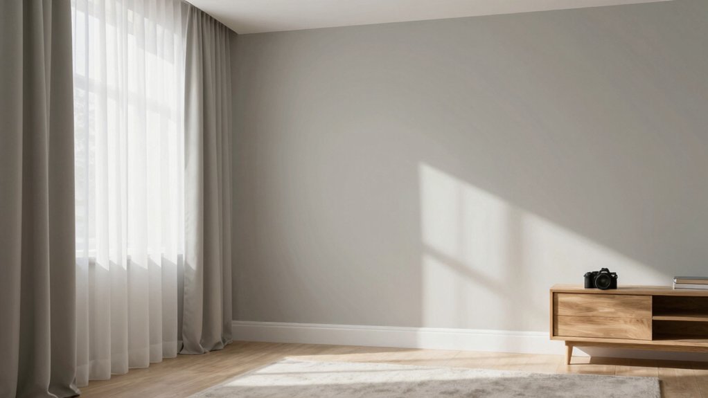
Light Greys With Subtle Warm Undertones
Light greys with subtle warm undertones balance North-facing light by counteracting cool reflections without becoming flat. You’ll notice how these tones harmonize with cool blues and crisp whites, while preserving depth through gentle warmth.
This balance hinges on undertone clarity, ensuring the gray remains readable in north light and supports steady, hour-to-hour color stability.
Subtle Warm Undertones
Subtle warm undertones in light greys introduce a gentle coziness without sacrificing brightness. You’ll notice how the warmth softens the coolness of north-facing light, creating a balanced palette that remains crisp.
The undertone interacts with your lighting techniques to produce consistent color perception across the day, avoiding flatness in shaded corners. Choose greys with tiny, aureate hints—eggshell or biscuit flecks—so the room feels inviting yet contemporary.
In practice, aim for a base that reads cool on the wall at noon, then shifts to a refined warmth under evening lamps. This effect supports color psychology goals: comfort, focus, and perceived room size.
Keep contrast subtle, and use materials that reflect warm neutrals to reinforce the design logic.
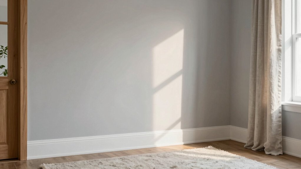
North-Light Compatibility
North-facing rooms often read cooler and flatter under daylight, so light greys with subtle warm undertones must be tuned to counterbalance north light without drifting into amber. You should evaluate how the north window glare shifts perceived undertone, then select shades that maintain tonal neutrality across mid-morning to late afternoon.
In practice, test swatches on all wall planes under your actual light, noting slight shifts near the window and in corners. Favor paints with balanced chroma and minimal cool bias, reinforcing depth without deadening brightness.
For finish, consider paint sheen choices that optimize diffusion—matte or eggshell reduces glare, while satin can enhance detail without amplifying glare. Document perceptual changes and adjust hue slightly toward warmer neutrals if contrast feels too cool.
Light Grey Balance
When selecting light greys with subtle warm undertones for north-facing rooms, balance is key: aim for hues that read cool enough to counter the inherent blue of the northern sky while carrying a hint of warmth to prevent flatness. You should assess color psychology effects, noting how small shifts in warmth influence perceived brightness and mood during daylight and lamplight.
Favor greys with barely perceptible almond or beige undertones to avoid clinical sterility while preserving contrast with white trim. Consider paint finish options—matte for diffuse light diffusion, satin for subtle sheen and cleaning ease, or eggshell for a balanced, mid-sheen performance.
Test panels across walls, observing at multiple times; fine-tune with cool or warm accent notes to optimize depth, clarity, and perceived room size.
Taupe and Greige Favorites for Balance
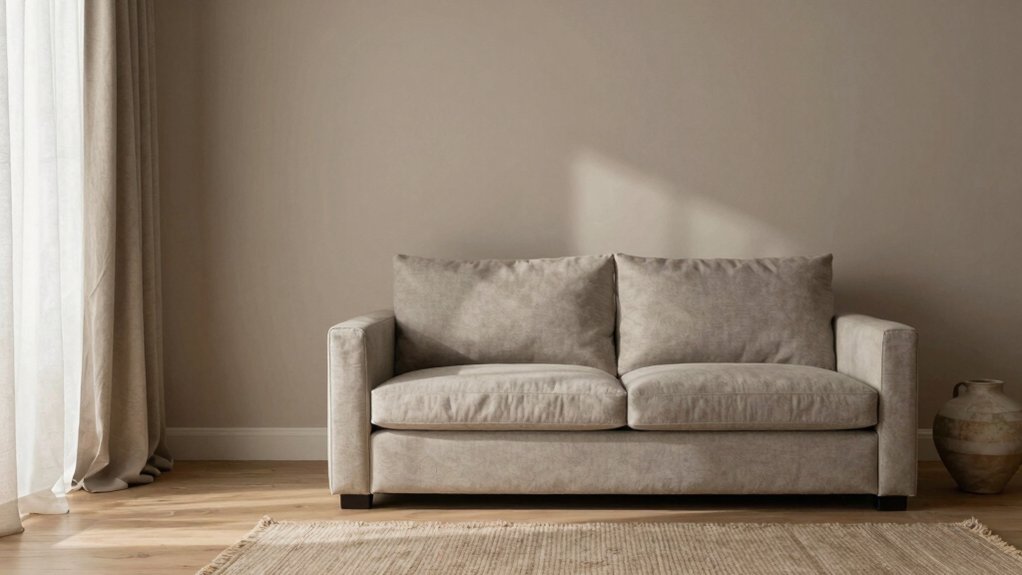
Taupe offers a warm balance that anchors north-facing rooms without overpowering them.
Greige reads clearly under north light, maintaining cohesion with natural wood tones.
Together, these hues create a disciplined, timeless palette that supports architectural details while keeping interiors calm and cohesive.
Taupe’s Warm Balance
To balance cool northern light, taupe and greige tones create a warm, grounded backdrop that avoids flatness and glare. You’ll notice how this pairing modulates color temperature, shifting from cool to welcoming with depth that reads stable in every hour.
Taupe’s warmth arises from subtle undertones that pair well with neutral whites and soft blacks, keeping contrast legible without harsh edges. The key is selecting paints with balanced pigment load and a gentle, low to mid paint sheen that preserves nuance on walls, trim, and architectural details.
Use layered swatches to confirm under morning and afternoon light, ensuring the finish reinforces cohesion rather than highlights. This approach yields a sophisticated, durable canvas for furniture and textures, avoiding optical fatigue in busy spaces.
Greige Under North Light
Even under north light, greige remains a balanced protagonist, pairing the calm neutrality of taupe with the cool neutrality of gray. In practice, greige under northern light reads as a sophisticated midpoint, avoiding the yellow cast of warm beiges and the starkness of true grays.
You’ll notice subtle shifts depending on time of day and room orientation, revealing depth rather than flatness when the pigment interacts with ambient luminance. Choose a mid-saturation greige to preserve detail in architectural features while maintaining visual calm.
Consider paint sheen: an eggshell or satin finish preserves nuance in texture and prevents chalkiness on walls exposed to indirect daylight. This approach supports a refined, versatile backdrop for art, textiles, and furniture without competing with natural light.
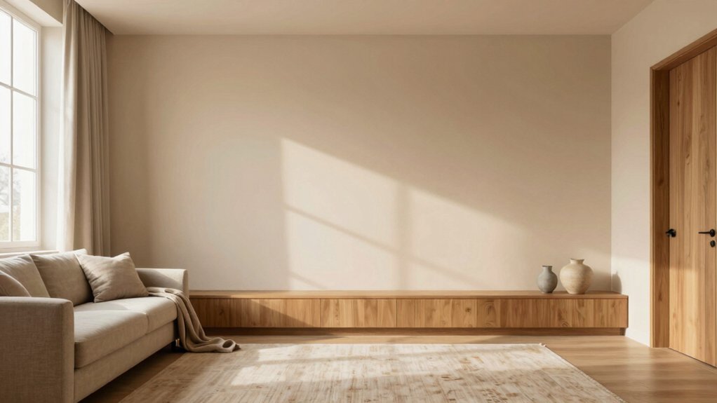
Pairing With Natural Wood
Natural wood reads warmly against a north-facing backdrop, so pair taupe and greige tones with it to maintain balance without dulling the wood’s character. You’ll want taupe as a medium base to warm the room while preserving grain visibility, and greige as an adaptable neutral to soften contrasts.
This pairing supports daylight variations, keeping color perception steady throughout the day. Consider decorative accents in matte metallics or soft wood tones to reinforce depth without competing with the wood.
For finishes, opt for paint finish options that protect without glare; satin or eggshell offer subtle sheen that highlights grain and texture. Test samples on-site under north light, evaluating both mood and reflective quality.
Precision in color placement preserves furniture lines, optimizing overall harmony.
How to Test Swatches in North-Facing Spaces
When testing samples in north-facing spaces, rely on controlled lighting to reveal true color. Begin with a neutral daylight-equivalent source, then compare under ambient lamps to observe shifts.
Apply samples on large test panels rather than small chips to track how hue, value, and saturation interact with wall texture and room geometry. Rotate lighting angles to uncover subtle undertones, and document the moments when colors look warmer or cooler as lighting changes.
Consider color psychology: cool whites may read as sterile, while warm neutrals can feel cozier under diffuse light. Evaluate paint finish options—matte, eggshell, satin—under the same conditions, since sheen affects perceived depth.
Record impressions methodically, then compare against samples in similar north-facing contexts to ensure consistency.
Common Mistakes and How to Avoid Them
Common mistakes in north-facing rooms often stem from underestimating light limitations and overcorrecting with color. You’ll often see people misjudge warmth, choosing overly cool tones that deaden depth or too dark hues that flatten contrast. To avoid this, measure light as it shifts through the day and test swatches under real lighting.
Watch for ceiling color mistakes: bright ceilings can lift a space only if the wall color remains softly warm and luminous, else the ceiling reads chalky. Coordinate furniture color conflicts by balancing wood, fabric, and accents to maintain a cohesive temperature.
Keep textures tactile but restrained, preventing glare on glossy finishes. Favor midtone neutrals with selective saturated accents to preserve depth without overpowering the room’s natural light.
Frequently Asked Questions
How Does Artificial Lighting Affect Color Perception in North-Facing Rooms?
Artificial lighting impact your perception by shifting warmth and intensity; you’ll notice cooler tones under cool bulbs and warmer hues under amber lighting. This color perception adjustments can skew north-facing room readings, so calibrate with reference samples and neutral tests.
Can White Paint Look Different in Winter vs. Summer in North Light?
White can look different in winter vs. summer in north light. You’ll notice natural light variations create seasonal color shifts, so expect cooler undertones in winter and warmer casts in summer, influencing perceptual warmth and brightness.
Are There High-Contrast Color Schemes Suitable for North-Facing Spaces?
Yes, you can: high-contrast color schemes work in north-facing spaces. You’ll balance with color harmony techniques, using bold accents and whites to prevent winter flatness. You’ll see contrast color schemes energize without overwhelming, staying technically aesthetic.
What Are Budget-Friendly Ways to Refresh a North-Facing Room?
You can refresh a north-facing room on a budget by implementing affordable decor and DIY painting tips, focusing on light reflectance, warm accents, and strategic lighting. Affordable decor choices plus DIY painting tips yield dramatic, technically aesthetic improvements.
Which Finishes (Satin, Eggshell) Best Suit North-Facing Walls?
Directly: satin generally suits north-facing walls better, offering smooth sheen with good durability. You’ll get a balanced glow like a soft sunrise. Paint sheen comparison, finish durability tips, you’ll prefer satin over eggshell for stability and light reflection.