
White kitchen cabinets set a bright, versatile backdrop, so you’ll want wall colors that balance warmth and clarity. Opt for soft neutrals or cool tones for a modern feel, or warm creams to add coziness, with bold accents for personality. Undertones matter; test samples in your light to guarantee harmony with cabinets and lighting. Layer textures to keep depth and avoid flatness, and use contrast to define zones. If you keep exploring, you’ll uncover how to fine‑tune every nuance.
Understanding How White Cabinets Influence Wall Color
White cabinets set a bright, clean backdrop that shapes how any wall color reads in a kitchen. You notice how their brightness can amplify or soften nearby hues, making choices feel consequential yet grounded.
When you evaluate wall color, consider undertones—cool whites pull toward blue, warm whites toward cream—and how those shifts interact with your cabinet’s crisp line. Accent wall options offer a controlled contrast that preserves openness, while still delivering personality.
For ceiling paint choices, keep the ceiling lighter or with a subtle value shift to maintain vertical perception and airiness. Balance is key: select tones that harmonize with cabinetry’s brightness, then measure how lighting—sunlight or fixtures—guides mood and cohesion.
In this framework, your palette stays functional and thoughtfully nuanced.
Soft Neutrals That Complement White Cabinets
Soft neutrals create a quiet harmony with white cabinets, offering subtle warmth that still reads crisp and clean. Consider hues that read as a touch warmer to help the space feel inviting, while keeping brightness from reflecting on the backsplash and counters.
You’ll find options that balance warmth with lightness, guiding the palette toward hues that subtly amplify the room’s functional aesthetics.
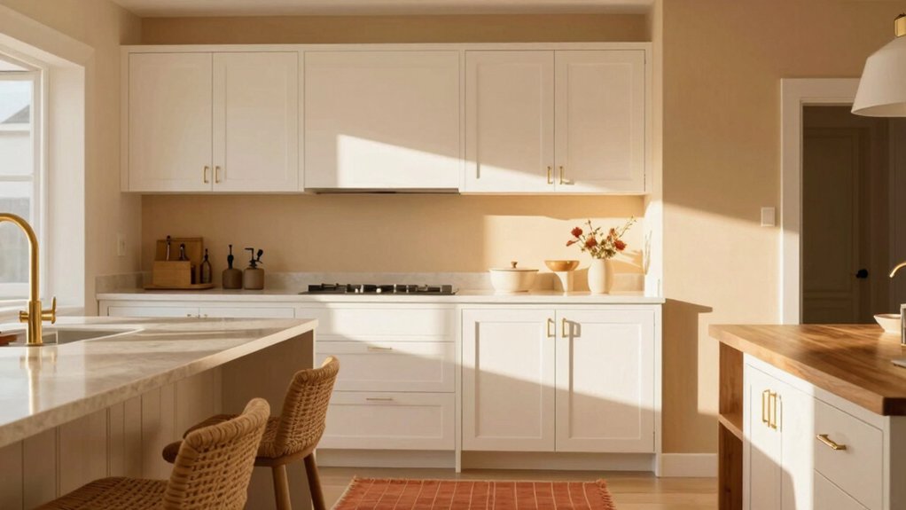
Subtle Warmth Matches
Subtle warmth comes from soft neutrals that play well with white cabinets without competing for attention. They provide a calm backdrop that enhances natural light and the clean lines of the room.
You’ll notice how these hues read as approachable rather than stark, linking color psychology to everyday use. Choose mid-tone beiges or warm greiges to maintain cohesion with chrome hardware and wood accents, avoiding high-contrast statements.
Consider paint finish options that balance durability and texture, such as eggshell for everyday rooms or satin for higher-traffic areas. This helps preserve a subtle sheen without glare.
This palette supports subtle nuance in art and accents, while keeping the kitchen airy. In practice, the result feels intentionally calm, functional, and timeless.
Hues for Brightening
Brightening your space starts with choosing soft neutrals that complement white cabinets rather than compete with them. You’ll notice that warm, airy tones push light across the room, while cool neutrals preserve crisp edges. The goal is a cohesive palette with nuanced undertones, so pick hues that shuttle between calm and clarity.
Color psychology suggests that soft beiges, greiges, or misty whites can evoke openness and focus without overwhelming fixtures. Consider undertones that harmonize with stainless, quartz, or wood elements, ensuring subtle contrast rather than stark separation.
When selecting paint finishes, lean toward eggshell or satin for a gentle sheen that catches light without glare. In practice, test samples in multiple lighting moments to confirm balance, then apply consistently for a polished, inviting kitchen.
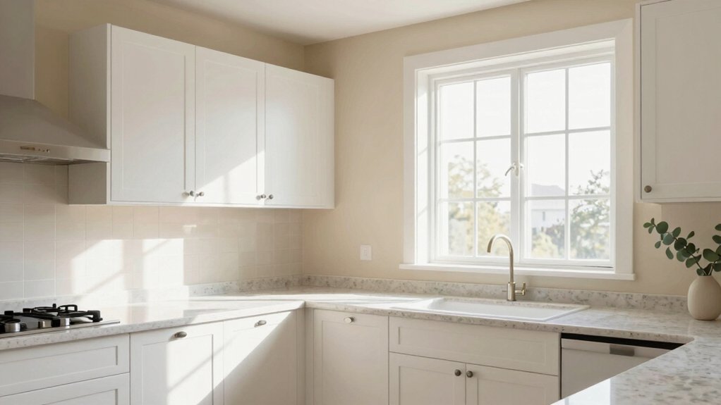
Warm Tones to Create Cozy Kitchen Vibes
Warm tones instantly cozy up white cabinets by grounding the space with a sunlit, inviting glow. You’ll notice how creams, sand, and warm taupe weave depth into the backdrop without overpowering details.
Choose hues that read warm in daylight yet shift smoothly at night, preserving clarity around your cabinetry. The palette should remain cohesive, guiding functional aesthetics: easy-to-clean walls, a complementary backsplash, and lighting that amplifies the warmth.
Subtle, nuanced undertones matter—avoid pinky beiges or muddy yellows that fight the white. Artwork pairing benefits from gentle, earthy tones that echo your wall color, creating curated focal points without competing with cabinets.
Consider window treatment options that soften glare while preserving warmth—linen shades or light wood blinds work harmoniously with this scheme.
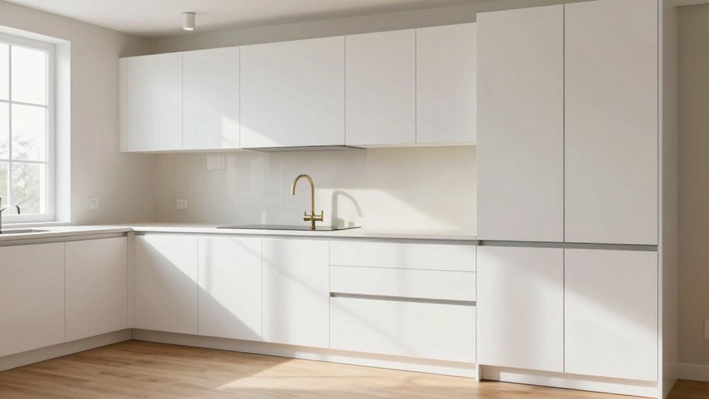
Cool and Crisp Palettes for Modern Kitchens
You’ll tastefully pair chill, crisp neutrals with cool-toned accents to keep modern kitchens feeling airy and precise.
This palette centers on clean contrasts that read as calm, not stark, with undertones that stay nuanced at every light change.
As you test swatches, you’ll notice how the cool balance guides cabinets and counters toward a cohesive, functional vibe.
Chill, Crisp Neutrals
Think cool and collected with chill neutrals that keep white kitchen cabinets feeling crisp and modern. Chill, crisp neutrals lean into understated tones that harmonize with bright surfaces, creating a breathable backdrop for daily tasks.
You’ll notice that soft grays, misty beiges, and pale greiges offer subtle depth without overpowering lines, letting cabinetry remain the focal point. This palette supports a cohesive, functional aesthetic, where lighting and materials play off each other to sculpt nuanced undertones.
Consider how decor trends skew toward simplicity, while color psychology reveals calm, balanced environments perfect for quick meals or late-night prep. Use these neutrals as a versatile base, then layer texture and warm accents to preserve warmth and readability in your kitchen.
Cool Toned Accents
Cool toned accents bring a crisp, contemporary edge to white kitchen cabinets. You’ll lean into cool, light-based palettes that emphasize clean lines and practical mood.
Use decorative wall textures to add tactility without visual noise, balancing gloss with matte to keep reflections controlled. Think airy blues, slate grays, and icy greens that read fresh rather than clinical, ensuring rooms feel expansive without coldness.
Pair these tones with minimal hardware and streamlined shelving to reinforce a cohesive palette. When selecting wall colors, consider undertones that harmonize with natural light, so shadows feel intentional, not muddy.
For wall art selection, choose pieces with restrained contrast and subtle echoes of your accent hues to maintain functional aesthetics. The result is understated elegance that remains livable.
Bold Hues That Make White Cabinets Pop
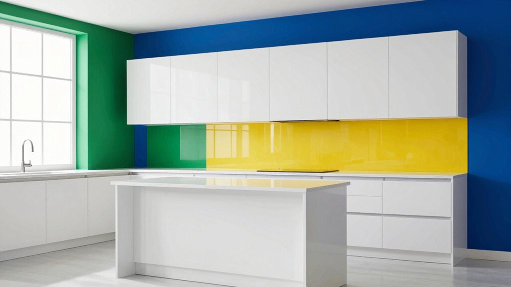
Bold hues can turn white cabinets into a focal point without overwhelming the space. When you choose bold, you’re not shouting color; you’re defining character with purpose. A saturated navy or lush emerald creates depth, while warm terracotta or graphite adds contemporary edge.
You’ll balance these tones with clean white or soft neutrals to preserve clarity in the kitchen’s workflow. Use bold walls to anchor accents, then pull in complementary textures—matte finishes, natural wood, and subtle metals—for a cohesive palette.
Accent wall ideas guide the eye without crowding, and color contrast strategies ensure legibility between cabinetry and surfaces. Keep lighting steady to prevent dull undertones from creeping in, and tailor hues to your flooring and cabinetry hardware for nuanced undertones that feel intentional.
Practical Tips for Balancing Undertones and Lighting
Color undertones and lighting don’t just shade the cabinets; they set the room’s mood and legibility. You’ll balance cool and warm hints by testing samples side by side, noting how daylight shifts color during the day and bulbs at night.
Keep a simple reference: note the undertone in each wall and how it plays with your white cabinetry. Use practical checks—paint finish options on sample boards, then view at eye level under both daylight and artificial light.
Consider furniture coordination to prevent clashes or monochrome overwhelm. Favor a cohesive palette that supports functional aesthetics: choose finishes that reduce glare, preserve depth, and highlight subtle nuance.
When in doubt, lean toward softer contrasts and layered textures for timeless appeal.
Frequently Asked Questions
What Wall Color Makes White Cabinets Look Brighter Without Glare?
A bright, buttery wall color acts like a sunbeam heavenward; you’ll see your white cabinets glow without glare. You’ll notice decorative accents popping against subtle wall texture, and your cohesive palette cultivates functional aesthetics with nuanced undertones.
How Do Cabinet Hardware Choices Affect Wall Color Perception?
Cabinet hardware choices affect wall color perception by altering contrast and reflections. You’ll notice cabinet hardware styles and hardware material choices influence how warmth or coolness reads on surrounding walls, guiding cohesive palette, functional aesthetics, and nuanced undertones.
Do Ceiling Colors Impact the Perceived Wall Color With White Cabinets?
Yes—ceiling colors impact perceived wall color with white cabinets, shaping color contrast and mood. You’ll notice subtler shifts as you test ceiling paint, so your cohesive palette reveals nuanced undertones, guiding functional aesthetics and confident design decisions.
Which Paint Finishes Best Suit White Cabinets in Kitchens?
You should choose satin or eggshell paint for kitchens, because their durable finishes handle humidity, smudge resistance, and cleanability; these surfaces balance paint sheen with wall texture, delivering cohesive palette, functional aesthetics, and nuanced undertones.
How Can Lighting Temperature Alter Wall Color With White Cabinets?
Lighting temperature subtly shifts wall color with white cabinets, you’ll notice warmer temps cozying walls and cooler temps crisping them; embrace the irony, creating lighting ambiance while wall paint durability stays reassuringly steady, and your space feels thoughtfully cohesive.