
To brighten a basement with no natural light, pick light-reflective neutrals like pale whites, soft beiges, or cool neutrals with a touch of blue or green. Use higher sheens on walls to bounce light, and keep ceilings bright. Pair these with layered lighting and matte or satin trims to reduce glare. Test samples in corners under real lighting, and add small, saturated accents for depth. If you keep exploring, you’ll uncover more practical tricks and palettes.
Brighten Your Basement: Light-Reflecting Paint Tones
To brighten a basement without natural light, choose light-reflecting paint tones that maximize available illumination. You’ll notice small rooms feel larger when you lean into pale whites, soft beiges, or cool neutrals with a slight blue or green undertone.
Prioritize high or medium gloss levels for walls to bounce more light, and pair them with bright ceilings to keep the space airy. Use matte or satin finishes strategically on textured walls to reduce glare while preserving depth.
Faux finishes can mimic reflective surfaces without overwhelming the eye, adding subtle movement that enhances brightness. Test samples in multiple corners and under different lighting to confirm true brightness.
Keep trim crisp, avoid dark accents, and maintain a cohesive, light-forward palette.
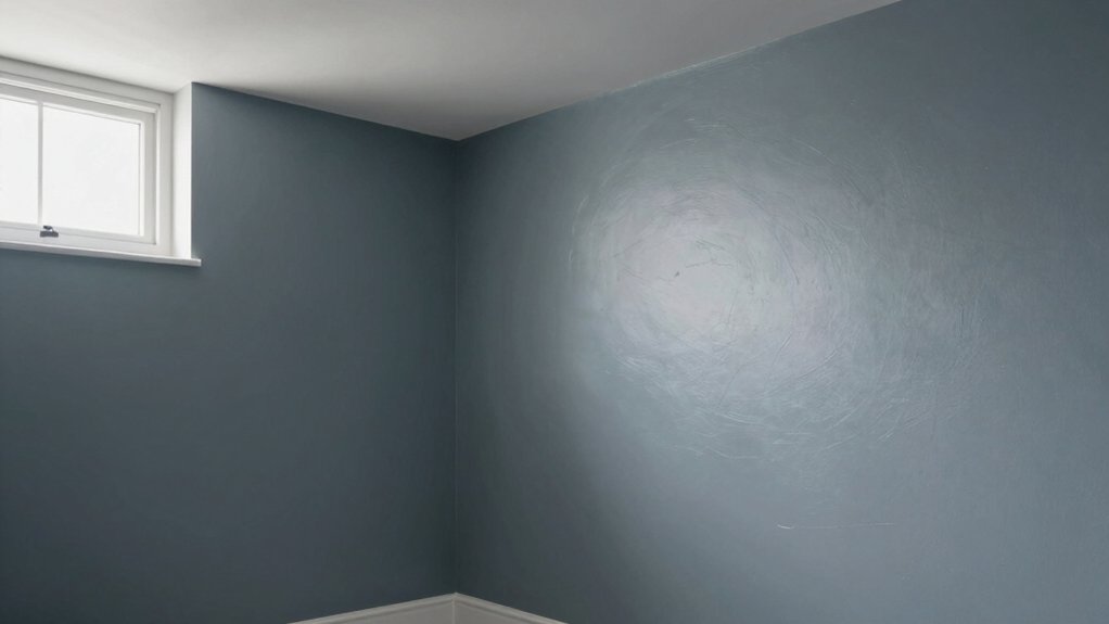
Warm and Cozy: Soothing Neutrals That Read as Light
If you want warmth without sacrificing light, soothing neutrals that read as light offer the best of both worlds. You’ll choose soft beiges, warm whites, and off-tones that bounce scarce daylight without washing out depth.
Apply these neutrals on walls with a satin or eggshell finish to reflect more light and keep surfaces easy to clean.
Create contrast with dark corner accents in furniture or architectural niches to anchor the space and prevent it from feeling flat.
Introduce bold color accents through throw pillows, art, or a single statement chair to add personality without overpowering the room.
Keep trims crisp and consistent, and let natural textures—wood, linen, and woven fabrics—enhance the cozy, breathable atmosphere.
Crisp and Modern: Pale Grays and Whites for Clarity
Pale grays and whites sharpen a basement’s silhouette, making corners feel intentional and spaces feel larger. You’ll notice how cooler tones reflect whatever light exists, boosting perceived brightness without glare.
Start with a crisp grayscale pair to map your contrast, then fine-tune with texture and accents for depth.
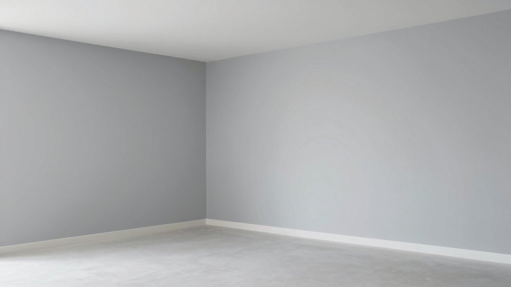
Pale Gray Clarity
Pale gray tones offer a crisp, modern backbone for a basement with no natural light, brightening the space without feeling sterile. You’ll notice pale gray walls reflect artificial light more efficiently than deeper hues, creating a sense of airiness without washing out features.
Choose cool, neutral undertones to prevent a damp or dreary effect, and pair with white trim for definition. The effect hinges on color psychology: grays with slight blue or green undertones can feel calm and expansive, while warmer grays add coziness without heaviness.
For longevity, prioritize paint durability in high-traffic areas; look for a model with stain resistance and mildew resistance suitable for basements. Apply a satin or eggshell finish for easy cleaning and a subtle, modern sheen.
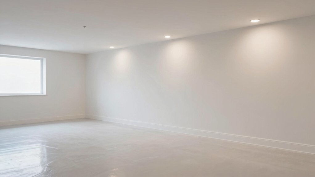
White Brightness Effect
White comes alive in a basement with no natural light, turning corners and textures into visual cues rather than shadows. You’ll achieve the White Brightness Effect by selecting pale whites with subtle warmth and avoiding stark, flat tones. Use a consistent white base on walls to maximize reflection, then treat the ceiling color as a deliberate, slightly lighter or complementary note to prevent a boxed-in feel.
Emphasize crisp edges and minimal contrast to keep surfaces reading clean and forward. Choose furniture choices that reinforce luminance: light woods, glass, and metal accents that don’t absorb light. Add color through textiles and art sparingly, maintaining a cohesive, bright ambience.
Balance brightness with texture, avoiding busy patterns that fragment the space.
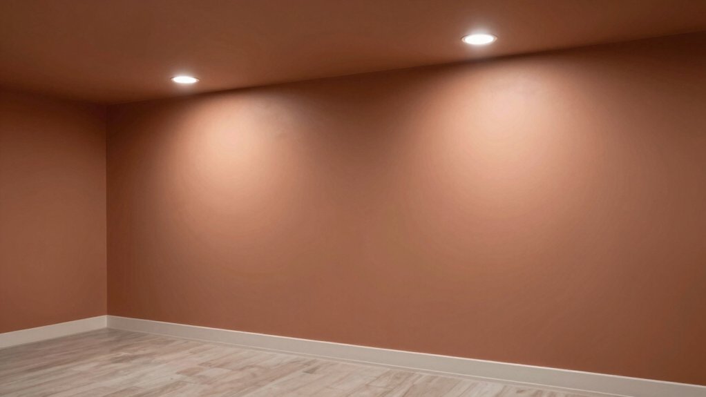
Strategic Accent Colors to Lift Dim Spaces
Strategic accent colors can dramatically lift a dim basement, guiding the eye toward focal points and creating the illusion of depth. You use contrast thoughtfully: a lighter base wall with bold, purposeful accents pull attention upward and around the room.
Choose one or two decorative accents to anchor the palette—throw pillows, art, or a rug—so color psychology nudges mood without shouting. Opt for saturated neutrals or jewel tones on trim, fixtures, or a single feature wall to add warmth and dimension.
Keep most surfaces neutral to preserve light reflectance. Test samples in the space at different times of day, noting how natural and artificial light interact. This approach yields a cohesive, refined space that feels larger and more inviting.
The Right Sheen: Matte Vs Satin in Low-Light Areas
Choosing the right sheen matters more in a basement with little natural light. In low-light spaces, matte and satin finishes each offer distinct benefits, so you can choose with confidence.
Matte conceals tiny imperfections and minimizes glare, creating a soft, intimate feel that complements muted palettes. Satin, while slightly reflective, adds subtle depth without overwhelming dim rooms, enhancing perceived brightness and durability in high-traffic areas.
When deciding, weigh your priorities: if you want a quiet, refined look, lean matte; if you crave a touch more luminance and easier washability, opt for satin.
Consider your furniture and flooring, too. For most basements, a mid-range satin provides a practical balance of aesthetics and paint sheen options.
Compare sheen durability comparison to ensure long-term satisfaction.
Testing Color in a No-Window Basement
Testing color in a no-window basement is about seeing how hues read in artificial light, not in daylight. You should test swatches on multiple walls at different times with the actual lighting you’ll use, including overhead fixtures and lamps.
Place large samples where furniture will sit and note how they shift under warm and cool bulbs. Document color readings with a simple grid: name, angle, surface, and lighting condition.
Consider basement ventilation; poor airflow can exaggerate yellowing or damp-mold odors that color perception can’t hide. Use samples on both matte and satin finishes to judge texture interaction.
For moisture prevention, let tests dry fully and inspect for halos or staining after 24 hours. Close windows, run a fan, and compare notes to confirm a true, stable finish.
Lighting and Color: Maximizing Impact With Fixtures
When you illuminate a basement with no natural light, the right fixtures don’t just brighten space—they sharpen color, texture, and mood. You’ll optimize ambience by layering light: ceiling ambient lighting for even tone, task lamps at desk nooks, and accent spots to draw attention to architectural details.
Choose fixtures with neutral, high-CRI bulbs to render hues accurately. Fixture placement matters: place cans or panels along the perimeter to minimize shadows, and use floor or table lamps to fill any dark corners without glare. Avoid overlighting; balance intensity to preserve depth.
Dimmer controls give you flexibility for different tasks and moods. Prioritize practical, low-glare options that maintain consistency, ensuring color appears true across walls, floors, and furnishings.
Wall Treatments and Color Tricks for Airiness
Even with no natural light, choosing wall treatments and color tricks that feel airy starts with light-reflective surfaces and simple textures. You’ll maximize brightness by selecting matte paints in pale tones, then pair them with glossy accents on trim to bounce a hint of light around the room.
Use wall texture sparingly: a subtle, smooth finish keeps walls visually expansive, while avoiding heavy patterns that close in a space. Ceiling treatments matter: paint ceilings a lighter shade than walls, or install shallow beadboard to add height without weight.
Consider reflective paneling or mirrors placed across from light sources to amplify glow. Keep furnishings streamlined and edges clean, so the eye travels uninterrupted, maintaining airiness throughout your basement.
Practical Palette Examples for Different Basement Moods
If you want basement moods that feel cohesive, start with practical palettes tailored to lighting, function, and vibe. You’ll craft distinct looks by pairing color psychology insights with real-world paint choices.
For a calm, study-friendly basement, choose cool neutrals with a touch of desaturated blue for depth, and apply matte walls with a satin trim to reduce glare.
In a cozy, intimate space, lean into warm taupes and muted greens, using higher-contrast accents to create visual anchors; use strategic lighting to avoid heaviness.
A bright, energetic nook benefits from pale, reflective tones and a pop of saturated color in small surfaces.
Master paint application techniques: cut-in precisely, roll evenly, and seal with appropriate primer.
Frequently Asked Questions
Can I Use Black or Deep Colors in a No-Window Basement?
Yes, you can use dark hues in a no-window basement. In practice, you’ll balance with bright ceilings and mirrors for ceiling illusions, use saturated walls sparingly, and pair with ample lighting to keep the space feeling open and cohesive.
Do Color Choices Affect Mold Risk in Basements?
Yes, color choices don’t change mold risk; ventilation strategies and moisture resistant paints matter. You should improve airflow, dehumidify, and seal surfaces, then broadcast moisture management strategies, choosing moisture resistant paints that modernize aesthetics while protecting walls.
How Do Humidity Levels Influence Paint Longevity?
Humidity levels influence paint longevity: when you manage moisture effectively, you preserve paint durability. You’ll notice fewer bubbles and cracking, thanks to consistent moisture control, proper primers, and breathable topcoats that support lasting beauty and performance.
Are There Specific Primers for Basement Ceilings?
There are primer options, and yes, for basement ceilings you should prep first. You prep, you seal, you choose. Suspense aside, your ceiling deserves durable primer options, meticulous ceiling preparation, and a precise, aesthetic coating for lasting finish.
Can Color Impact Perceived Ceiling Height Without Windows?
Yes, color can affect perceived ceiling height even without windows. Choose lighter, cooler tones and consider strategic lighting effects; lighter colors feel higher. Understanding color psychology helps you select hues that visually expand space and brighten atmospherics.