
Light neutrals and cool T tones bounce daylight, widening sightlines and making walls recede. Use soft whites across walls, ceilings, and trim for seamless flow, with slightly warmer undertones to keep it inviting. Pair these with restrained contrast—cool grays on secondary planes or a single bold accent wall—to add depth without shrinking the space. Add metallic touches for sparkle and airiness. If you keep the palette sparse and purposeful, you’ll maximize openness—and there’s more to explore if you keep going.
Light Neutral Foundations That Expand Space
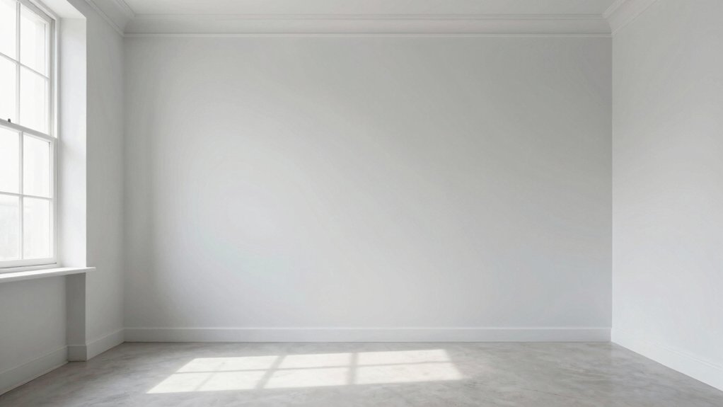
Light neutrals form the foundation for a room that feels open and expansive. You choose soft whites, beiges, or greige tones to bounce light and keep sightlines clear. With a neutral base, architectural details emerge without competition, and furniture reads cleaner.
You’ll notice depth from subtle texture and matte finishes that reduce glare while preserving brightness. Dark accent walls provide dramatic contrast, drawing eye to focal points without shrinking the space.
When you add bold color contrasts, you define zones—without crowding them. Keep ceilings lighter than walls to pull the eye upward; use light flooring to extend the floor plane.
You bond utility with elegance, achieving a room that feels larger through restrained palettes and purposeful contrasts.
Cool T Tonos That Reflect Light
Cool T tones that reflect light maximize brightness without overwhelming the space. You’ll feel the room open up as cooler undertones bounce daylight across walls, keeping ceilings visually high. Choose teal, turquoise, or icy blue-greens to create a crisp, modern vibe that reads spacious rather than heavy.
For depth, pair these tones with bold accent walls in complementary hues, sparingly applied to focal points without overpowering the overall palette. Introduce metallic finishes through hardware, lighting, or decor to add reflective interest and a sense of airiness.
In small rooms, avoid excessive saturation; instead, leverage restrained contrast and clean lines. Use these cool T tones to maintain clarity, reduce visual clutter, and enhance perceived size while still feeling inviting.
Soft White and Its Variants for Seamless Flow
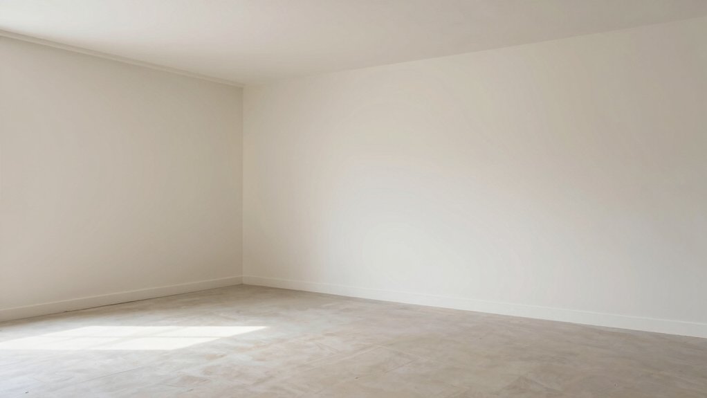
Soft white and its variants create seamless flow by unifying walls, ceilings, and trim without drawing attention to individual surfaces. You’ll notice a cohesive backdrop that makes rooms read bigger and more open.
Opt for warm-tinted whites with subtle undertones to avoid stark contrast while preserving brightness. In practice, choose soft whites that lean toward creamy or ivory, not pure bone or stark white, so light remains gentle and inviting.
This approach works well with shades of beige and pastel color schemes, keeping color movement restrained and elegant. Use the same white on walls and ceiling, with trim in a slightly lighter or matching shade to preserve continuity.
Across furniture and textiles, maintain restrained color pops to prevent visual clutter and preserve airiness.
Subtle Contrast: Whites With Cool Grays
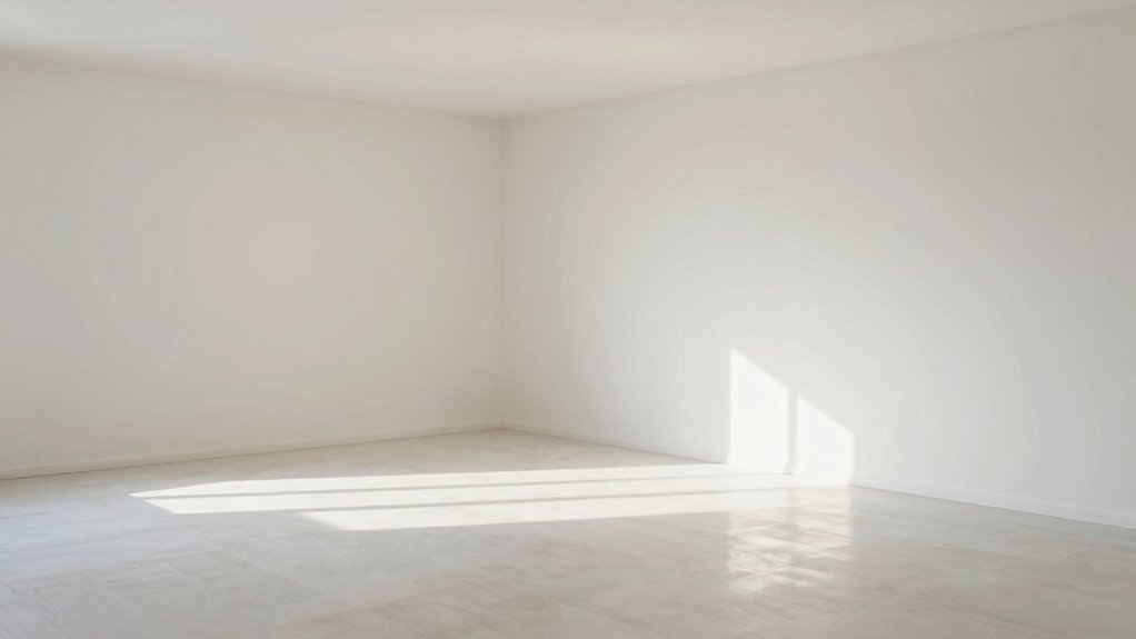
When you pair whites with cool grays, you preserve brightness while adding depth and definition, preventing a flat look. Subtle contrast leverages cool gray undertones to sculpt edges and create perceived space without heavy color statements.
Use whites as the largest surface area, then introduce the gray in secondary planes for balance. An accent wall in a slightly deeper cool gray draws the eye inward, adding dimension without shrinking the room.
Ceiling paint in a crisp white maintains height, reflecting light downward and keeping the ceiling feeling open. Choose matte or eggshell finishes on walls to minimize glare while preserving smoothness.
Pair with bright textiles and reflective hardware to enhance the sense of airiness. Subtle contrast delivers clarity, cohesion, and an expansive feel.
Strategic Accent Colors to Breathe Depth
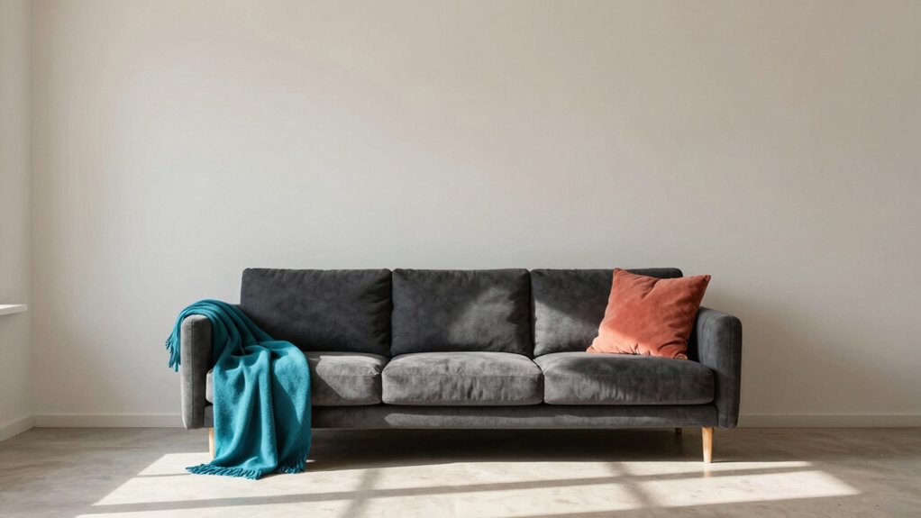
Strategic accent colors can breathe depth into a room by drawing the eye to architectural details and creating pockets of visual interest without overpowering the space. You guide attention with intentional contrasts, not loud chaos, so the room reads larger and more cohesive.
Use bold accent walls sparingly, selecting a shade that echoes or complements the dominant palette to emphasize depth rather than shout. A single bold wall can anchor furniture groups and reveal architectural nuance, like moulding or alcoves, without crowding the room.
Consider statement ceiling paints to add vertical intrigue and surprise from above, enriching perception without shrinking floor area. Keep transitions smooth with complementary neutrals on surrounding surfaces, ensuring depth accents enhance, not compete with, overall brightness.
Practical Tips for Perceived Space Through Paint Choices
Moving from depth-focused accents to practical paint choices, you can shape perceived space with straightforward tactics. First, select light, cool neutrals to reflect more light and elongate walls. Use matte or satin finishes to minimize glare while keeping walls visually clean.
Apply decorative wall techniques sparingly—run a single thin border or a subtle two-tone at the ceiling line to add height without crowding the room. For color blocks, keep contrast minimal between wall and ceiling to avoid chopping the space.
Pair paint with furniture placement strategies: float sofas away from walls, use slim-legged pieces, and keep surfaces clear to enhance flow. Finally, test samples on multiple walls at different times of day to confirm consistent perceived size.
Frequently Asked Questions
How Does Ceiling Color Affect Room Perceived Height?
Ceiling height feels taller when you light the ceiling with a brighter color than walls, creating color contrast. You’ll notice added vertical emphasis, as lighter ceilings draw your eye upward and expand the room’s perceived height.
Do Matte vs. Satin Finishes Change Perceived Space?
Matte finishes absorb light and can make a space feel cozier, while satin finishes reflect more light for a brighter, larger feel; choose matte for walls and satin for accents to maximize perceived space.
Can Wall Color Influence Room Acoustics or Sound Perception?
Did you know that acoustic panels can reduce echo by up to 60%? You can influence sound perception with wall color choices by focusing on sound absorption and reducing noise reflection, enhancing clarity without sacrificing style.
What Lighting Tones Maximize Paint Expansion Illusion?
Lighting tones that maximize expansion use lighting contrast and cool color temperature. You’ll perceive more space when you pair bright, neutral walls with higher-contrast accents, keeping shadows minimal and moments of depth emphasized by cool, balanced illumination.
Do Window Treatments Impact Color’s Perceived Size Effect?
Window treatments do influence perceived size; choose slim profiles and light colors to minimize obstructions. You’ll notice window reflection boosts brightness, enhancing color psychology effects and making spaces feel more expansive and open.