
Soft creams and warm taupes are your best friends with beige tile. You’ll get a calm, airy vibe by leaning into creamy whites, pale greige, and soft yellows that bounce light without washing out textures. Add depth with charcoal or smoky taupe accents, and keep ceilings and trim crisp. Introduce natural woods, woven textures, and brushed brass for warmth. Want smoother guidance tailored to your space? There’s more to explore beyond this.
Soft Creams for a Warm, Monochrome Look
Soft creams create a warm, monochrome canvas that makes beige tile feel serene rather than flat. You’ll notice how subtle, creamy hues reflect natural light, keeping spaces calm while still feeling current.
Choose shades with yellow or pink undertones to preserve depth without contrast chaos. Your goal is a unified field: the wall and tile read as one soft surface, so keep trim and ceilings lighter for lift.
If artificial lighting dominates, opt for bulbs with a gentle warmth to avoid muddy tones. Wall texture matters too—delicate plaster, fine stucco, or a whisper of grain adds tactility without breaking the monochrome flow.
Test samples in situ, compare at different times of day, and confirm that the mood remains cohesive, not flat.
Warm Taupe Complements for Cozy Living Areas
Warm taupe acts as a soft backbone, guiding your space with cozy warmth and subtle depth.
Pair it with cozy accents and textiles to create inviting contrasts that feel both current and timeless.
Think of warm taupe as the quiet stage that lets your focal pieces shine.
Warm Taupe Pairings
Because warm taupe walls invite natural light to bounce, you can pair them with charcoal accents and creamy whites to create a cozy, layered living area that still feels modern. You’ll notice how the palette reads as approachable yet sophisticated, with depth added by wood textures and matte finishes.
To keep beige tile maintenance simple, choose grout and sealants that resist staining, then lean into a restrained accessory sweep to avoid visual clutter.
Regarding color psychology, warm taupe anchors calm energy while allowing accent colors to pop without shouting. For contrast, experiment with rusted metals or deep olives, but keep the core tone soft. This approach ensures a timeless, versatile foundation for evolving decor trends.
Cozy Living Accents
When you lean into cozy living accents, warm taupe walls act as a soft canvas that makes charcoal silhouettes and creamy whites feel inviting rather than heavy. You’ll lean on texture: woven throws, boucle cushions, and matte ceramic lamps to deepen the warm mood without clutter.
Accent wall ideas pair a charcoal panel or smoky taupe behind a seating cluster to anchor the room and guide traffic flow. For furniture color coordination, choose pieces in dark wood, toasted oak, or espresso accents that echo the walls without competing with beige tile.
Add metallic accents in brushed brass or antique bronze to lift the palette. Keep surfaces lean and purposeful to preserve that intimate, inviting vibe.
Subtle Contrast Tones
Subtle contrast tones pull warmth forward without stealing the spotlight, making warm taupe complements ideal for cozy living areas.
You’ll notice how gentle shifts in shade add depth without competing with beige tile, creating an inviting, balanced palette. Choose warm taupe base coats that lean buttery rather than muddy, then layer in slightly darker or lighter accents for dimension.
Accent wall ideas can anchor the room, using a richer taupe or smoky gray to frame seating and artwork. Textured paint finishes, like subtle stipple or brushed-on textures, catch light softly, enhancing tactile interest without shouting.
Keep trim and ceilings crisp to preserve contrast clarity, and test samples in natural light to confirm the cohesive mood you’re after.
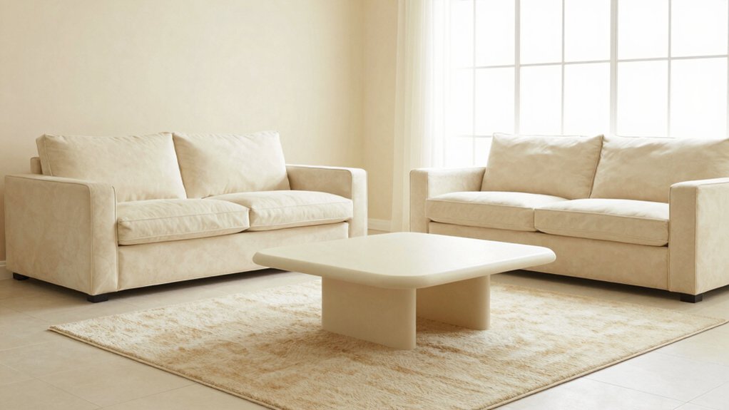
Crisp Neutrals for Bright, Airy Vibes
Brighten your beige-tiled space with crisp neutrals that feel clean and modern. Pair airy off-whites with pale greige tones to keep the room luminous without washing out architectural details.
You’ll notice the quiet confidence of these neutrals when you mix in subtle textures and natural light.
Brightening Neutrals
To brighten beige tile without washing out warmth, opt for crisp neutrals that reflect light and keep spaces feeling open. You’ll lean into bright, but not brilliant, whites and soft taupes that read clean on walls while preserving depth in textiles and wood.
Think satin or eggshell finishes to minimize glare, and aim for subtle undertones—warm peach, cool stone, or greige—so every piece harmonizes. Prioritize color palette coordination across walls, ceilings, and trim, then layer with natural textures to enhance airiness.
When selecting furniture, pursue furniture style integration that feels cohesive rather than disjointed; choose streamlined silhouettes and lighter veneers. Balance with metallic accents or glass to amplify brightness without sacrificing warmth and personality.
Airy Color Pairings
Pair airy neutrals with crisp accents to keep beige tile feeling light yet anchored. You want spaces that breathe, so choose pale neutrals like warm whites or soft greige as your base.
Add in crisp accents—think graphite, charcoal, or Navy—for contrast that stays refined, not shouty. This is where decorative wall art becomes a moment of focus: opt streamlined frames and minimal imagery to preserve luminosity.
Keep furniture color coordination intentional: lighter wood tones, brushed metals, and restrained upholstery maintain the airy vibe without clutter. Introduce texture through woven fabrics and matte finishes to add depth.
Let daylight cycle through your palette, reinforcing a clean, modern mood. The result is a serene, versatile living room ready for daily use and subtle changes.
Subtle Blues to Add Calm and Depth
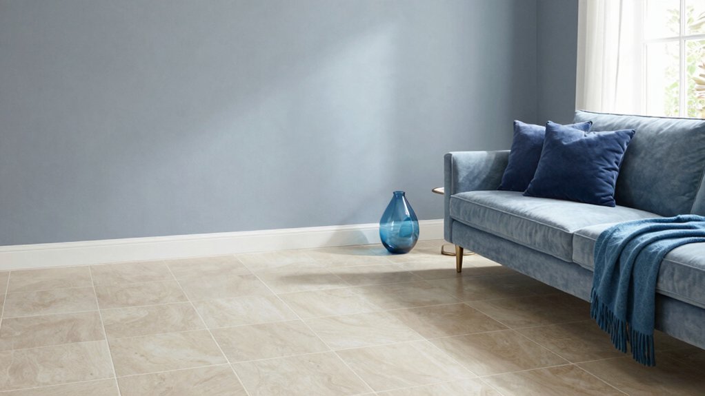
Subtle blues can transform beige tile into a serene backdrop, lending depth without overpowering the room. You’ll notice how soft navy, powder, and slate tones recede the tile’s warmth while keeping space feeling open.
Choose cool blues as wall color or on built-ins to create a calm anchor for accent furniture. Pair with crisp whites for contrast that reads sophisticated rather than stark.
Decorative accents in muted blues—ceramic vases, textiles, or art—pull the palette together without shouting. For depth, layer different blues in varying sheens: matte walls, satin trim, and a glossed coffee table.
Lighting techniques matter: balance ambient and task lighting so the blue reads consistently, not muddy. This approach maintains a tranquil mood while highlighting architectural features.
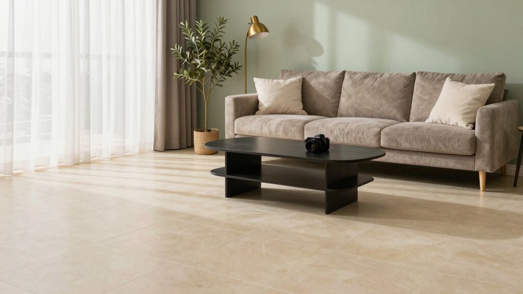
Sage Greens for a Fresh, Natural Feel
Sage greens bring an invigorating, natural feel to beige tile rooms, turning the space into a verdant retreat without overpowering the warmth. You’ll find these hues pair cleanly with warm undertones, avoiding muddy contrast while maintaining depth.
For walls, choose soft sage or misty green-gray tones to keep ceilings feeling airy and large. In decor, lean into botanical accents, linen textures, and muted woods to reinforce the natural vibe without shouting color.
When you decorate with beige, balance is key: use sage as an accent on artwork, cushions, and a single statement chair rather than throughout the room.
Beige tile maintenance stays simple with regular dusting and a light sealant on grout. This approach sustains harmony while revitalizing the palette.
Greige: Balancing Beige With Modern Neutrality
Greige creates a calm, contemporary counterpoint to beige tile, marrying warmth with clean, modern neutrality. You’ll notice the balance between soft warmth and cool sophistication when you choose greige as a base.
This hue adapts to varying light, so you won’t fight glare or shadow—you simply refine the mood.
For beige tile maintenance, lean on matte finishes and simple, wipeable surfaces to preserve the subtle depth greige offers.
When selecting greige furniture choices, prioritize low-contrast textures and natural materials to keep the palette cohesive and timeless.
Avoid overwhelming the room with busy patterns; opt for clean lines and restrained accents that let the tile’s warmth breathe.
In essence, you create a polished, versatile canvas for evolving decor moments.
Light Greys for Contemporary Contrast
Light greys deliver contemporary contrast against beige tile without stealing the show. You’ll notice how these cool neutrals recede while your beige foundation stays warm, creating a balanced, modern vibe.
Pick mid-tone greys—not too blue, not too warm—to preserve depth without overpowering architectural details. In your space, decorative wall patterns can pop against a clean field, adding texture without competing with furniture.
Consider matte finishes for walls to minimize glare and emphasize subtle shifts in tone. For the ceiling, ceiling paint choices matter: a soft, lighter grey or a whisper of white can lift the room and visually expand it.
Pair with crisp trim to frame lines, keeping the palette cohesive and intentionally contemporary.
Muted Terracotta Accents With Beige
Muted terracotta accents bring warmth to beige tile without overpowering the space, creating a cozy, sun-washed vibe. You’ll notice how small doses of terracotta—thrown into cushions, throws, or a single ceramic piece—ground your palette without shouting.
Pair muted terracotta with beige accents to maintain cohesion while introducing depth and character. In walls or large textiles, keep tones soft and desaturated so the effect stays sophisticated, not rustic.
Add contrast with a cooler undertone, like a pale fog or stone gray, to keep balance. You’ll find the look readies itself for modern furnishings and natural materials, preserving openness.
This approach celebrates warmth, texture, and quiet confidence—muted terracotta serving as a refined accent rather than a focal statement.
Pale Yellows for Sunny, Inviting Spaces
So, you’re choosing pale yellows to warm up beige tile without overpowering the room. These sunny hues bring inviting warmth and a breathable, modern feel that plays well with natural light.
Let’s explore how subtle yellows—from butter to pale citrus—set the mood for a bright, cohesive living space.
Sunny Yellow Hues
Sunny yellow hues bring a glow that instantly lifts beige tile spaces, turning cool tiles into warm, inviting surfaces you’ll actually want to linger on. You’ll notice pale yellows feel fresh without overpowering, so you can layer texture and art without shouting.
Use soft, sunny tones as an accent wall or ceiling wash to bounce light across the room. Pair with crisp whites and natural woods to keep the look grounded, not sugary.
When you’re decorating with beige, choose yellow hues with a muted undertone to avoid muddy results.
For maintenance, keep surfaces dusted and wash away grime regularly to maintain the buoyant glow. This approach supports beige tile maintenance while preserving visual harmony and modern appeal.
Inviting Warmth Palette
Inviting Warmth Palette: pale yellows that brighten beige tile without overpowering it invite soft, sunlit rooms to feel cozy and refined. You’ll notice how these pale tones lift ceilings and illuminate corners without shouting for attention.
Pair the yellows with decorative trim to add subtle definition around doors, mantels, and built-ins, creating architectural detail that stays quiet yet stylish. For furniture, choose accent pieces in warm woods or muted whites to maintain balance; think a buttercup ottoman or pale honey chairs that don’t compete with the tile.
Keep walls light but not stark, and let natural light do the heavy lifting. This palette supports cozy conversation zones and elegant, timeless appeal.
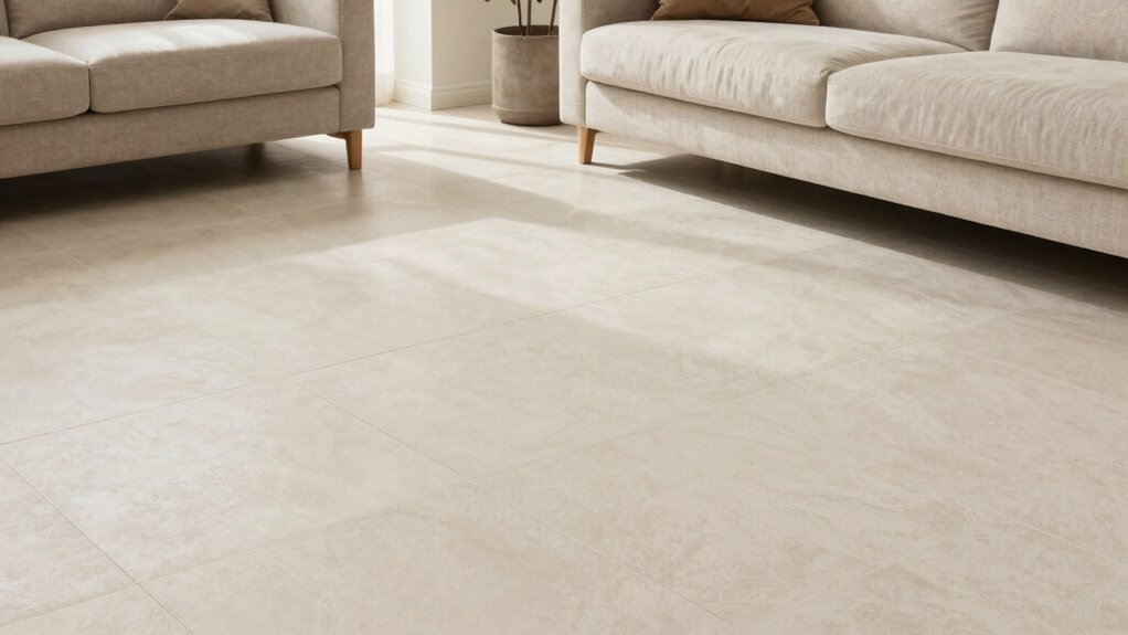
Whites With Warm Undertones to Illuminate the Room
Soft whites with warm undertones brighten beige tile floors without feeling stark, lending a cozy, cohesive backdrop for furniture and art. You’ll notice how subtle cream and eggshell variants reflect natural light, enhancing space without overpowering it.
Choose warm whites with slight yellow, peach, or apricot hints to keep tones inviting rather than clinical. In practice, test samples at different times of day to confirm consistency across walls and ceilings.
Pair these shades with decorative accents that pick up their warmth—wooden frames, woven textures, and brushed brass hardware unify the palette. When planning furniture choices, favor clean silhouettes in softer whites or warm neutrals to maintain airiness.
Finish with texture—linen, velvet, or boucle—to preserve depth while preserving the glow.
Frequently Asked Questions
How Does Lighting Affect Beige Tile Color Choices?
Lighting shifts beige tile color options; it can warm, cool, or mute tones. It also affects perceived texture and maintenance needs, including beige tile maintenance. Consider natural light, add-ons, and texture contrasts to highlight beige tile texture.
Can Beige Tile Influence Wall Color Perception?
Beige tile can influence wall color perception by reflecting warm undertones onto your walls. You’ll notice shifts with beige tile textures and texture-heavy finishes, while beige tile maintenance matters for keeping color accuracy as lighting changes.
Which Undertones in Beige Tile Should Guide Paint Picks?
You should gauge undertones first: warm beige with yellowing casts invites creamy neutrals, cool beige with gray nicks guides toward soft greens or blues. Favor beige tile contrast for depth, and use beige tile accent colors sparingly.
Are Warm Whites Better With Beige Tile Than Cool Whites?
Warm whites work better with beige tile, yes—choose creamy, confident tones. You’ll notice warmer whites harmonize beautifully, and you’ll simplify beige tile cleaning and beige tile maintenance with softer, seamless, stylish spaces that feel balanced and bright.
How Do Ceiling Tones Interact With Beige Tile Walls?
Ceiling tones can shift space: higher ceilings feel grander with light, airy shades; darker ceilings make walls pop, but balance is key. Ceiling height effects, ceiling design impact—your beige tiles glow when you harmonize hue, texture, and proportion.