
With beige tile, you’ll want warm creams, taupes, and airy grays as your foundation, then layer in greige or soft warm grays for depth. Keep accents subtle yet intentional to let light flow and textures stay calm. Use creamy whites to brighten without washing out texture, and add soft blues or sage for a soothing pull. For contrast, introduce rich charcoal or espresso sparingly. Curious how to tie every finish together? You’ll find it all ahead.
Understanding Undertones in Beige Tile
Undertones are the subtle color hints that gray, tan, or cream tiles show beyond their surface beige. You’ll identify them by sweeping light across a room and watching how the hue shifts, brightens, or cools.
Beige tile patterns reveal warmth when under incandescent glare and lean toward gray or pink under cool daylight. Your plan starts with a quick audit: note tiles that look yellow, pink, or green in multiple spots, then confirm with a test swatch in the room corner.
With this clarity, you’ll choose paint sheen options that enhance the undertone without washing it out. Pair the right sheen with your tiles to preserve texture, and align these choices with practical goals: durability, washability, and a cohesive, visionary mood.
Soft Neutral Palettes That Whisper With Beige
Soft neutral palettes whisper with beige by leaning into warm creams, taupes, and airy grays that harmonize without competing with the tile. You design spaces that feel calm and coordinated, not loud or busy. Choose tones that reflect natural light, so rooms stay bright without glare.
In practice, you solidify cohesion with dining room furniture that echoes creamy or taupe hues, creating a unified rhythm across the living area. For window treatment options, aim for fabrics that skim restraint: sheer textures to soften sunlight or light linings that preserve privacy while maintaining airiness.
Keep contrast subtle—avoid stark white against beige—and let texture do the talking: woven blinds, linen drapes, and brushed finishes bring depth. This approach yields timeless serenity with practical, forward-looking harmony.
Warm Gray and Greige Combinations for Depth
Warm gray and greige add real depth to beige tile without shouting. You’ll see texture and nuance emerge as you pair mid-tones with warm undertones, avoiding cold, flat walls.
Start with a greige base on main walls, then layer in warm grays for depth where light hits most, like entryways and around windows.
In rooms, balance with furniture finishes that pick up the same warmth—wood grains, brushed metals, and soft leather. Decorative accessories in slightly deeper or lighter shades create visual moves without creating mischief.
Use about two to three shades maximum to maintain cohesion; restraint keeps the palette sophisticated. Choose matte or satin finishes to minimize glare, so depth remains tactile.
This approach yields calm, practical spaces that feel expansive and curated.
Creamy Whites to Brighten the Space
Creamy whites can brighten beige tile without washing out texture, giving your space a soft, inviting glow. You’ll notice depth remains in the grout and edges, so the room feels polished rather than sterile.
Choose warm, creamy whites with subtle undertones that enhance natural light, avoiding stark brightness that can wash out architectural details. In practice, test swatches on multiple walls at different times of day, then commit to two or three that harmonize with your beige tile.
For beige tile maintenance, keep surfaces dust-free and use gentle cleaners to preserve the warmth of the off-whites.
When planning furniture pairing, favor pieces with soft textures and clean lines to maintain balance between color and form. This approach yields a timeless, bright, functional living space.
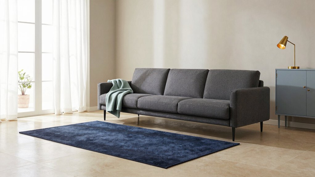
Subtle Blues and Sage Accents for Calm
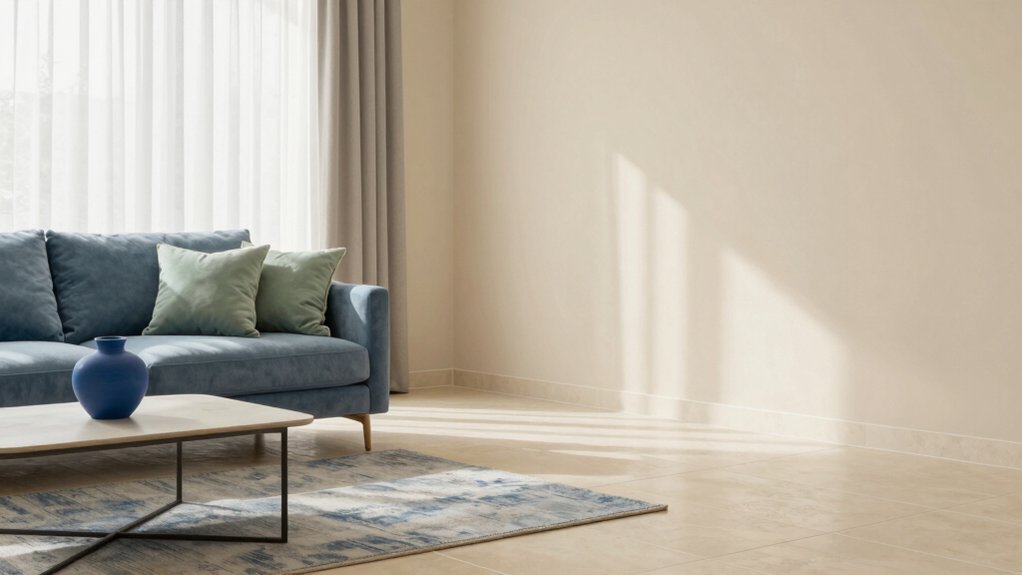
Subtle blues and sage accents can cultivate a calm, cohesive aura that complements beige tile without competing with its warmth. You’ll create balance by layering soft blues with muted greens, letting texture and light lead the mood.
Lean into beige tile textures for depth—slight variation in plaster, linen, or matte glaze reads as natural, not flat. Choose a restrained palette: slate, powder, and sage, with airy whites for contrast.
When applying paint, apply in thin, even coats using paint application techniques that preserve texture and avoid pooling. Use dedicated accent walls sparingly and pair with textiles that echo the same cool-toned spectrum.
This approach yields a tranquil base ready for future shifts without sacrificing sophistication or warmth.
Rich Charcoal and Espresso for Contrast
Rich charcoal and espresso provide bold contrast against beige tile, creating a grounded, modern living room that still feels warm. You’ll notice how deep tones anchor the space, while lighter surfaces bounce daylight, keeping things from feeling weighty.
Use charcoal on feature walls to define zones without heavy dividers, and sprinkle espresso on cabinetry or fixtures to add rich depth. Pair with crisp white trims to sharpen edges and enhance clarity.
Consider wall textures—a matte charcoal with a subtle plaster or brick reveal adds tactile interest without shouting. Lighting effects matter: layered lighting—ambient, task, and accent—highlights the contrast tastefully, avoiding glare.
Balance sheen with matte surfaces so reflections stay soft and inviting, not stark.
Earthy Terracotta and Sand Hues for Warmth
Earthy terracotta and sand hues bring instant warmth to beige tile without overwhelming the room. Layered correctly, they create a welcoming, sun-kissed backdrop you’ll want to live in.
You’ll want practical pairings that preserve beige tile durability while feeling intentional. Use terracotta as an anchoring accent on a single feature wall or in textiles, while sand tones roll softly across larger expanses to maintain breathability.
For furniture, choose woods with warm undertones and matte finishes to minimize glare and elevate texture. Consider lighting that emphasizes natural warmth, not harsh yellow.
Keep surfaces easy to clean for beige tile maintenance, focusing on grout-less or sealed textures. The goal is a timeless, cohesive warmth that remains modern and durable over time.
Accent Colors and Finishes to Tie the Room Together
You’ll start by balancing accent hues with the room’s warm beige base to create a cohesive feel.
Choose finishes that echo each other—matte walls, subtle sheen on furniture, and a touch of metallics—to knit the space together without shouting.
Use a tie-color palette that anchors focal points while remaining flexible for future changes.
Accent Hues Balance
To balance accent hues, start with a unifying base that lets pops of color feel intentional rather than incidental. You’ll strengthen balance by choosing a restrained backdrop—think warm neutrals or a soft gray—so bold accents read as deliberate statements.
Use monochrome schemes at the core: vary only lightness and saturation within one family to create depth without chaos. Then introduce color blocking thoughtfully: place larger swaths of the base with small, strategic panels of a complementary hue to carve visual rhythm.
Tie finishes through sheen and texture rather than loud color shifts—matte walls with satin accents keep the room cohesive. In practice, test swatches in natural light and commit to a few calibrated hues for a timeless, purposeful palette.
Finishes for Cohesion
Finishes tie a room together by linking color decisions to texture, light, and mood. You’ll choose finishes that reinforce cohesion without overpowering beige tile.
Start with wall texture: a soft, matte backdrop lets accents glow, while a subtle plaster or linen finish adds depth without noise.
Trim finishes should echo your wall tones for unity or offer a deliberate contrast to highlight architecture. If you favor warmth, pick warm whites or greiges; for modern calm, opt for cool neutrals with low-sheen surfaces.
Consider metallics sparingly on fixtures or hardware to create a cohesive sparkle. Use consistent sheen across major surfaces—walls, trim, and cabinetry—to avoid visual conflict.
A thoughtful mix of texture and finish harmonizes color, light, and mood.
Tie-Color Palette Tips
Accent colors should feel intentional rather than ornamental, so pick two to three hues that echo your beige tile and the wall texture you’ve chosen. In practice, map these tones to your furniture silhouettes and textiles, then test swatches in natural light at different times of day.
Use monochrome schemes to ground the room, layering lighter and darker shades of the same family for depth without clutter. For contrast, reserve bold accent walls for focal points like the fireplace or an architectural niche, and balance them with softer neutrals on adjacent surfaces.
Consider finishes—matte walls with satin trim, or a subtle gloss on cabinetry—to create reflected light without glare. Your vision: calm sophistication that feels cohesive, expressive, and timeless.
Frequently Asked Questions
How Do Lighting Changes Affect Beige Tile Color Perception?
In your space, 60% of color appears true only in natural light, so lighting changes shift beige tile perception. You’ll want a paint sheen that softens glare, and adapt with natural light to feel your vision come alive.
Can Furniture Color Sway Beige-Tiled Room Mood?
Yes, your furniture color options can sway room mood. You influence the vibe by choosing bold contrasts or soft harmonies; let thoughtful textiles, textures, and scale guide the room mood influence toward balanced, practical, and visionary comfort.
Are There Ceiling Color Tips to Pair With Beige Tile?
You’ll want ceiling paint options that brighten without glare, guiding light with soft white or pale gray. You see how ceiling color coordination can feel like a beacon—practical, visionary—awakening space, while you keep harmony with beige tile.
Which Wall Finishes Best Complement Beige Tile?
Accent walls and wall textures best complement beige tile. You’ll design with bold, warm accents, using textured finishes for depth. You’ll balance neutrals with soft, contrasting hues, envisioning a cohesive vibe that stays calm, inviting, and practical.
Do Wood Floor Tones Influence Beige Tile Choices?
Yes, wood floor tones do influence beige tile choices, guiding shade and contrast. You’ll prioritize beige tile maintenance and consider beige tile installation tips to guarantee cohesive harmony across floors, walls, and natural light for a practical, visionary space.