
UK homes are embracing warm terracotta and clay-pink palettes, moody greens with emerald accents, and bright sunlit yellows, all layered with natural textures and matte finishes to feel calm and inviting. You’ll see soft neutrals in living spaces, tactile textiles, and restrained palettes that flow across rooms. Accents stay subtle to avoid overwhelm, while seasonal updates come from textiles, lighting, and small décor swaps. If you want deeper guidance, you’ll uncover how to apply these trends step by step.
How to Choose a Colour Palette for UK Homes This Year
Choosing a colour palette for UK homes this year starts with a clear mood and a practical plan. You identify the vibe you want—calm, energetic, or inviting—and translate it into a choose-and-compare approach.
Colour psychology guides your selections: soft neutrals for serenity, warm tones for sociable spaces, bold accents for personality. Build a cohesive scheme by testing swatches in natural light at different times of day, then map them to each room’s function and flow.
Prioritise paint durability: choose high-quality finishes that resist scuffs and fading, especially in kitchens and hallways.
Create balance with 60/30/10 rules, ensuring dominant tones support contrast-free progression. Document your palette, save trusted combinations, and remember that dependable, purposeful choices foster belonging and long-term satisfaction.
Key Drivers Behind UK Colour Trends This Year
This year’s UK colour trends are driven by a blend of practical living needs and a renewed emphasis on well-being, with biophilic greens, tactile neutrals, and warm earthy tones leading the charge.
You’re guided by everyday functionality—durable surfaces, low-maintenance finishes, and adaptable spaces—while seeking comfort and connection. Color psychology informs choices that soothe or invigorate, helping you create rooms that feel right at home for long stays and quick resets alike.
Cultural influences shape palettes through shared memories, regional crafts, and modern global textures, making trends feel personal rather than imposed. The result is a nimble language of colour you can trust, evolving with you as priorities shift, and inviting everyone to belong in a thoughtfully styled home.
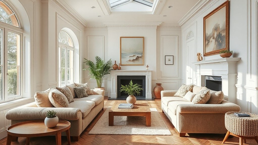
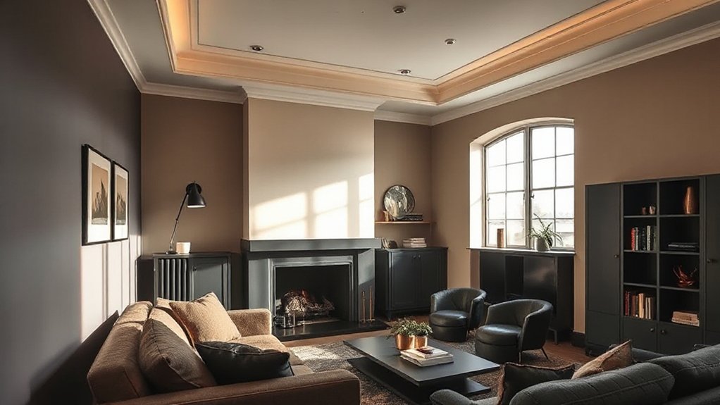
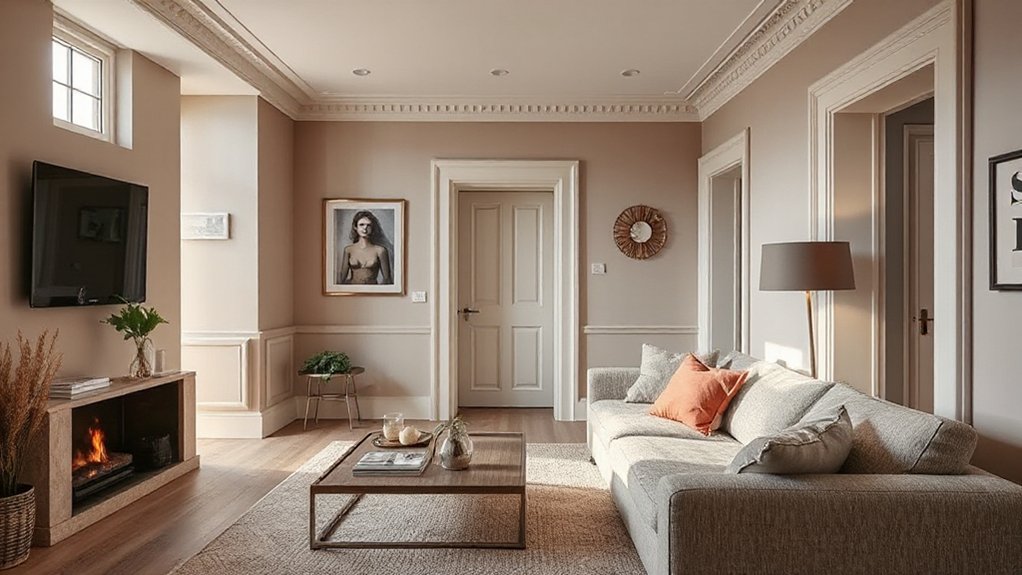
Warm Terracotta and Clay Pink: The Soft European Palette
Warm terracotta and clay pink soften European-inspired schemes into welcoming, versatile spaces. You’ll notice how terracotta accents ground airy rooms while clay pink decor adds warmth without overpowering the light.
This soft European palette works across living rooms, bedrooms, and kitchens, giving a cohesive sense of belonging to your home. Use terracotta accents in furnishings, ceramics, or textured textiles to create subtle, tactile resonance.
Pair them with clay pink decor through rugs, cushions, or art that echoes muted sunset tones, ensuring balance and cohesion. The look stays modern by avoiding heavy contrasts; it relies on tonal harmony and natural materials.
Embrace this palette for approachable elegance that invites comfort, conversation, and everyday confidence in your design decisions.
Moody Greens and Emerald Accents for Living Rooms
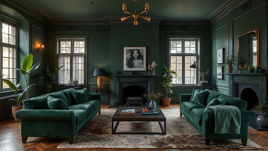
Moody greens set a grounded, sophisticated mood, while emerald accents punch depth and subtle drama in living rooms.
Consider layered greens from sage to forest and pair with brass or charcoal for contrast that stays timeless.
You’ll see this palette flex from calming retreats to bold statement schemes as trends evolve.
Moody Green Palettes
Moody greens bring depth and sophistication to living rooms, pairing deep emeralds with lighter olive tones to create contrast that feels both grounded and fresh. You’ll find palettes that balance saturated walls with warm neutrals, so you don’t sacrifice comfort for drama.
This trend leans on Historical influences and Cultural symbolism, drawing from heritage tones while staying modern and liveable. Expect a quiet richness: matte textures, velvety fabrics, and timber accents that echo nature.
You’ll feel a sense of belonging through curated contrasts that invite conversation, not confrontation. Use emerald highlights as focal points—soothing yet energized—while softer greens and stone undertones create cohesion.
In practice, layer color with lighting and plant life to sustain depth without overwhelm.
Emerald Accent Ideas
Emerald accents bring living rooms to life by pairing bold pops with the softer greens that ground the space. You’ll find emerald elegance in furniture silhouettes, wall tones, and decorative textiles that read as calm yet confident.
Accent versatility lets you switch focal points with ease, preserving cohesion as trends evolve. To implement:
1) Choose a dominant emerald piece as a grounding anchor.
2) Layer textures—velvet, linen, and boucle—to deepen mood without overpower.
3) Introduce contrast with warm woods or metallics for balance.
4) Mix patterns sparingly in cushions and rugs to keep harmony.
Bright Yellows and Sunlit Hues for Kitchen Warmth
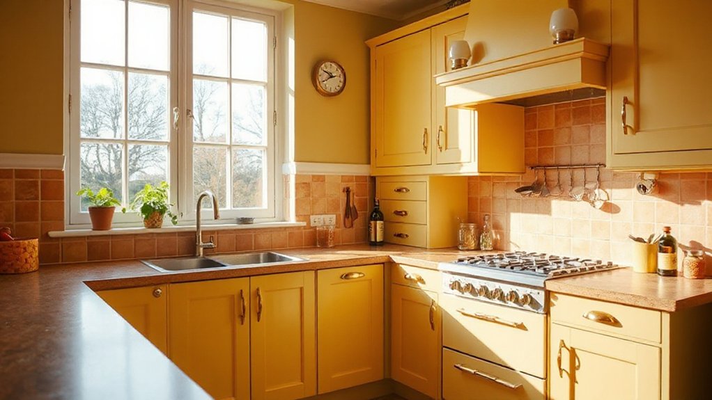
Bright yellows and sunlit hues bring instant warmth to kitchens, redefining daytime spaces as inviting hubs for cooking and socializing. You’ll notice how sunlit hues elevate mood without overpowering functionality, making mornings smoother and gatherings cozier.
Choose warm lemon, saffron, or butter tones for walls or cabinetry to create a cohesive backdrop that reflects natural light. Pair these colors with clean whites or soft neutrals to preserve clarity and avoid visual fatigue.
Accent with metallics or natural textures to add depth and texture, keeping the space feeling premium rather than gimmicky. This approach signals belonging: you’re in a space that radiates energy, supports practical tasks, and welcomes conversation, meal prep, and shared moments—comfort, clarity, and kitchen warmth.
Sunlit hues work best when balanced with thoughtful lighting.
Earthy Neutrals With Rich Textures for Bedrooms
Earthy tones set a calm foundation, while rich fabrics add instant warmth to your bedroom. Layer textures deliberately—think linen, wool, and velvet—to sculpt depth without shouting color.
Prioritize atmosphere: soft lighting, tactile surfaces, and a balanced mix of matte and subtle sheen.
Earthy Tones, Rich Fabrics
Layer earthy neutrals together with rich textures to create bedrooms that feel anchored and inviting. You’ll notice how natural materials shape the room’s warmth, while sustainable choices keep your space responsible. Embrace a curated mix of fabrics and surfaces that read tactile and timeless.
- Choose linens and velvets in oatmeal, taupe, and stone for depth.
- Pair wool throws with a linen headboard to boost texture without heaviness.
- Layer rugs in natural fibers to ground the bed zone.
- Opt for wood finishes and clay ceramics to reinforce earthy warmth.
Texture Layering Techniques
Texture layering in earthy neutrals and rich fabrics starts with a deliberate mix of tactile surfaces you can feel. You’ll blend materials—soft wool, linen, velvet, and sisal—to establish textural contrast across a bedroom’s surfaces.
Use layering techniques to create depth: a neutral headboard, pinned throws, and a woven rug anchor the space while maintaining calm cohesion. Introduce subtle sheen with a satin pillow or lamp shade, ensuring gloss doesn’t overwhelm the matte base.
Balance weight by pairing heavyweight textures with lighter accessories, so the room reads grounded rather than busy. Prioritize authenticity over trendiness; choose textures that invite touch and linger in memory.
This approach reinforces belonging, inviting you to unwind in a thoughtfully composed, serene sanctuary.
Bedroom Atmosphere Essentials
A calming bedroom starts with earthy neutrals paired with rich textures that invite touch and linger in memory. You’ll create depth with natural fibers and matte finishes, while ambient lighting sculpts mood. Focus on balance, not busy patterns, so your space feels intentional and serene.
- Choose Bedroom lighting that softens edges and highlights texture without glare.
- Pair bed linen colors with warm undertones to unify walls, bedding, and textiles.
- Layer textures—from wool throws to linen sheets—for tactile depth you can feel.
- Keep a restrained palette, letting earthy neutrals breathe and guide relaxation.
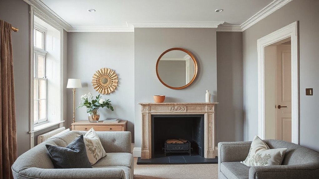
Soft Pastels That Modernize Bathrooms
Soft pastels are redefining contemporary bathrooms by adding warmth without sacrificing cleanliness. You’ll notice how gentle tones—blush pinks, sage, powder blues—create a calming backdrop that still feels fresh.
Embrace pastel palettes to soften rigid fixtures and mirror frames, making daily routines feel more soothing and inclusive. In practice, pair matte whites with muted hues to maintain cleanliness while inviting coziness.
Subtle color blocks on cabinetry or tiles establish visual interest without shouting trend. Accessorize with warm metals and natural textures to enhance bathroom serenity, ensuring spaces read as welcoming rather than clinical.
You don’t need dramatic contrast to make a statement; quiet color shifts offer sophistication, cohesion, and a sense of belonging for every member of your household.
How to Use Dark Colors Without Overwhelming a Room
Dark colors can ground a space without overwhelming it, provided you balance them with light, breathable elements. You’ll create depth without heavy heaviness by pairing dark walls with airy textiles, reflective surfaces, and controlled lighting. Use these practical steps to keep it inviting:
1) Introduce vivid accents through cushions, art, or accessories to prevent a flat look.
2) Anchor rooms with Monochrome schemes on larger surfaces, then lift with lighter upholstery.
3) Vary textures—matt walls with glossy lamps or brushed metals—to add dimension.
4) Limit color concentration by distributing dark tones across focal points, not everywhere.
In this approach, you maintain a confident, inclusive vibe, inviting others to belong in a space that feels curated yet comfortable.
Grounding Bold Color With Natural Materials
Natural textures balance bold hues by anchoring statement colors in materials like wood, stone, and woven fibers. Let a strong color act as the anchor, while the natural materials provide warmth, tactility, and depth.
This approach keeps spaces cohesive, modern, and quietly luxurious.
Natural Textures Balance
Textures ground bold color by pairing them with natural materials. You’ll create calm, cohesive spaces by layering textures that echo the outdoors and anchor vibrant accents.
- You integrate textured fabrics to soften edges and invite tactile comfort.
- You pair natural stone with warm woods to establish organic contrast.
- You balance sheen and matte finishes for visual depth.
- You choose durable textures that age gracefully, reinforcing belonging.
Bold Hue AnchorsMaterial
Bold hue anchors rely on natural materials to ground vivid color and keep spaces from feeling chaotic. You’ll find bold hue anchors when you combine saturated walls or upholstery with earthy textures like timber, stone, linen, or wool. These materials absorb and soften intensity, offering a tactile counterpoint that makes bold hues feel intentional rather rather than loud.
When you introduce colour anchors, choose two or three complementary tones and repeat them through décor elements—art frames, cushions, throws, or rugs—for cohesive rhythm. This approach signals belonging: you’ve crafted a lived-in, welcoming home rather than a showroom.
Prioritise high-quality substrates, matte finishes, and subtle patinas to elevate bold hues while preserving warmth and balance.
The Role of Lighting in Perceiving Colour
Lighting isn’t just about brightness; it shapes how colour reads in a room. You’ll notice that lighting tweaks change mood, warmth, and the way tones feel on walls and textiles.
To master perception, use intentional light angles and colour-accurate sources, aligning with perception psychology insights and your room’s purpose. Here are practical moves:
- Choose a consistent colour temperature to avoid muddy shifts.
- Layer light: ambient, task, and accent for dynamic depth.
- Embrace dimmable LEDs to reveal true hues at different moments.
- Test with small swatches under your main lighting to confirm cohesion.
When you experiment, you create spaces that feel belonging, confident, and on-trend. Lighting illusions aren’t tricks; they’re tools for honest colour storytelling.
Pairing Colour With UK-Loved Textiles and Wood
Wood accents should respect the room’s mood—light woods brighten modern schemes, darker grains ground traditional ones, and mid-tones balance both. In practice, align curtain, upholstery, and rug tones with furniture timber for a unified feel, then introduce a single accent colour through cushions or throws to energise the space.
This approach signals belonging, inviting guests to notice thoughtful detail. Remember: restraint strengthens impact, so test combinations in natural light.
Textile pairing plus subtle wood accents deliver timeless, UK-loved interiors.
Finishes That Elevate Colour: Matte, Satin, and Sheen
Matte finishes soften colour depth and hide imperfections, making rooms feel calm and cohesive.
You’ll notice satin and sheen lift brightness and texture, while preserving durability for high-traffic zones.
We’ll compare matte appeal with satin and sheen benefits to help you choose where each finish shines in your home.
Matte Finish Appeal
Matte finishes are redefining how colour reads on walls, offering depth without glare and giving spaces a modern, sophisticated edge. You’ll notice colour perception shifts: shadows soften, tones feel more grounded, and texture gains prominence without distraction.
- You create calm backdrops that amplify artwork and furniture.
- You harness depth without sacrificing warmth in smaller rooms.
- You achieve a cohesive flow between walls and architectural details.
- You reduce glare, improving comfort for everyday living.
In practice, matte finish invites belonging by prioritising quiet tone variation over high shine, ensuring your space reads as intentional and current. Choose hues with subtle undertones and test under natural light to confirm that colour perception aligns with mood, not brightness.
Matte, timeless, and versatile, this finish anchors contemporary interiors across the UK.
Satin vs Sheen Benefits
Satin and sheen finishes bring a perceptible lift to colour without the glare of high gloss, delivering a refined balance between depth and reflectivity. You’ll notice satin finish softens edges and hides imperfections, making walls feel welcoming without shouting for attention.
Sheen benefits include easier wipe-downs and a brighter room light, while avoiding the harshness of full gloss. If you aim for a contemporary vibe, satin creates smooth gradations between spaces, pairing well with muted palettes and natural textures.
In high-traffic areas, satin finish resists fingerprints better than matte, yet remains warmer than gloss. Consider lighting: warmer bulbs amplify the softness of satin, while cool rooms benefit from the subtle lift of sheen.
Satin finish guides colour perception; sheen benefits boost practicality without compromising atmosphere.
Accents Without Domination: Subtle Accent Walls
Subtle accent walls fine-tune a room without shouting for attention, letting your main palette remain the star while adding nuance through a soft, restrained contrast. You’ll achieve understated elegance by choosing tones that echo existing colors, then applying them in small, intentional doses.
Subtle contrasts create depth without overwhelm, guiding the eye and anchoring furniture.
- Select a single wall or panel as your focus, avoiding busy patterns.
- Use a tint or shade slightly lighter or darker than the surrounding color.
- Pair with matte finishes to preserve a calm, sophisticated vibe.
- Balance with minimal accessories to maintain cohesion and belonging.
This approach keeps you current, confident, and connected to a timeless look. Subtle accents support the room’s mood, not its roar.
Small UK Rooms: Tricks to Create Perceived Space With Colour
When you’re working with compact UK spaces, color becomes a powerful tool for perception. You’ll gain room by embracing pale, cohesive palettes that extend sightlines and unify furniture. Use light neutrals on walls, ceilings, and floors to create Space illusions that feel airy rather than cramped.
Reserve bolder accents for textiles, artworks, or a single feature item to avoid visual clutter. Leverage Colour psychology: cool tones calm and open, while warm notes invite comfort without shrinking the footprint.
Increase depth with a touch of sheen on surfaces you want to appear farther away, and keep clutter out of sight to preserve calm. In shared homes, choose consistent hues to foster belonging and a confident, stylish flow.
Seasonal Swaps: Quick, Budget-Friendly Updates
Seasonal swaps let you revitalize your space without breaking the bank, focusing on quick budget updates you can implement this weekend. Try a seasonal paint swap, small wall accents, and invigorating textiles to shift the mood with minimal cost.
You’ll see how easy it’s to harness color and accessories for a revitalized look that stays on trend.
Quick Budget Updates
Switch things up on a budget with quick seasonal swaps that refresh every room in minutes. You’ll feel more connected to home as you swap small touches that matter, guided by colour psychology and budget friendly upgrades that punch above their price.
- Swap throw cushions and a rug to shift mood without large commitments.
- Tweak lighting with warm bulbs or a lamp shade to alter atmosphere instantly.
- Add a statement accent, like a mirror or art print, to reflect personality.
- Introduce a cohesive colour cue through accessories that ties rooms together.
These moves are intentional, affordable, and pair with current trends. You’ll notice belonging deepens as you curate spaces that feel thoughtful and cohesive, reinforcing a confident, modern home aesthetic.
Seasonal Paint Swaps
Want to refresh your space without a full redo? Seasonal paint swaps offer quick, budget-friendly updates that pay off in mood and cohesion. You don’t need a full palette overhaul to feel new; swap accent walls, trims, or doors to reflect seasonal cues.
Lean into colour psychology: warmer tones in autumn invite coziness; cooler pastels in spring inject freshness; muted neutrals support focus during winter nights. Choose one main colour and pair it with complementary shades to maintain balance, avoiding overwhelming contrast.
Quick tasks—patch, prime, and two coats—lock in durability without a mess. Accessorize subtly after you’ve painted for a polished finish.
These swaps create visible change while respecting budget, helping you belong to a thoughtfully styled, season-aware home.
Easy Accessory Refresh
You can refresh your space fast with easy accessory updates that echo the seasonal vibe without a full redo. Small swaps yield big impact, keeping your room current and welcoming. Focus on deliberate details that reinforce belonging and style.
- Swap throw pillows and blankets for seasonal hues to shift mood quickly.
- Layer textiles to support furniture placement — rugs, cushions, and throws define zones with ease.
- Update window treatments with light sheers or autumnal drapes to invite natural light and seasonal warmth.
- Add a cohesive accent piece, like a statement vase or sculpture, to anchor the space and reflect your taste.
Kitchen Colour Codes: Cabinets, Backsplashes, and Counters
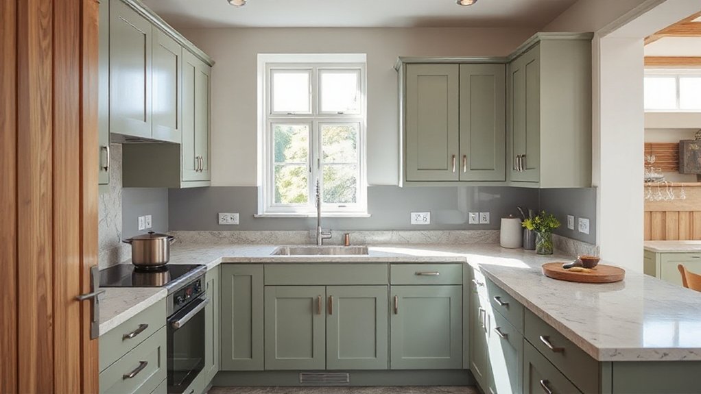
Cabinets, backsplashes, and counters set the tonal backbone of a kitchen, guiding mood and practicality with color choices that balance longevity and trend. You’ll optimize flow by pairing cabinet tones with countertops to create cohesion, then introduce backsplashes that lift or soften the palette without competing for attention.
Favor timeless neutrals for main cabinets and let color accents appear in backsplashes or mock‑ups of surface textures. Consider outdoor palettes to extend the kitchen’s aesthetic into seasonal exteriors and backyard dining areas, tying indoor and outdoor spaces.
For furniture coordination, align seating, islands, and storage modules with a shared tonal thread to reinforce visual unity. This approach delivers confident, welcoming spaces that feel durable, current, and personally yours.
Living Room Layouts That Maximize Colour Impact
Strategically arranged seating and focal points can amplify color impact in any living room, so start by orienting the main sofa or sectional toward a bold accent wall or statement artwork. You’ll create a natural color hierarchy that guides the eye and anchors your palette.
To maximize impact, blend vintage furniture with modern pieces for texture and depth. Embrace statement artworks as color anchors and use cushions to echo hues across the room.
- Position seating to frame a dominant color source
- Layer textures (velvet, matte, wood) for nuance
- Vary value across furniture and accessories
- Tie tones together with subtle repeats of color
This approach feels cohesive, inclusive, and current, inviting everyone to belong.
Common Colour Mistakes in British Homes: and How to Avoid Them
Common colour missteps trip up many British homes, but they’re easy to fix with a few targeted tweaks. You’ll avoid clashing palettes by embracing balanced neutrals and a restrained accent.
Beware overly warm whites that clash with cooler woods, and don’t pair saturated hues with small rooms without scale tests. Consider artificial lighting’s impact: bulbs skew tone, transforming fabrics and finishes; test at dusk and adjust with cooler or warmer bulbs accordingly.
Respect historical influences by honoring legacy tones in trims or fixtures while updating walls with modern, breathable finishes. Create flow through harmonised swatches across spaces, not isolated experiments.
Keep patterns minimal and purposeful, letting textures and light do the talking. With intention, your rooms feel cohesive, current, and welcoming.
Frequently Asked Questions
How to Choose a Palette for Varied UK Lighting?
You should test your space under different UK lighting before committing. Start with Eco friendly paints in a neutral base, then layer with accents that reflect Vintage colour palettes to avoid clashes at dusk and under artificial light.
Use a color thermometer app or swatch outdoors and indoors to compare tones. Choose versatile, warm whites and subtle greens or blues for harmony.
This approach invites belonging while staying trend-aware and environmentally responsible.
Which Colours Boost Room Perceived Size in Small UK Homes?
You’ll boost room size by using light, cool neutrals and strategic color psychology: airy whites, soft grays, and pale blues. Pair these with bright, reflective surfaces and minimal clutter.
Accent wall ideas should stay subtle—choose one wall in a slightly bolder shade to anchor the space without shrinking it. Use these colors to create depth, and you’ll feel more expansive.
This approach helps you belong in a modern, trend-aware home.
What Finishes Best Suit Durable UK Living Rooms?
Durable finishes in UK living rooms combine practicality with style, like a sturdy frame that holds a painting. You should choose low-maintenance, resilient materials: washable paints, hard-wearing laminates, and robust fabrics.
Prioritize accent walls in durable, wipeable paints or textured finishes to add depth without sacrificing longevity. You’ll feel a cohesive sense of belonging as these choices anchor the space, promoting warmth and lasting appeal.
While doing so, stay trend-aware and choose options that are easy to refresh over time.
How to Balance Bold Hues With Traditional UK Textiles?
You balance bold hues with traditional UK textiles by pairing a strong accent wall with restrained, timeless textiles.
Choose an accent wall in a saturated color or rich deep tone, then layer in textile patterns—think plaids, florals, or jacquards—in complementary scales.
Keep the rest of the room neutral to let the patterns breathe.
Use textile patterns to echo the accent color, creating cohesion and belonging in a modern, trend-aware space.
Which Colour Schemes Suit Seasonal UK Ventilation and Heat?
You should choose cool, breathable palettes like soft whites, pale blues, or sage greens to suit seasonal UK ventilation and heat. These schemes preserve indoor air quality and pair well with open-window days.
Use sustainable materials—limewashed walls, cork flooring, low-VOC paints—so you feel responsible and connected.
Add natural textures for warmth without overheating. This approach helps you belong to a mindful, stylish, and health-conscious community that prioritizes comfort and air quality year-round.
Conclusion
Conclusion (75 words):
You’ll find that colour trends aren’t just paint swatches; they reveal how you live. The theory that “light = bigger space” isn’t just true in theory, it’s practical: brighter hues energize small rooms and calmer tones expand them. In practice, mix warm terracotta with moody greens, and punctuate kitchens with sunny yellows to create rooms that feel both current and welcoming. Trust the trend, but tailor it to your lifestyle for a space that truly resonates.