
North-facing rooms in UK homes can feel cooler and more clinical, so you’ll want warm neutrals that soften the light and invite comfort. Think subtle taupes, soft greys with warm undertones, or gentle beiges that balance space without shrinking it. Start testing under natural and artificial light at different times of day, and layer in warm accents and lighting to build depth. It’s a careful, practical approach that reveals the right choices when you push a little further.
Identify Why North-Facing Rooms Need Warmer Neutrals
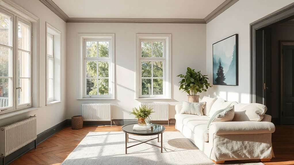
North-facing rooms receive less natural light and tend to look cooler on the eye, so warmer neutrals help counteract that shadowed feel. You’ll notice cooler undertones wash out details, while warmer tones preserve warmth during dreary days.
Choosing neutrals with subtle amber, peach, or apricot undertones prevents the space from appearing flat or blue-tinted, helping furniture and fabrics read more accurately. This isn’t about chasing glow; it’s about balance, so you avoid an overlit, artificial ambiance.
Consider how artificial lighting interacts with the wall color throughout the day, ensuring consistency from lamp glow to daylight. Warmer neutrals also support paint longevity by reducing perceptual fading from cold light.
You’ll maintain an inviting, stable mood without constant repainting or tint shifts.
Top Neutrals for Low-Brightness North Light
When light is scarce, lean into neutrals that read warm and stay steady in low brightness. You’ll want tones that reflect ambient daylight without looking muddy. Choose neutrals with a warm undertone to keep spaces inviting rather than clinical, and avoid stark whites that amplify dullness.
The best options balance subtle depth with softness, so walls feel cozy yet defined. Pair these neutrals with natural accents—wood, linen, stone—to reinforce warmth and texture without shouting.
In rooms with north light, opt for slightly lighter cores than you’d expect, then layer richer fixtures and textiles for contrast. Test large patches at different times of day, ensuring the color remains calm, not pale.
Remember: warmth should feel deliberate, not pushed.
Test Warm Undertones: How to Read Neutrals in North Light
Start by testing warm undertones under the actual north light, not under showroom lighting. You’ll notice how warm neutrals shift as the day progresses and the sun angles change.
Pick a neutral shade and compare it against pure whites and cools on the same wall. Observe three moments: morning coolness, midday soft warmth, and evening depth.
If the sample reads too peach, too yellow, or too pink, you’ve spotted a pronounced neutral undertone you won’t want. Aim for a balance that stays calm rather than loud.
Note the undertone while you stand still, then step back to assess harmony with fixtures, fabrics, and wood.
Read neutrals by behavior, not memory, and choose warmth that remains cohesive in north light.
Moody Neutrals That Still Read Spacious in North Light
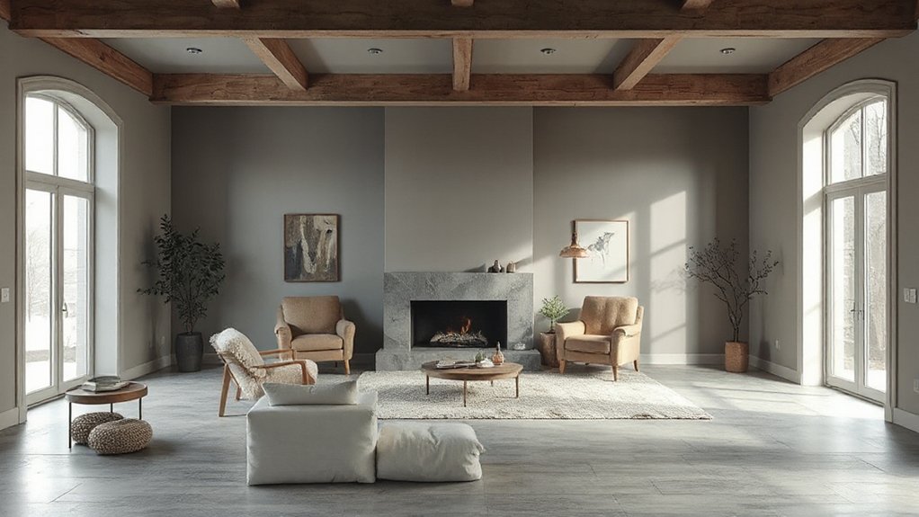
Moody neutrals can feel intimate in north light without shrinking the room, thanks to depth that still reads expansive. You’ll choose charcoal-leaning taupes or slate greys to anchor spaces while preserving airiness.
In north-facing homes, depth must be balanced with reflected light, so keep saturation at a thoughtful level and lean into cool or neutral undertones that don’t skew blue in low sun.
Lighting your walls with carefully selected lighting fixtures can fortify perception of space, using warm bulbs to avoid a cold cast.
Paint application matters: roll tall, even coats for a seamless field, and feather edges where alcoves meet to avoid harsh delineation.
Pair with light furnishings and minimal decor to preserve breathing room.
Finish Sheens That Boost Warmth in Cool Light
In cool north light, choosing the right finish can make warmth feel natural, not artificial. You’ll notice satin or soft eggshells soften shadows and reflect a gentle glow, while keeping textures clear and clean.
Start with warm undertones in these sheens to counteract the chill and keep rooms inviting.
Warmth-Boosting Finishes
If you’re coping with cool, North-facing light, the right finish can add instant warmth without changing the colour itself. For warmth, choose finishes with depth and subtle sheen that reflect light softly. Satin and eggshell offer a gentle glow that enhances mood without glare, while low-lustre options keep colour true and practical for high-traffic rooms.
Avoid high-gloss finishes that read cold in cool light, unless you need a sleek, modern edge. Color psychology plays a role: warmer sheens can evoke coziness and approachability, even with cool-toned palettes.
Consider paint durability alongside finish—durable, stain-resistant options perform longer in living spaces and kitchens. In balance, a carefully selected warmth-boosting finish delivers comfort, practicality, and enduring appeal.
Cooler Light Equivalents
Even in cool light, you can boost warmth with finish sheens that subtly reflect and soften illumination. When you choose cooler light equivalents, look for satin or eggshell sheens that balance brightness with gentle depth, so walls feel inviting rather than sterile.
Color psychology guides you to favor warm undertones within cool palettes—think subtle yellows, creams, and greige tints that read warmer under diffuse daylight. Use targeted paint application techniques: prime first to reduce static glare, apply thin, even coats, and build coverage gradually for a smooth, refined finish.
In north-facing rooms, test swatches at different times of day to confirm mood and temperature shift. Pair with strategic accents to anchor the space, ensuring cohesion and a welcoming, luminous atmosphere.
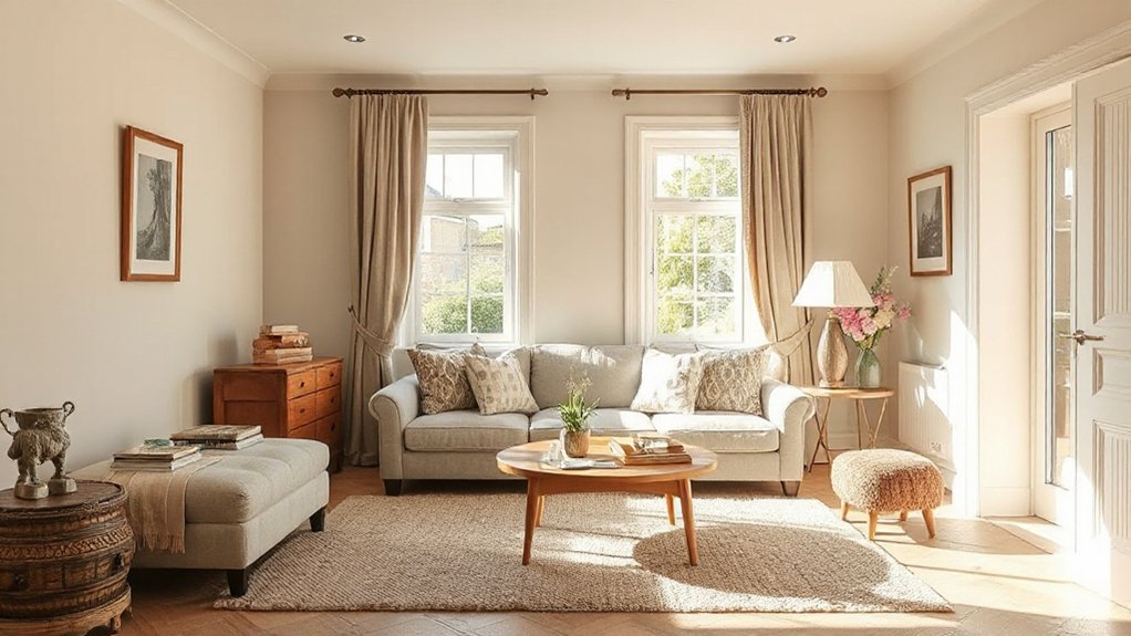
Pair North-Light Neutrals With Furniture and Fabrics
Pair north-light neutrals with furniture and fabrics by choosing tones that reflect the daylight without overpowering it. You’ll create a calm backdrop that enhances natural brightness while preventing muddy results.
Opt for cool or warm neutrals that sit mid-range on the spectrum, then invite texture with careful fabric coordination. For sofas and chairs, select upholstery in subtle limestone, dove, or greige to maintain furnishing harmony across rooms.
Introduce contrast with a darker wood or metal leg detail, keeping patterns restrained to avoid visual clutter. Pillows, throws, and drapery should echo the neutral base, punctuated by a single accent hue drawn from the artwork or accessories.
The result is cohesive, layered, and effortlessly serene, with furniture and fabrics working as one under north light.
North-Light Color Suggestions by Room (UK Homes)
You’ll see how North-Light Palette Picks shift with each room, from bright kitchens to cozy bedrooms.
By room, you’ll match light tones that keep spaces airy yet grounded, using contrast where it counts.
Let’s start a practical chat on choosing room-by-room light tones that work in UK north-facing homes.
North-Light Palette Picks
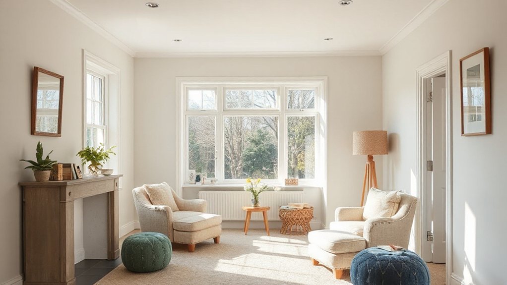
North-facing rooms can feel cool and shadowed, so the North-Light palette picks lean into soft, airy hues that reflect whatever daylight they receive. You’ll find color suggestions organized by room type, prioritizing calm neutrals and gentle pastels that avoid heaviness while keeping space bright.
Think warm whites with a touch of creamy warmth, or muted greiges that read clean in overcast skies. Practicality guides your choice: choose paints with good undertone balance and low reflectivity to prevent the room from feeling drab.
Accent wall ideas should add depth without overpowering the light, while ceiling color choices stay lighter than walls to maximize perceived height. Maintain continuity with baseboards and trim for a cohesive, luminous scheme.
Room-by-Room Light Tones
For each room, pick light tones that reflect daylight without dulling the space, then layer with softer accents to keep the atmosphere airy.
In north-facing layouts, match walls with cool whites or pale neutrals that lean slightly blue or green to counteract dull light. Use mid-tone trims to create definition without chopping the glow.
Consider room purpose: kitchens benefit from warm, durable finishes; bedrooms gain calm, muted hues for rest.
Build contrast with artful accents—textured fabrics, soft furnishings, or a single bold artefact.
Apply artistic techniques like subtle color washes or glaze overlays to add depth while preserving luminosity.
Historical influences guide palette choices—softer victorian whites or airy midcenturies tones can anchor a cohesive scheme.
Practical testing across daylight hours confirms harmony and mood.
Practical Lighting and Finish Tips for Lasting Color
Even with north-facing light, you can keep color true by pairing the right finishes with smart lighting choices. You’ll want low-sheen or satin finishes on walls to minimize glare and reveal true undertones as daylight shifts.
Pair these with dimmable LEDs that render color faithfully, and bias color temperature toward warm to balance cool north light.
Use layered lighting: a solid ambient base, targeted task lamps, and soft accents to sculpt shadows without washing color.
Test swatches under different lighting setups before committing, and note how finishes interact with wall textures.
Outdoor decor accents should echo the hues you’ve chosen, reinforcing harmony at dusk.
Mind your room’s texture choices, as wall textures amplify or mute color nuances.
Common North-Light Painting Pitfalls and Fixes
North-light spaces can skew colors warm or flat, so you’ll want to spot common pitfalls like muddy browns or washed-out neutrals before you commit.
I’ll show you practical fixes—adjustments to lighting, swatches, and finish choices—to keep north-facing rooms feeling true to tone.
North-Light Color Pitfalls
North-facing rooms throw light that leans cool and drift-prone, so you’ll often notice paints look grayer or bluer than expected—unless you plan around it.
You’ll encounter two common traps: choosing warm neutrals that read muddy in north light, and selecting cool whites that feel sterile or chalky. To avoid misreads, test swatches on-site at different times of day, and compare next to furniture and fabrics under actual illumination.
Be mindful of colour perception shifts caused by adjoining surfaces—cool walls can pull surrounding hues cooler, while warm accents can glow unexpectedly. Favor midtone values with balanced undertones, not extremes.
Document how each candidate reads in your room, then compare mood shifts rather than naming undertones alone. This practice yields a reliable north light mood for your palette.
Fixes For North-Facing Rooms
If you’ve found common north-light pitfalls, here are practical fixes you can apply right away. Start with color psychology in mind: opt for warm neutrals with subtle undertones to counteract cool ambient light, and test swatches at different times of day.
To boost paint durability, choose a satin or eggshell finish for walls in high-traffic zones and a washable matte for ceilings or low-traffic areas. Use higher-quality primers to balance undertones and prevent patchy patches when layering multiple coats.
Adjust brightness by pairing cool whites with warm accents, avoiding stark contrasts that feel clinical. Treat south-facing trims or woodwork separately to prevent color creep.
Finally, seal edges with painter’s tape to keep crisp lines and extend life.
Testing Colours at Home: Swatches, Samples, Timeframes
Testing colours at home starts with swatches you can trust. You pick up a handful of chips, compare undertones in natural light, and note how each hue shifts as the day unfolds.
Create a dedicated wall or large sample board to test multiple tones side by side, not just tiny chips. Then move to samples on walls you actually use, for at least 5–7 days, so you see real color behavior with furniture and flooring nearby.
Track timeframes for drying and curing, and observe how lighting changes influence mood and perceived color.
Consider color psychology when finalising decisions, and account for paint durability in high-traffic areas.
This disciplined approach reduces costly re-painting and confirms your North‑facing room reads true.
Frequently Asked Questions
How Do Lighting Types Affect Warmth Perception in North-Facing Rooms?
Natural light makes north-facing rooms feel cooler, while artificial lighting adds warmth; combine cool, neutral tones with warm LEDs or incandescent accents to maintain comfort, balance brightness, and preserve color accuracy under different lighting conditions.
Which Brands Offer True Warm Neutrals in the UK Market?
You’ll find true warm neutrals from brands like Farrow & Ball, Dulux, and Little Greene in the UK. Color blending and paint finish matter—look for creamy, softly warm tones that stay flattering under north light.
Can Lighting Temperature Influence Color Accuracy Indoors?
Yes, lighting temperature can shift how you perceive color indoors; use a consistent color temperature around 2700–3000K for walls. Match paint consistency when applying coats, and test samples under the same lighting to avoid surprises.
Do North-Facing Rooms Benefit From Cooler Ceiling Tones?
“Less is more.” You’ll find north-facing rooms benefit from cooler ceiling tones to keep spaces bright; choose ceiling paint that leans blue-gray for Colour harmony, avoiding stark whites. You’ll feel more energized and visually balanced throughout the day.
How Often Should I Retest Colors in Changing Light Conditions?
You should retest colors every 6–12 months as lighting shifts; watch for color fading and note how paint durability holds up. Reassess after seasonal changes to guarantee hues stay true, especially in sunlit or highly variable conditions.
Conclusion
In north-light, your colors are quiet lanterns. Warm neutrals become the hearth you lean on when gray mornings creep in and the room sighs for comfort. Think of taupe as a familiar chair, soft gray as a whispered conversation, beige as a sun you carry indoors. Let layered lighting be the wind that moves the shade, never the room’s shape. Test, trust, and tune—the palette will tell you when to glow and when to glow brighter.