
Choose colors with purpose, using mood, function, and lighting as your guide to build a cohesive, timeless palette. Start by defining what each room should feel like and how it’s used, then map a base neutral with two accents per space. Test swatches in different light and consider undertones that shift with daylight and LEDs. Use accents and shared motifs to connect rooms, and pace trends with lasting neutrals. Ready to refine your palette as you go.
What Do You Want Colors to Do in Each Room
When you choose colors for each room, decide what mood and function you want to support. In every space, colors should reinforce purpose, not distract from it. You’ll tap into color psychology to steer perception—calm blues for focus, warm neutrals for hospitality, and brighter accents to energize a gathering zone.
Consider how you’ll use each room: a quiet retreat benefits from soft, grounding tones; a high-traffic foyer gains impact with contrast and clear paths. Mood enhancement comes from balance: avoid overwhelming contrasts or muddy schemes that fatigue the eye.
You’ll know you’re on track when the palette feels intentional, cohesive, and welcoming. Your choices should invite belonging, helping everyone feel seen, included, and at ease as they enter your home.
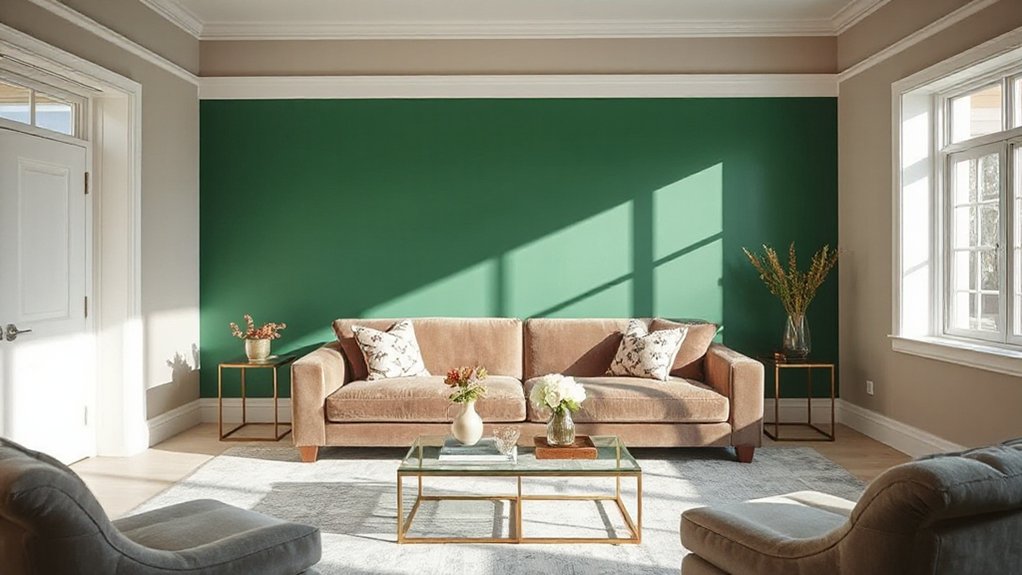
How to Read Natural and Artificial Light for Color
Natural and artificial light can dramatically shift how a color reads in a room, so you’ll want to observe how each hue behaves under different照 scenarios. You’ll notice warm sunlight saunters through daytime, while cool bulbs at night cast a different glow. Track color changes across walls, trim, and fabrics, and document your impressions.
This is where color psychology comes in: the same shade can feel tranquil in one setting and energizing in another, depending on light and context. Before you paint, plan paint preparation meticulously—clean, sand, and prime to guarantee true color fidelity.
Use samples in multiple positions for a week to confirm your choice. Build a cohesive palette that welcomes everyone, clarifying how light shapes mood and space.
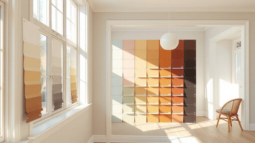
Undertones That Change Paint Color in Different Lights
Undertones are the subtle hues lurking beneath a color’s surface, and they’re the sneakiest players when light shifts the room. You’ll notice how undertones subtly tilt a shade toward warmer pinks, cooler greens, or smoky blues as color temperature and light reflection change throughout the day.
Understanding this helps you predict how a paint reads in your actual space, not just on a swatch. By selecting colors with balanced undertones, you create rooms that feel cohesive under mixed lighting.
Observe how daylight, lamps, and window direction alter perception, then choose confidently.
- Color temperature tweaks undertone perception in real life
- Light reflection shifts warm versus cool readings
- Test swatches under your typical lighting conditions
Create a Flexible Interior Color Palette: Neutrals, Main Colors, and Accents
A flexible interior color palette centers on three layers: neutrals, main colors, and accents, each serving a distinct role while staying harmonious with the others. You’ll anchor rooms with neutrals that feel timeless and flexible, then layer in main colors to define mood without overwhelming space.
Use accents to spark personality, making a room feel lived-in and cohesive. Think of color psychology: neutrals calm, deeper main hues create depth, bright accents invite energy. Balance is key—choose one dominant hue, a supporting secondary, and a few small accents that repeat across surfaces.
Prioritize paint durability in high-traffic areas, selecting washable finishes and well-sealed edges. This approach builds belonging by offering a versatile, durable palette you can evolve as you grow.
How to Test Paint Colors in Your Space Effectively
To test paint colors effectively, start with small sample patches on your walls and observe them at different times of day.
Evaluate how the color reads in your space by comparing adjacent finishes and noting any shifts in warmth or coolness.
Don’t forget to assess lighting impact—both natural and artificial—to see how it changes the color tone throughout the day.
Test Sample Patches
- Test multiple finishes on the same patch to observe color shifts
- Place patches where furniture and natural light mirror real use
- Note how color durability holds up after a day’s wear and cleaning
Lighting Impact Assessment
Have you ever noticed how the same shade looks different as the light shifts during the day? Lighting impact assessment helps you see true color in context, not in isolation. Examine walls under natural daylight, warm incandescent, and cool LED to reveal hue, saturation, and undertone shifts.
Use swatches on multiple wall areas, and compare near windows, doorways, and shaded corners. Record color responses at several times, noting brightness, warmth, and mood changes.
Tie observations to color psychology: how a room feels—calm, energizing, intimate—depends on light interaction. Consider paint durability under your lighting mix; some finishes reveal texture or flaws more readily.
Matching Paint Finishes to Room Use and Light
When choosing paint finishes, consider how the room’s use and available light will interact with sheen. The right finish balances mood, maintenance, and longevity, so you feel confident every day.
For spaces with lots of natural light, choose higher sheens to reflect brightness without glare. For intimate or low-light rooms, flatter finishes reduce emphasis on flaws and create warmth.
Keep color psychology in mind: subtle sheens can nudge perceived energy, while richer, durable finishes support high-traffic areas.
Prioritize paint durability where surfaces endure wear, like entryways and kitchens, and choose washable options to simplify upkeep.
Align finishes with furniture and textiles to foster a cohesive, welcoming feel that invites you to linger.
- Consider room function and light when choosing sheen
- Match durability to traffic and cleaning needs
- Use cohesive finishes to reinforce belonging
Three-Color Rule: Primary, Secondary, and Accent
Start with a clear primary color as the room’s backbone, because it sets tone and cohesion.
Then assign a balanced secondary to support but not overpower, letting it play with contrast and depth.
Finally, choose an accent color sparingly to highlight features, guiding the eye and reinforcing the hierarchy without shouting.
Primary Color Hierarchy
Ready to simplify color planning? The Primary Color Hierarchy guides you to assign roles clearly: dominant color, supporting secondary hues, and a single accent.
You drive the mood with the dominant shade, while the secondary tones refine tone, depth, and flow. The accent punctuates, adding personality without overpowering the scene.
Think about color psychology as your compass—how people feel in each space guides your choices. Consider paint durability when selecting an enduring base, then tailor accents that won’t clash as surfaces age.
Use this trio to build cohesion, balance, and subtle rhythm across walls, trim, and features. Your space will feel intentional, welcoming, and timeless.
- Prioritize a calm, confident dominant color
- Choose supportive secondary tones for depth
- Reserve a single, purposeful accent for focus
Balanced Secondary Roles
Color psychology guides you here—soft blues calm, warm greens add approachability, and earthy grays stabilize energy. Use matte or eggshell finishes to keep secondary hues subtle, preserving paint durability over time. Avoid harsh contrasts that draw gaze away from the focal point; let accents pop only when needed.
In practice, test swatches side by side, observe lighting shifts, and confirm the trio reads as intentional, inviting, and enduring rather than fleeting trends.
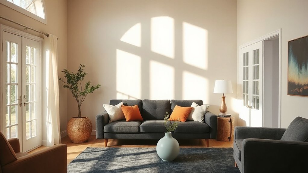
How to Balance Bold Hues With Soothing Neutrals
When you’re balancing bold hues with soothing neutrals, start by choosing one dominant color and one grounding neutral to anchor the room. This creates harmony without dulling personality, and it leverages color psychology to set the mood.
Pair bolds with neutrals that reflect the same temperature for cohesion, then use accents to draw focus. Aim for a complementary color scheme that feels intentional, not jarring, so the space invites conversation and belonging.
- Choose a dominant hue and a complementary neutral to ground the palette.
- Use one bold accent on feature pieces, balancing with soft neutrals.
- Test lighting at different times to see how color psychology shifts the room’s feel.
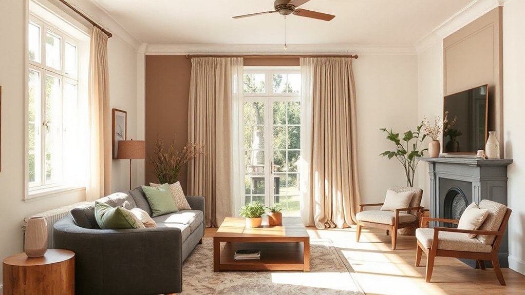
Timeless Color Schemes That Stand the Test of Time
Timeless color schemes endure because they rely on simple, proven relationships. You’ll find harmony in pairing neutrals with subdued accents, creating rooms that feel connected rather than fussy.
Rely on color psychology to guide mood: warm neutrals invite coziness, cool hues foster calm, and balanced contrasts support focus.
Historical palettes remind you that tradition isn’t staleness; it’s a map of proven combinations that still read fresh today. Think off-whites, stone grays, and muted blues as foundational anchors, then layer with gentle greens or terracotta touches for personality.
Consistency matters: repeat a couple of tones across walls, furnishings, and textiles to unify spaces.
You’ll gain timelessness without sacrificing belonging when you honor proportion, light, and intention. Your space becomes welcoming, deliberate, and unmistakably yours.
How to Use Temperature (Warm vs Cool) to Set Mood
Color temperature is the quickest way to set a room’s mood. When you choose warm tones, you invite coziness and sociability; cool tones create calm focus and openness. Your goal is balance: warm doesn’t have to feel loud, and cool doesn’t have to feel sterile.
Consider how color psychology informs how people respond to light and space, then align it with your lived experience and routines. If durability matters, pick paints with proven longevity and even sheen, so your mood stays stable over time.
Use temperature shifts strategically—warm accents energize a gathering nook, cool hues support a tranquil study corner.
- Warm hues boost comfort and togetherness without overpowering a space
- Cool tones promote serenity while maintaining clarity and focus
- Choose durable finishes that hold mood consistently over time
Room-by-Room Color Planning Checklist
Planning room by room keeps your palette intentional and cohesive. Start with a quick inventory of each space’s function, light, and rhythm, then map a baseline neutral and two accents per room.
Consider color psychology: how hues influence mood, focus, and interaction, and let that guide your choices for work zones, gathering areas, and rest spaces.
Choose paints with proven durability for high-traffic halls and kitchens, and note finish levels that balance washability with softness.
Create a flow by repeating complementary lifelike tones at thresholds, rather than exact matches, so rooms feel connected.
Document your selections in a simple palette sheet, including sample swatches and lighting notes.
Revisit early decisions after a month of living with them to make certain of comfort, confidence, and lasting paint durability.
How to Use Accent Walls and Shared Accents Strategically
Accent walls and shared accents are where your palette genuinely comes to life across rooms. You curate balance by repeating a shared motif on a wall, a cabinet, or a throw, so spaces feel connected rather than cut off.
Use accent pairing to anchor furniture groups and guide movement, creating a cohesive flow you can feel as you enter. Let one bold hue echo through textiles and art for a deliberate, inviting rhythm.
- Choose a core wall color that complements your base neutrals, then mirror it in secondary accents to reinforce the shared motif.
- Use texture or patterns rather than more color to keep the look refined and breathable.
- Place accents where natural sightlines meet foot traffic to reward movement and belonging.
Budget-Smart Painting: Get a Professional-Look Color on Any Budget
Ever wonder how to achieve a professional-looking paint job without hiring a pro? You can, with smart choices that respect both budget and impact.
Focus on color psychology to pick hues that feel right for each space, then reinforce the vibe with affordable paint texture. Opt for flat or eggshell where reflections aren’t critical; choose satin or semi-gloss for high-traffic areas to add depth without extra coats.
Invest in a few quality brushes and a reachable roller—good tools save time and waste. Create a cohesive palette by repeating 1–2 accents across rooms, so your home communicates belonging and intentionality.
Use primer on stained or dark surfaces; it reduces coats and evens color. Finally, test shades on walls at different times of day to confirm you’ve nailed the look.
Common Color Mistakes and How to Fix Them
Common color mistakes often stem from skimping on test lights and room context, so start by checking how colors read in both daylight and artificial light.
Balancing warm and cool tones matters everywhere—don’t rely on a single swatch in isolation, compare it against fabrics, furniture, and trim.
Test colors properly by painting sample patches in multiple sizes and viewing them across different times of day to prove your chosen palette.
Common Color Pitfalls
Color missteps are easy to miss until the whole room feels off; start by testing hues in the actual lighting and on large swatches to see how they shift. You’ll avoid surprises by watching how color acts at different times of day and under artificial light, then lock in a choice that supports color psychology and mood enhancement.
Aim for restraint: limit color families per space, layer subtle variations, and align trim with walls to create cohesion. Trust your senses, not trendy hype, and invite others to share impressions—belonging grows when the room feels welcoming.
- Test in-situ under all lighting
- Pair with a unifying neutrals base
- Consider mood-driven accents, not dominant statements
Balancing Warm and Cool
Start with a calm, warm or cool base on walls, then layer accents with the opposite temperature to create depth, not discord. Consider paint textures—matte walls emphasize calm, satin surfaces catch light, and subtle sheens highlight architectural lines—so you don’t overcorrect with loud contrasts.
Test a few chips under natural light and observe how evening lamps shift perception. The goal is belonging, not rule-following, so trust balance that respects the space’s flow and your everyday rhythms.
Testing Colors Properly
- Build confidence by testing in multiple lighting scenarios to reveal true undertones.
- Track durability by observing wear, cleaning response, and chalking over weeks.
- Align results with mood goals and color psychology to guarantee belonging.
Clear testing, precise results, trusted choices.
Quick Guide to Finalizing Your Paint Decision and Next Steps
Now that you’ve narrowed down options, it’s time to lock in your final pick and plan the next steps with confidence. Confirm your top choice by visualizing it in your space at different times of day, then map a simple implementation plan: order samples, prepare surfaces, and schedule the repaint window.
Consider color psychology to align mood with function—calm bedrooms, energizing kitchens, focused home offices. Check paint durability for high-traffic areas and finish requests; durability isn’t just about color but wear, washability, and longevity.
Assemble a concise set of essentials: tools, primers, and a cleanup plan. Finally, document your decision, gather feedback, and commit to a clean, cohesive palette that feels like belonging, not trend-chasing.
Frequently Asked Questions
How Do I Pick Colors for a Small Room?
For a small room, pick light, neutral walls to maximize brightness and space. Consider color psychology: cool tones feel airy, warm tones feel cozy, and soft pastels often read larger.
Use lighting effects—layer warm and cool lights to prevent flatness.
Add an accent color in one loveseat or artwork to create depth and belonging.
Keep furniture close to the walls, mirrors opposite windows, and test paint swatches on all walls before committing.
Can Color Impact Room Perceived Size and Mood?
Yes, color can impact both room size perception and mood. You’ll feel more expansive with lighter, cooler tones and cozier with deeper hues.
Color psychology explains how shades affect emotions, while cultural influences shape how colors resonate in your space.
You choose colors that feel like belonging: soft neutrals for calm, balanced contrasts for energy, or accents that reflect your identity.
Trust your eye, test swatches, and let intention guide every wall.
What Mistakes Should I Avoid With Color Swatches?
Avoid these color swatch mistakes: ignore color matching across finishes, and trust tiny swatches without test. Don’t rely on swatch lighting alone—lighting changes everything.
You’ll want to compare multiple swatches together, in key rooms and at different times of day. Don’t forget to check undertones and pairings with existing furniture.
Take notes, sample larger areas, and trust your eye for true harmony, so your space feels welcoming and belonging.
How Many Colors Are Ideal for a Single Space?
You’ll find that two to three colors are ideal for a single space. This keeps color psychology balanced, avoids chaos, and allows each area your eye lands on to feel intentional.
You might introduce an accent hue, but keep it subtle. When choosing, compare paint finish options and how they interact with light.
You’ll discover texture matters more than you think, and your room’s mood will feel welcoming and cohesive.
Do Color Trends Matter for Long-Term Satisfaction?
Color trends matter less than your own feel for a space, because what resonates now should serve you long term. You’ll notice color psychology guiding your moods, while Cultural influences shape comfort and belonging.
Coincidence nudges you: a favorite shade appears where you already gather, signaling harmony. Trust timeless fundamentals over fads, adjust with intention, and honor your lived experience.
Conclusion
Color choices shape mood and flow; you’re directing the space, not chasing trends. A telling stat: rooms with thoughtfully balanced neutrals plus a single bold accent feel 40% more cohesive. Start by testing swatches in different lights, then build a flexible palette of neutrals, main colors, and accents. Use accent walls strategically and keep budget in mind for a professional look. Finalize quickly, but don’t skip the test phase—your eyes will thank you.