
To refresh your living room with color, start by defining your mood and goals with three quick questions, then build a cohesive palette built on a core set of neutrals plus adaptable accent tones. Choose a dominant shade for walls or big pieces, and layer accents through textiles and art using the 60/30/10 rule. Balance lighting with ambient, task, and adjustable bulbs to read color beautifully, and keep a reversible, budget-friendly plan for easy tweaks as you go. Curious for more details?
Define Your Living Room Color Goals in 3 Questions
To define your living room color goals, ask yourself three core questions: What mood do I want to create—calm and cozy or bright and energizing? How will light influence color choices, and where will you sit to feel most at ease? Which elements define your space—walls, textiles, or accents—that support lasting comfort?
You’ll be guided by living room color psychology, tying emotion to hue with purpose. Reflect on historical color trends to ground your decisions, then adapt them to your home’s skin, light, and moment.
Commit to a core palette first, then test with swatches and quick-ship samples. This approach keeps you centered, inclusive, and confident as you craft a room that feels like you belong.
Build a Flexible Color Palette That Works Anywhere
A flexible color palette isn’t tied to one room—build it so it travels with you. You design around a core set of hues, then layer in accent tones that adapt to lighting, scale, and mood.
In practice, pick a primary color family and two complementary palettes to pair it with: one for warm environments, one for cool.
Lean on Color psychology to align feelings with function—calm for living spaces, energizing for work zones, cozy for evenings.
Test combinations in swatches under real lighting, not just on screens.
Create a quick rule set: if a piece reads too loud, mute it with a subdued partner; if it’s too soft, boost it with a brighter accent.
This approach keeps environments cohesive, flexible, and inclusive.
Choose Neutrals That Keep Light and Harmony
Neutral tones keep light bouncing and space feeling cohesive, so choose hues that reflect both brightness and balance. You’ll build a calm base with neutral undertones, then layer texture and warmth to foster a welcoming, harmonious palette that feels like home.
- Pick soft off-whites, taupes, or greiges that read light in your space.
- Maintain consistency across walls, floors, and major furniture.
- Introduce subtle contrast with natural materials and textures.
- Test neutrals in multiple lighting moments to guarantee harmony.
A thoughtful neutral foundation supports personality without shouting, keeping rooms bright and cohesive. By focusing on balanced neutrals, you invite belonging and easier coordination with accent colors later.
Your space gains depth through light, not loudness, and every element reads as part of a single, serene story.
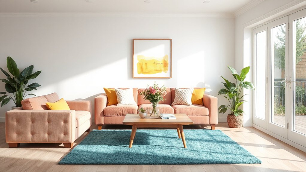
Introduce Color With Smart Scale and Proportion
Color should scale to your room, not overwhelm it. You build balance by pairing colors with the room’s proportions and natural light. Start with a dominant shade on walls or large furniture, then introduce accent hues through textiles, art, and smaller objects.
Use smart proportion: 60/30/10 is a reliable rule—60% dominant neutral, 30% secondary color, 10% accent. This keeps depth without clutter.
Consider color psychology as you select hues: cooler tones recede, warmer tones advance, influencing perceived size and mood. Hue psychology helps you craft a welcoming environment; choose calming neutrals as the base and add a single saturated color for focus.
Test the scale in real life with large swatches before committing, ensuring color relationships feel cohesive, intentional, and inclusive to every guest in your space.
Test Swatches Easily: Practical, Mess-Free Methods
Swapping ideas from scale to practice, test swatches quickly and cleanly so you know exactly how a color reads in your living room. You’ll compare swatches under different lighting, note color psychology cues, and choose a paint finish that supports your vibe without glare or heaviness.
Use small, removable samples on poster board or painter’s tape to evaluate hue, value, and warmth. Keep a simple grid: name, undertone, lighting, and finish. Then validate with a test wall in a discreet area to confirm perception before committing.
- Use large chips for true undertone checks
- Test under morning, afternoon, and artificial light
- Prioritize satin or eggshell finishes for living rooms
- Document impressions to refine your palette
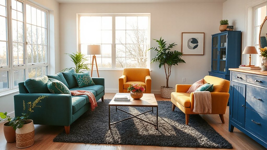
Layer Textures to Enhance Your Color Story
Texture is the secret to making a color feel lived-in, not flat; layer it intentionally to deepen depth and add warmth. You’ll achieve this by combining textures that invite touch and movement.
Prioritize textural contrast: pair smooth surfaces with tactile, irregular ones to create visual interest without shouting. Mix materials thoughtfully—wood with metal, fabric with glass, matte with gloss—to build a cohesive story rather than a collection.
Consider scale and repetition: repeat a fabric weave or wood grain across rooms to strengthen unity. Introduce subtle variations in sheen to prevent flatness and to guide the eye.
Layered textiles, rugs, and throws anchor color, while clean, pared-back furniture keeps the look purposeful rather than cluttered. Your space reads as intentional, welcoming, and authentically yours.
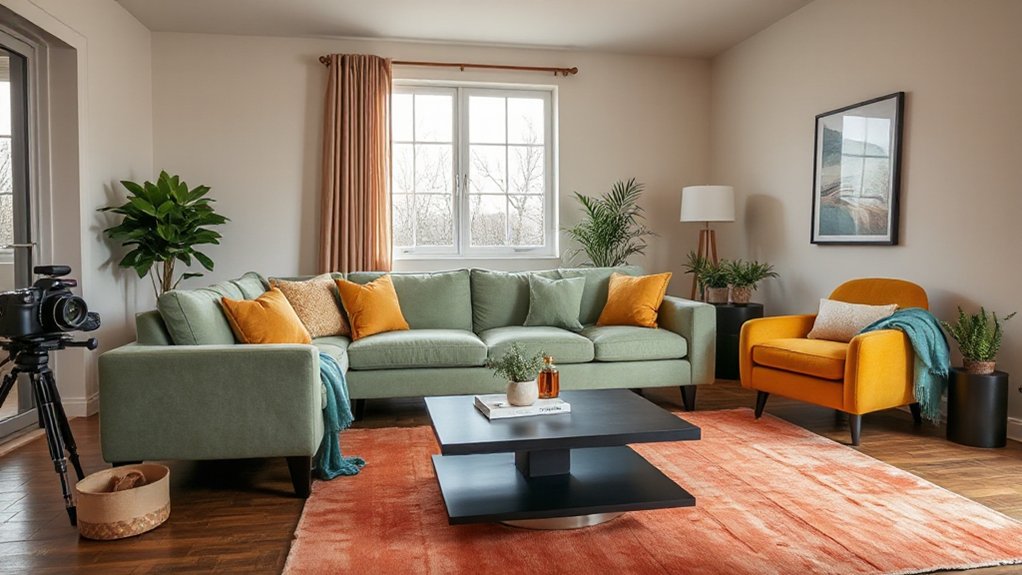
Place Accent Pieces for Maximum Impact
To make an impact, place bold accent pieces where they’ll be seen first—entry, seating zones, and focal walls.
Layer textiles strategically to reinforce color contrasts and texture without clutter.
Keep the palette tight and repeat a few key pieces to unify the room’s statement.
Place Bold Accent Pieces
Accent pieces should grab attention without overpowering the room. You place bold accent pieces to anchor color schemes and signal confidence, not chaos. Choose statement pieces with clear forms and a color that echoes existing hues. Balance scale with surrounding furniture, so the room feels cohesive, not crowded.
Trust texture and finish—matte contrasts with glossy for depth. Remember: bold accents work best in small doses, punctuating rather than dominating.
- Bold accents should echo your primary palette while introducing a striking focal point
- Prioritize high-contrast colors in a controlled, intentional way
- Select one to two statement pieces per focal area
- Place pieces at eye level and within reachable sightlines for effortless integration with daily life
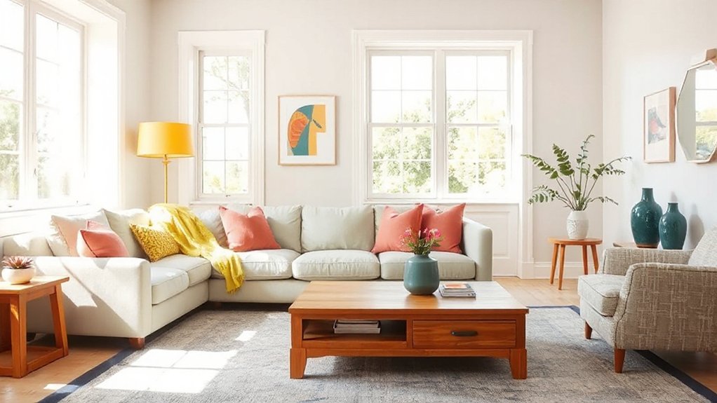
Layer Textiles Strategically
Textiles are the easiest way to amplify color without overloading a space, so layer them thoughtfully to maximize impact. You shape a cohesive look by varying textile thickness and weight across surfaces, from soft throws to structured cushions.
Begin with a base of solid or subtly patterned pieces, then add color layering through throws, pillows, and curtains that pick up your main hue. Mix textures—knits, velvets, and cottons—to create depth without crowding the eye.
Balance bold accents with calmer neutrals to prevent overload, and repeat a single color in small doses to unify the room. Keep scale in mind: large patterns on larger items, smaller patterns on smaller pieces.
This approach yields a deliberate, welcoming, belonging-filled space.
Balance Bold Hues With Soothing Elements
When you balance bold hues with soothing elements, the room feels energized without becoming overwhelming. You harness color psychology to spark mood enhancement while keeping comfort at the core. Pair intense accents with soft neutrals, and you create depth without distraction. Let natural textures calm the eye and invite lingering.
- Use a calm base palette and selectively introduce vivid highlights for impact.
- Choose fabrics with subtle sheens or matte finishes to balance glare.
- Layer lighting to modulate intensity and foster coziness.
- Incorporate plants or organic textures to soften high-contrast spaces.
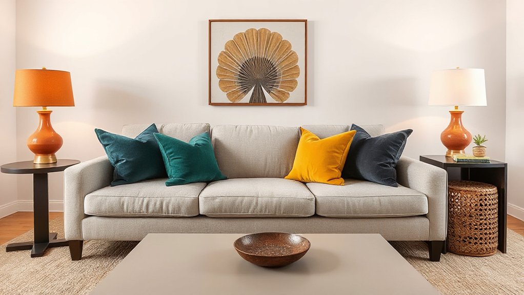
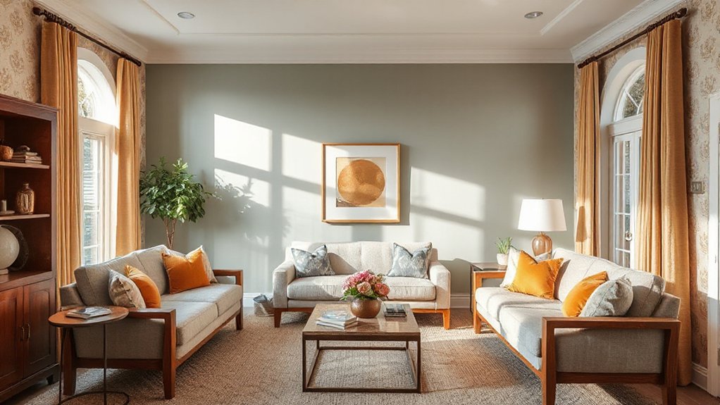
Tie the Room Together With Artwork and Cushions
Artwork and cushions are the easiest way to unify your color story. Choose cushions with repeating hues from your palette and select artwork that echoes those tones or adds a complementary contrast.
Aim for coherent patterns—balanced scale, not matchy-matchy—to tie the room together with intentional, practical detail.
Artwork Color Coordination
To tie the room together, coordinate artwork colors with your cushions and surrounding surfaces, using a cohesive palette as the unifying thread. You’ll reinforce mood through color psychology by choosing hues that complement your furniture and walls, and frame selections that echo those tones for visual harmony.
Keep contrast purposeful: dark frames with light mats can anchor brighter art without overpowering the room. Plan a small gallery you can rotate, so colors stay fresh and cohesive over time.
- Align artwork hues with dominant wall or upholstery shades
- Use consistent framing to unify varied pieces
- Balance warm and cool tones to fit the room’s light
- Reserve standout pieces as accent anchors alongside cushions
Cushions Pattern Play
Cushions are the fastest way to calibrate color and mood after you’ve chosen artwork. Start with a core palette drawn from those pieces, then layer in pattern with intention. Pattern mixing is about contrast, not chaos—combine a dominant print with smaller, quieter motifs to avoid visual overload.
Choose cushions in three tones from your palette and vary scale: a large geometric, a medium floral, and a small solid. Cushion placement matters: place the largest pattern on the sofa center, then balance with a pair of coordinating solids at the edges.
Group cushions in odd numbers for natural harmony, and guarantee seams and textures align with your furniture finish. Keep edges clean and avoid clutter; let your cushions reinforce, not compete with, artwork.
Refresh Lighting to Elevate Color
Layer new lighting to lift color in your living room by layering sources that enhance hue and mood. You’ll use lighting fixtures that support color clarity and warmth, guided by color psychology to evoke togetherness. Start with ambient light to set a steady foundation, then add task and accent layers to sculpt tone and texture.
Choose bulbs with adjustable warmth or a dimmer to shift mood as colors change with the day. Aim for even spread to prevent harsh shadows, and balance cool and warm tones for cohesion.
- Layer ambient, task, and accent lighting to control color perception
- Select bulbs with adjustable warmth for mood shifts
- Use dimmers to fine-tune intensity and harmony
- Position fixtures to highlight furniture and art without glare
Plan a Reversible, Budget-Friendly Refresh
Start with a clear plan: identify high-impact, reversible updates that won’t break the bank and won’t require permanent changes. You’ll shape a refreshed room by prioritizing finish, texture, and scale rather than big renovations.
Begin with swaps that are easy to reverse: cushions, throws, and a statement rug in colors guided by color psychology to create mood without commitment. Use washable paint or peel-and-stick wallpaper on accent walls for temporary drama, then revert if needed.
Introduce layered lighting and reflections—mirrors, lamps, and translucent window coverings—to amplify color without altering structure.
Choose accessories inspired by historical palettes to ground the space with timeless appeal while remaining adaptable.
Track your progress, keep receipts, and document reversible steps so the refresh remains flexible and inclusive.
Avoid Color Mistakes and Regret
Color mistakes are easy to make when you’re revitalizing a living room, but you can prevent regret by testing combinations in real life before committing. You’ll maximize impact by aligning color choices with color psychology and cultural symbolism, not just fashion trends.
Start with a neutral base and introduce accents gradually, evaluating how light shifts them throughout the day. Ask whether each hue communicates the feeling you want—calm, energy, welcome—and how it resonates with guests.
Consider room function and cultural context to avoid unintended signals. Keep a clear palette to preserve cohesion, then refine with texture and contrast. Remember, comfort and belonging come from thoughtful, deliberate choices.
- Test samples in natural light at different times
- Balance bolds with neutrals for harmony
- Map colors to intended moods
- Respect cultural symbolism and personal meaning
Frequently Asked Questions
How Long Does a Color Refresh Typically Take?
A color refresh typically takes a few days, depending on prep and drying times. You’ll see mood enhancement quickly as color psychology guides your choices, and you’ll feel belonging as the space reflects your taste and improves ambience.
Can Color Changes Affect Room Acoustics?
Yes, color changes can influence room acoustics. Color psychology shapes mood, while color choices subtly affect perceived space. Acoustic absorption is impacted by textiles and surfaces you select, aligning practical decor with therapeutic, belonging-focused design goals.
Which Paints Are Best for High-Traffic Living Rooms?
You should choose durable, washable paints like satin or eggshell with mold- and stain-resistant finishes for high-traffic spaces, because color psychology guides calming blends. Prioritize easy-clean, low-VOC options; paint finish matters for longevity and shared comfort.
How Often Should You Repaint for Lasting Impact?
You should repaint every 5–7 years to maintain lasting impact, avoiding Color psychology drift and minimizing Fading paint. Stick to durable finishes, test samples, and schedule reminders, so you feel confident, consistent, and part of a well-cared-for home.
Do Color Tweaks Require Professional Help?
Color tweaks can be done yourself; no pro needed if you follow color psychology principles and test swatches. You’ll feel confident choosing hues that support furniture coordination, creating harmony and belonging while you refresh your living room.
Conclusion
You’ve got a clear path to a refreshed living room. Define your goals, pick a flexible palette, and test swatches before you paint. Keep neutrals that brighten and harmonize, then introduce color in measured, proportional steps. Layer lighting to make hues glow, and finish with artwork and cushions that pull it all together. Plan budget-friendly, reversible updates so you can evolve without fear. Think of color as a kitchen sink—keep it practical, and it’ll feel inevitable. Your space will thank you.