
Textures add depth fast when you layer contrasting fabrics, finishes, and materials around a dominant element. Start with a tactile foundation—earthy tones, varied textures, and thoughtful light handling. Balance light and shadow by choosing matte, plush, and smooth surfaces that reflect or absorb differently. Mix metals, wood, and stone in restrained contrast, and vary scale to create rhythm across zones. Stick to a cohesive color language, then use upgrades and budget tweaks to keep it fresh. You’ll uncover more techniques as you continue.
Layer Fabrics and Surfaces to Create Depth
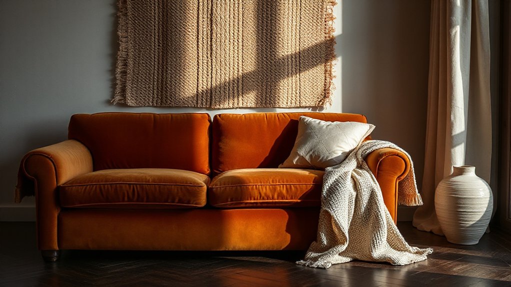
Layering fabrics and surfaces is where depth begins. You choose fabric combinations with intention, pairing tactile varieties that contrast yet harmonize. Start with a dominant textile—softer weaves or structured knits—that anchors the room, then introduce complementary textures to create movement.
Consider surface finishes in furniture and accents: matte woods, brushed metals, and subtle gloss on a pillow edge can catch and reflect light differently, enriching the palette without overpowering it. Maintain cohesion by repeating a unifying color or subtle pattern across textiles and surfaces.
Balance is essential: a plush rug against smooth leather, a linen curtain beside a glossy ceramic, a woven throw over a sleek chair. You’ll feel more grounded, more connected, as depth emerges through thoughtful Fabric combinations and Surface finishes.
Build a Foundation: Textured Color as Warmth
Building a foundation starts with texture-driven color that imbues warmth from the ground up. You select hues guided by color psychology to evoke comfort, stability, and welcome. Begin with earthy undertones and saturated accents that read as grounded, not loud, so rooms feel anchored.
Then layer textures that reinforce warmth: matte finishes, woven fibers, and softly brushed surfaces, each contributing tactile depth without visual clutter. Your approach should balance density with breath, so the space remains breathable and inclusive.
Consider how texture psychology influences perception, creating a sense of coziness through subtle contrast and repetition. Use intentional, restrained palettes that invite participation, ensuring guests feel they belong.
Finally, document your color-texture relationships to preserve a cohesive foundation as your interior evolves.
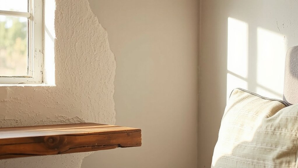
Balance Light and Shadow With Tactile Surfaces
To balance light and shadow, prioritize tactile surfaces that actively modulate how you perceive illumination. You’ll guide rooms toward cohesion by selecting textures that reflect, absorb, or diffuse light with intention.
Matte fabrics soften glare; plush weaves absorb scatter, creating intimate pockets. Smooth membranes may bounce brightness, enhancing clarity where you want focus.
Consider color psychology to align texture and hue for mood stability and belonging—cool neutrals calm, warm textures invite connection.
Layer surfaces at varied scales to sculpt depth without overwhelming the eye.
Acoustic benefits matter too: sound-absorbing textiles reduce reflective noise, enhancing perceptual quiet that reinforces perceived lightness.
Use these choices strategically: textures should reinforce function, comfort, and confidence, so inhabitants feel seen, supported, and naturally drawn to each thoughtfully illuminated corner.
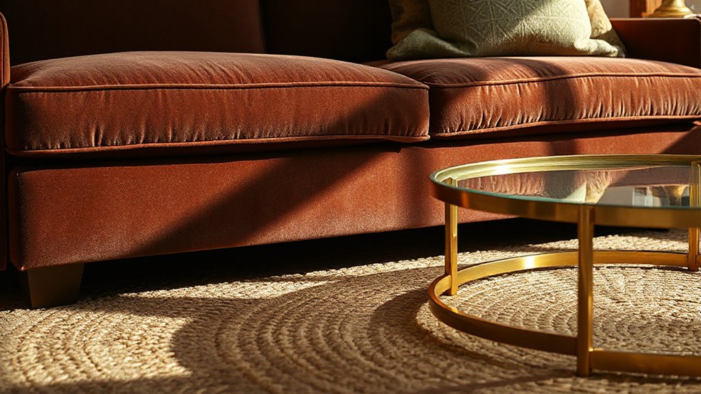
Surface Contrast: Metals, Wood, and Stone in Concert
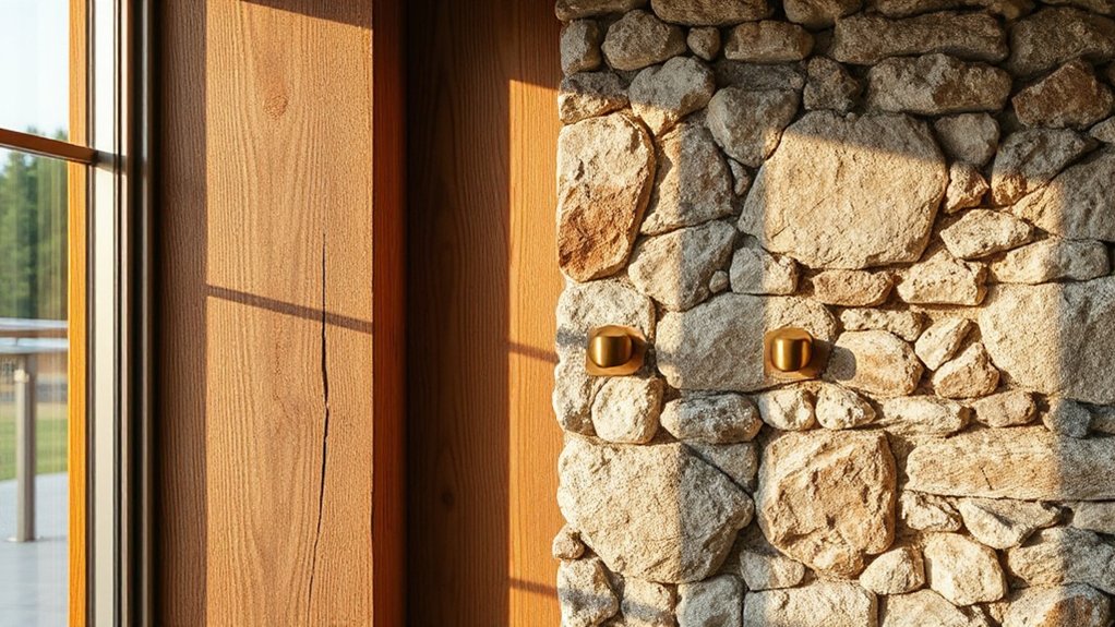
Metal, wood, and stone each carry distinct tactile and visual signatures, and when used together they create pronounced surface contrast that anchors a room’s depth and character. You’ll balance cool metal accents with warm wood and grounded natural stone to establish a cohesive, inviting hierarchy.
Begin with metal accents as punctuation—door pulls, frames, lighting—to introduce sheen and edge without shouting. Pair them with textured wood for warmth, ensuring grain direction guides the eye.
Let natural stone anchor counters, floors, or a feature wall to add weight and permanence. Maintain restraint: contrast should feel deliberate, not loud.
This trio rewards consistency—repeat finishes sparingly, vary textures, and keep color palette calm. The result: a balanced, belonging-rich space that reads intentional, refined, and enduring.
Scale and Proportion: Texture Rhythm Across Rooms
Texture rhythm travels through a space by how scale and proportion are paired with tactile variety. You curate texture across rooms by aligning scale variation with deliberate proportion balance, so each zone feels grounded yet dynamic.
Begin with a coherent hierarchy: larger pieces command attention, smaller textures fill gaps to create visual cadence. Maintain consistent tactile language—rough with rough, smooth with smooth—to reinforce rhythm and avoid jarring shifts.
In living, dining, and progression areas, distribute pattern and material weight so travel from one area to the next feels deliberate, not discordant. Use repeating motifs at varied scales to unify rooms while preserving individual personalities.
Keep edges restrained, but let texture variance echo your intended mood, ensuring a welcoming, belonging-centered flow throughout the entire home.
Texture by Room: Cozy Nooks and Sleek Living Areas
Ever wondered how to tailor texture to a room’s purpose? You tailor by guiding mood with deliberate textural choices.
In cozy nooks, embrace soft textiles, plush rugs, and tactile throws to invite lingering. Pair these with wood accents and matte ceramics to create warmth without heaviness.
In sleek living areas, lean toward crisp surfaces: satin or low-pile weaves, glass, and metal; balance their reflectivity with a restrained textile count to prevent coldness.
Use Textural contrasts to delineate zones: a velvety chair against a smooth leather sofa, a woven wall hanging beside a glossy media console.
Seek Material combinations that feel cohesive: natural fibers with refined finishes, subtle patterns with solid backdrops.
When done well, texture speaks belonging and elevates everyday living.
Everyday Materials for Texture: Concrete, Cork, and Jute
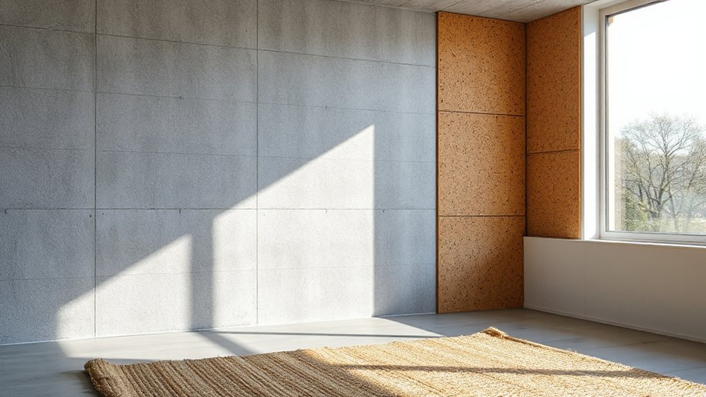
Concrete, cork, and jute aren’t just materials—they’re everyday options that bring texture with practical warmth and character. You’ll harness their tactility to ground a space without heaviness, letting color psychology guide accent choices and mood.
Use concrete’s cool, matte surface to anchor a room and reflect lighting effects off subtle gradients by choosing warm sealants or lime washes.
Cork adds acoustic softness and a natural warmth that invites lingering, especially when paired with soft, amber lighting.
Jute’s woven grain delivers an approachable, breathable texture that reads well in daylight and under layered lamps.
Combine them strategically: balance the cool with warm textiles, let light sculpt edges, and keep surfaces uncluttered.
Your environment gains cohesion, belonging, and a confident, contemporary sensibility.
Pattern Play: Weaves, Knots, and Subtle Motifs
From the tactile base of your materials, weave and knot patterns introduce rhythm and nuance without overwhelming the room. Pattern play leverages textiles, wood, and woven surfaces to form intentional visual cadence.
You’ll use embellishment techniques to elevate surfaces without shouting, choosing stitches, weaves, and knots that read as deliberate design decisions rather than random texture. Focus on a few motifs that repeat across scales—a subtle motif on cushions, a woven panel, a braided edge—to create visual unity.
Balance large-pattern statements with quiet, solid backgrounds so texture feels integrated, not cluttered. Aim for harmony where each pattern reinforces the room’s mood.
Your approach should feel curated, intimate, and belonging-driven, proving texture can provoke interest while remaining warmly inviting.
Do’s and Don’ts of Texture Pairings
Start with Texture Harmony: pair rough and smooth surfaces to create balanced depth, avoiding clashes in scale or sheen.
Match texture types by function and mood—soft with structured, matte with glossy—so contrasts feel deliberate, not accidental.
Keep balance and contrast in check by limiting extreme opposites to one focal area, ensuring the room remains cohesive.
Texture Harmony Rules
Texture harmony hinges on balanced pairings: some textures play well together, while others clash. You shape rooms by testing combinations, noting how materials read under lighting and time.
Do prioritize contrast—soft meets crisp to sharpen presence—yet avoid overloading surfaces with competing textures. Don’t mix multiple busy patterns in one focal area; opt for a single narrative texture and support it with subtler accompaniments.
Do anchor pairs with shared undertones—warm woods with linen, cool metals with stone—to create cohesion. Don’t ignore scale: a large textured piece needs calmer companions to breathe.
Do consider textural symbolism, where each surface communicates mood and intention, reinforcing belonging. Don’t overlook sensory engagement: your touch should invite exploration, inviting guests to linger and connect.
Pairing Texture Types
Don’t overwhelm a space with too many textures in the same scale; repetition creates rhythm, not chaos. Do prioritize a dominant texture and layer two or three supporting textures to deepen depth.
You’ll anchor ensembles through consistent color schemes, ensuring hues repeat across textiles, surfaces, and accents. Don’t fragment the palette with unrelated tones.
Do consider lighting effects—soft, directional light highlights grain and sheen, while cool lighting cools warmth in textiles. Don’t ignore how texture translates under different fixtures; test before committing.
Balance and Contrast Tips
Master balance hinges on intentional contrast: mix scale, finish, and tactile feel so each element supports the others rather than competes. You’ll optimize texture pairings by prioritizing a cohesive base—stone, wool, or linen—and layering deliberate accents.
Do emphasize varying scales, finishes, and warmth to create depth; don’t rely on a single surface or sheen. Balance is achieved when bold patterns sit beside quiet textures, while matte surfaces soften glossy ones.
Consider color psychology: cooler tones calm busy textures, warmer hues invite comfort, and neutrals unify disparate elements.
Apply lighting techniques that sculpt texture—directional light highlights texture seams, ambient light softens contrasts, and controlled shadows deepen perception.
You belong in a space that feels curated, intentional, and welcoming to every eye that enters.
DIY Texture Upgrades on a Budget
You can upgrade textures on a budget by choosing affordable, tactile materials that read as high-end. Layer different textures—like woven fabrics over smooth surfaces or roughed-up wood against glass—to add depth without overspending.
Start with DIY surface upgrades that mix and match budget-friendly textures to create a richer, more dimensional room.
Budget-Friendly Textures
To add depth without breaking the bank, start with simple, DIY texture upgrades that transform surfaces and feel cohesive. You’ll achieve texture through careful material choice, deliberate placement, and consistent mood across rooms.
Prioritize Textural contrasts that blend tactile surfaces with visual variation—think rough plaster alongside smooth wood, or linen drapes with glossy ceramic accents.
Choose Budget friendly materials that still read as refined: reclaimed wood, cork, jute, and low-cost textiles like cotton blends.
Apply frosting coatings or subtle beadboard in small doses to avoid overwhelm. Finish edges with clean seams and mindful color pairing to preserve balance.
Measure twice, install once, and document your outcomes to refine future projects.
Your spaces gain character, warmth, and belonging without excess.
Layering With Materials
Start with a dominant material and add accents that contrast in texture and weight. For example, pair a smooth velvet with rough linen and a matte wooden surface to balance softness and structure.
Prioritize cohesion over quantity; each piece should earn its place. Consider textural symbolism—a woven rug that echoes a chair’s grain can speak to tradition, while a lacquered tray adds a modern note.
Your aim is sensory perception: inviting touch, visual interest, and a sense of belonging in the room.
Keep budgets practical by repurposing finds and layering gradually.
DIY Surface Upgrades
Use surface layering to build depth: stage shelves with varied heights, add a softly worn rug, and introduce a throw with a subtle pile. Update hardware and frames in a unifying metal or warm brass to cue continuity.
Refinish a cabinet face or door with a chalky paint for depth, then seal with a matte topcoat to preserve texture. Keep color restrained—contrast through texture, not overwhelm.
Your space reads intentional, belonging, and thoughtfully curated.
Care and Longevity: Keeping Textures Fresh
Textures can fade or flatten over time, but with proactive care you can preserve their depth and character. You approach longevity with a proactive routine: clean, protect, and rotate pieces to distribute wear evenly. Use gentle methods that respect material-specific needs, avoiding harsh chemicals that dull finish or warp fibers.
Regularly inspect seams, edges, and surfaces for early signs of wear, repairing promptly to prevent escalation. For textiles, vacuum with a soft nozzle, air out fabrics after damp conditions, and rotate cushions to maintain even texture.
For surfaces, dust with microfiber, apply appropriate guards, and reapply treatments as recommended by manufacturers. Texture symbolism and sensory engagement—these remain vivid when you prioritize maintenance and mindful use, reinforcing belonging through durable, thoughtfully cared-for environments.
Quick Texture Checks: Maintenance Routines You’ll Actually Do
Maintaining depth in textures isn’t about grand overhauls; it’s about quick, repeatable checks you can fit into a busy week. You’ll implement a simple routine that preserves texture symbolism and enhances sensory experiences without disruption.
Start with surface integrity: wipe or vacuum textures monthly, inspecting for wear, pilling, or fading, and address promptly.
Next, assess cohesion: rotate accent textiles and reframe lighting to sustain contrast and tactile variety.
Clean fabrics with appropriate methods, avoiding harsh chemicals that dull fibers.
Listen to touch: if a material feels flat, refresh with a subtle layer—throw, throw rug, or a knit pillow.
Finally, document outcomes: note changes, update care labels, and schedule the next check.
Consistency builds belonging, not burden, while keeping textures lively and authentic to you.
Frequently Asked Questions
How Do Textures Influence Perceived Room Size and Height?
Textures influence perceived room size and height by leveraging tactile contrast and visual warmth. You’ll notice light, smooth surfaces feel more expansive, while textured elements skew scale upward, adding vertical emphasis.
Use glossy finishes to bounce light for apparent height; layer deeper textures to create coziness without shrinking space. Prioritize tactile contrast for depth and add visual warmth to invite belonging.
With deliberate texture pairs, you’ll control spatial perception while maintaining a cohesive, welcoming atmosphere.
Which Textures Pair Best for a Cohesive Color Palette?
Textures that pair best for a cohesive palette combine matte fabrics with glossy or woven surfaces, creating balanced contrast. Start with fabric combinations like linen with velvet, then echo that tension in wall treatments—matte paint on accent walls or satin wallpaper.
Use a consistent undertone across textures so colors mingle, not clash. You’ll feel grounded and welcomed, invited to belong, as the room reads as deliberate, unified, and thoughtfully layered.
What’s the Easiest Way to Layer Textures Without Clutter?
Start by choosing a unifying color base and build accents in small doses. Layer textures using layering techniques: pair smooth, tactile, and patterned surfaces, but keep one dominant texture.
Introduce each item slowly, balancing scale to avoid clutter, and rotate pieces seasonally.
Maintain Texture harmony by sticking to a cohesive palette, repeating materials, and minding negative space. You’ll feel belonging as cohesion grows, with deliberate choices that invite guests to notice subtle depth rather than overwhelm.
How Often Should Textured Surfaces Be Cleaned to Maintain Depth?
Textural durability depends on material, but you should clean textured surfaces every 1–3 months, more often in high-traffic areas.
Inspect for wear, then vacuum or brush gently to remove dust before taking a damp, mild-cleaner approach when needed.
Consistency matters for Cleaning frequency; staying on a routine preserves depth and gives you confidence in your space.
You’ll notice richer texture and a calmer ambiance when you clean thoughtfully and regularly.
Can Budget Materials Convincingly Mimic High-End Textures?
Yes, budget materials can convincingly mimic high-end textures. If you choose affordable alternatives, focus on authentic finishes, consistent aging, and strategic layering.
Prioritize material durability to guarantee lasting depth, and combine textures with careful color and light. You’ll create a cohesive space that feels elevated without overspending.
Use samples, test under your lighting, and trust your eye. Affordable alternatives can deliver depth when you balance texture, durability, and deliberate styling for belonging.
Conclusion
Textures breathe life into interiors, quietly lifting spaces without shouting. Embrace layered fabrics, subtle contrasts, and tactile surfaces to build depth, warmth, and balance. Don’t overdo texture—browse with restraint, like a careful gardener pruning a hedge. Maintain harmony by pairing metals, wood, and stone with measured rhythm. Keep upkeep simple: assignment your textures regular, not arduous. With thoughtful texture choices, you’ll gently guide light and shadow, inviting calm, refined rooms you’ll actually love to live in.