
To style shelving and built-ins, define the look first by choosing a shelf style and ideal heights that fit your space, with lower shelves for practicality and upper ones for display. Balance weight, texture, and negative space, and use lighting to spotlight focal pieces. Group items in blocks of 3–5, vary heights, and keep gaps intentional. Mix 2–3 textures with a restrained color palette, anchor with a vintage-modern focal moment, and maintain coherence as you refine over time. You’ll uncover more strategies as you explore further.
Define the Look: Set Shelf Style and Ideal Heights
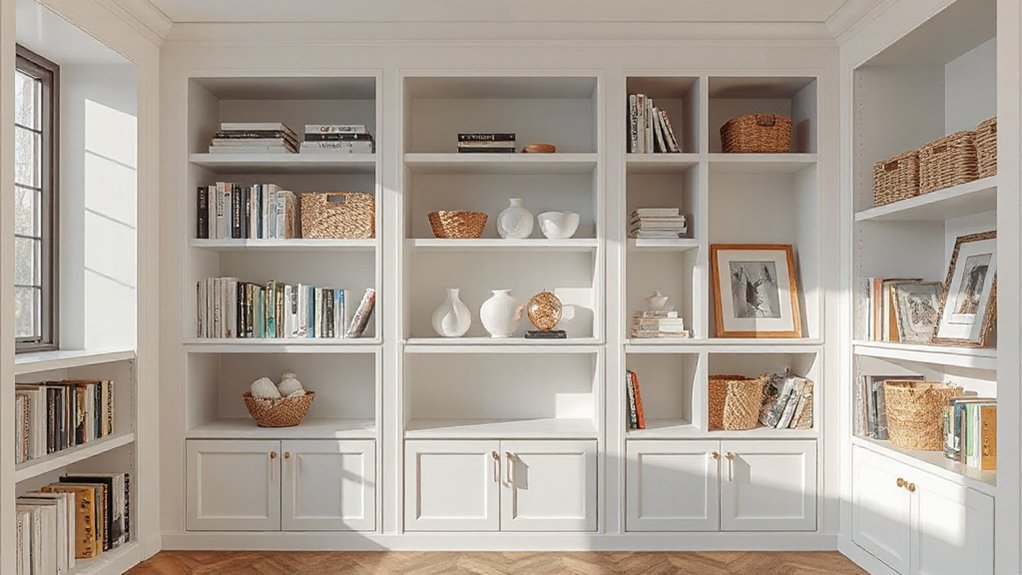
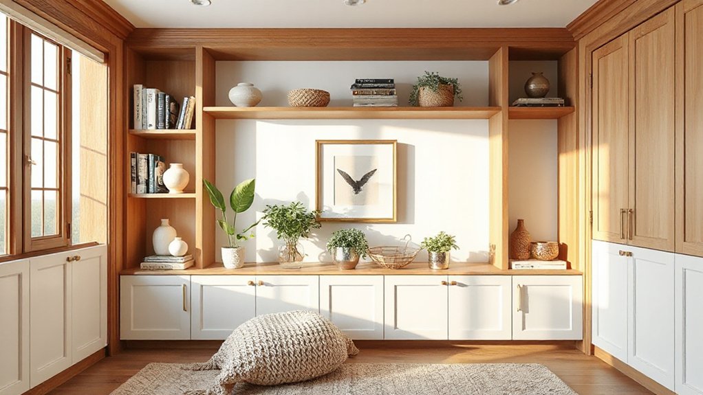
To define the look, start by choosing a shelf style that matches your space and then set ideal heights that suit how you use the area. You’ll align materials, finishes, and proportions so the unit feels like it belongs.
Begin with a clear baseline: lower shelves for practicality, upper shelves for display, and adjustable sections if possible. Integrate decorative accessories that echo your room’s color story, avoiding clutter that reads as noise.
Balance weight, texture, and negative space to create cohesion. Use lighting techniques to spotlight focal pieces and enhance depth without glare.
Keep cords managed, surfaces clean, and edges sharp for a polished impression. With intentional choices, your shelves foster belonging, usability, and a calm, inviting atmosphere.
Perfect Shelf Spacing: Tiering, Gaps, and Visual Balance
You’ve chosen a look that already balances materials and heights; now you’ll fine-tune how each shelf reads. Start with tiering: place your heaviest items lower, lighter pieces higher, and use mid shelves for mid-weight objects.
Create visual blocks by grouping three to five items, then vary the heights within each block for rhythm. Leave gaps strategically—enough to breathe, but not so much that shelves feel disjointed. Use decorative accessories to punctuate spaces and guide the eye, keeping scale in mind.
Consider lighting techniques to heighten balance: uplights, under-shelf LEDs, and soft shadows emphasize depth without glare. Maintain cohesion with a restrained color palette and consistent frames.
Your shelves will read as intentional, welcoming, and organized.
Layer Textures and Color Without Clutter
Layering textures and color without clutter means choosing a few tactile elements and a restrained palette that work together, not compete. You’ll create calm by prioritizing quality over quantity, so select 2–3 textures—wood, fabric, metal—that pair well.
Color coordination stays simple: pick a dominant base and 1–2 accent tones, then repeat them in small doses across shelves. Avoid fussy patterns that fight for attention; opt for solid or subtle textures instead.
Place larger items first, then layer with smaller, matte finishes to keep surface reflections under control. Maintain negative space to let pieces breathe.
Texture mixing stays deliberate: vary scales and finishes, not colors, to add depth. This approach fosters belonging, clarity, and a cohesive, gallery-like look.
Create Focal Moments: Display Rules for Vintage and Modern
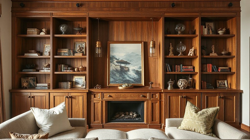
Mix vintage and modern pieces purposefully to create focal moments that feel intentional, not cluttered. You build these moments by grouping a single vintage item with a trio of modern pieces, then placing them at eye level for emphasis.
Alternate textures—metal, wood, glass—to keep contrast tactile and visual without shouting. Reserve bold statements for one shelf, and let others recede with muted tones.
When you display vintage charm, let it anchor the scene; pair it with clean-lined objects that embody Modern minimalism to balance personality with restraint.
Maintain breathing space around each focal cluster, so the eye can rest. Rotate items seasonally, and avoid overcrowding.
The result is curated, welcoming shelves that feel like belonging.
Maintenance and Integration: Keeping Shelves Coherent With Your Room
When shelves sit in harmony with the room, they read as a seamless extension of your space rather than a separate display. To maintain that coherence, establish simple integration habits: align colors with your wall tones, guarantee hardware is consistent, and stagger accents to reflect room rhythms.
Regular maintenance keeps this balance intact. Create practical Cleaning routines that you can actually stick to, focusing on dusting, wiping splashes, and checking joints quarterly.
Prioritize Material durability by selecting finishes that resist wear and by avoiding abrupt changes in texture between shelves and nearby surfaces.
Periodically reassess placement as your room evolves; small shifts can preserve flow without sacrificing function.
Frequently Asked Questions
How Do I Mix Materials Without Clashing Textures?
You can mix materials without clashing by aiming for material contrast with a unifying theme and texture harmony.
Choose one dominant material and layer in three supportive textures—metal, wood, fabric—so they relate via color, sheen, and scale.
Keep patterns simple and repeats steady to avoid chaos.
Use soft edges and deliberate gaps to breathe.
You’ll feel grounded, included, and confident as you curate, refine, and balance elements for cohesive, welcoming shelves.
What Lighting Makes Shelves Feel Bigger?
Use LED accent lighting along shelves and cabinets to make them feel bigger. Layer ambient lighting softly across the room, avoiding harsh glare.
You’ll create depth by placing lights at staggered heights and using dimmers for control. Choose a cool-to-warm color balance that complements your decor, not clashes.
You’ll feel more invited and connected as subtle glow highlights textures and objects, giving you a sense of belonging while your space reads larger.
Which Secure Mounting Methods Suit Heavy Collections?
You should use wall anchors and guarantee proper weight distribution when mounting heavy collections. Pick sturdy brackets rated for the load, mount into studs whenever possible, and distribute weight evenly across shelves.
Use anti-tip straps for tall units and secure top shelves first to prevent sway. Check level alignment after installation, and periodically recheck fasteners.
This approach keeps your belongings safe, your space feeling connected, and your setup confidently anchored for everyday use.
How Often Should I Refresh Shelf Displays?
You should refresh shelf displays every 4–6 weeks, or sooner if your decor arrangement shifts with seasons. Keep it practical: swap a few key pieces, rotate books by color, and introduce seasonal updates like a plant or art detail.
This cadence helps you feel intentional and present, while preserving cohesion. Use a consistent baseline, then layer with accents you genuinely love. You’ll maintain belonging, energy, and a refreshed vibe without overhauling your built-ins.
Can Shelves Influence Room Acoustics or Sound?
Shelves can influence room acoustics by absorbing and scattering sound, so yes, they affect sound. You’ll notice better clarity with strategically placed materials and textures.
Use Sound absorption in soft fabrics, books, and open shelving to damp flutter echoes.
Acoustic enhancement comes from varied shelf depths and gaps that diffuse sound rather than trap it.
Keep display cohesive, approachable, and practical, so you feel connected, confident, and welcome in your space.
Conclusion
You’ve mapped a clear shelf strategy: define the look, perfect spacing, layer textures, and set display rules. Keep color and clutter in check, so your shelves harmonize with the room, not compete with it. If a client balks at change, remind them how right-sized wheels—oops, not wheels—oops, right-sized spacing and thoughtful grouping actually reduce daily mess and boost calm. Stick with a simple rule: curate once, enjoy daily. Your built-ins will feel instantly intentional and timeless.