
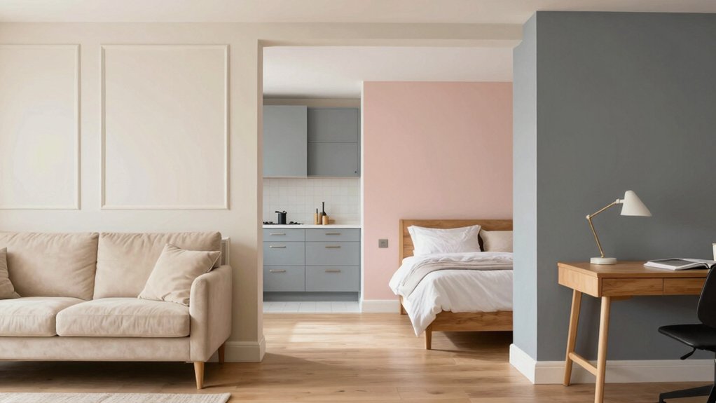
To pick the best interior paint colors for every room, follow a simple five-step framework: define the space’s function (work, rest, or gathering); survey natural and artificial light to forecast undertones; test chips in multiple lighting and on multiple walls; plan around furniture layouts for harmony; and commit with two coats, precise cutting, and clean edges. Use calm neutrals for living rooms, durable midtones for kitchens, sleep-friendly hues in bedrooms, and moisture-resistant finishes in bathrooms. Want more details to perfect your palette? Discover how in the next steps.
How to Pick Interior Paint Colors: A 5-Step Framework
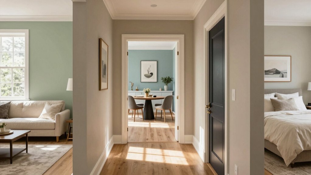
Choosing interior paint colors starts with a clear goal: pick hues that support how you live in each room. You’ll align color psychology with daily needs, selecting tones that energize, relax, or focus.
Step one is define function: is a space for work, rest, or gathering?
Step two, survey light: note morning warmth and evening shadows to forecast true undertones.
Step three, test strategically: sample chips in natural and artificial light, then compare across walls.
Step four, plan tomorrow’s photos and furniture layouts to ensure harmony.
Step five, commit with paint application techniques that preserve depth—two coats, cut-in precision, and careful edge work.
You gain confidence, belonging, and measurable results when your choices reflect how you live.
Living Room Palettes: Calm Neutrals and Subtle Accents
Calm neutrals set the stage for a timeless living room, while subtle accents—think warm taupe accessories or muted greens—keep the space inviting without overwhelming it. You’ll create cohesion by limiting color to a gentle palette and letting textures do the talking.
Choose low-contrast walls in alabaster, greige, or soft taupe, then layer with tactile elements—linen throws, wool rugs, and matte ceramics—that add depth without shouting.
For accent wall ideas, pick one surface to anchor the room with a slightly richer hue or a subtle contrast pattern, ensuring it supports but doesn’t dominate.
Coordinate wall art with your palette, selecting pieces that reflect light and repeat the quiet tones. The result is a serene, welcoming space that belongs to everyone who enters.
Kitchen and Dining Colors: Bright Yet Practical
You want kitchen and dining colors that brighten spaces without sacrificing practicality. Choose durable, easy-to-clean finishes that stand up to spills, heat, and heavy use.
We’ll explore how to balance vibrant hues with long-lasting performance for a cheerful, efficient eating area.
Brighten With Practicality
In kitchens and dining areas, practicality drives color choices that still feel bright and alive. You’ll pick hues that reflect how you use the space: efficient, welcoming, easy to coordinate with cabinetry and fixtures.
Color psychology guides you toward tones that elevate focus during meal prep while preserving calm for conversations around the table. You’ll favor midtones—soft yellows, airy greens, and clean, warm whites—that bounce light without glare.
Consider paint texture as a quiet ally: matte masks imperfections, eggshell adds subtle depth, and satin finishes resist splashes while staying personable.
Your goal is cohesion and energy without shouting. Choose palettes that feel like belonging—colors that invite you, your family, and guests to linger, cook, and connect with confidence.
Durable, Easy-To-Clean Finishes
Durable, easy-to-clean finishes are essential in kitchens and dining zones where spills, splashes, and fingerprints happen daily. You want surfaces that withstand wear without constant touch-ups, so choose paints designed for cleanability and resilience.
Textured finishes add subtle grip and depth, hiding minor imperfections while staying practical under frequent use. If you prefer a smoother look, consider matte vs. gloss options: matte reduces glare and hides flaws, while gloss resists smudges and makes cleanup effortless.
For high-traffic walls, opt for a washable, stain-resistant formula in muted neutrals or soft contrasts that reflect light without showing every smear. In dining areas, balance practicality with warmth by pairing durable paints with textures that invite gathering, not worry, ensuring your space feels like home.
Bedrooms That Help You Sleep: Soothing, Sleep-Friendly Shades
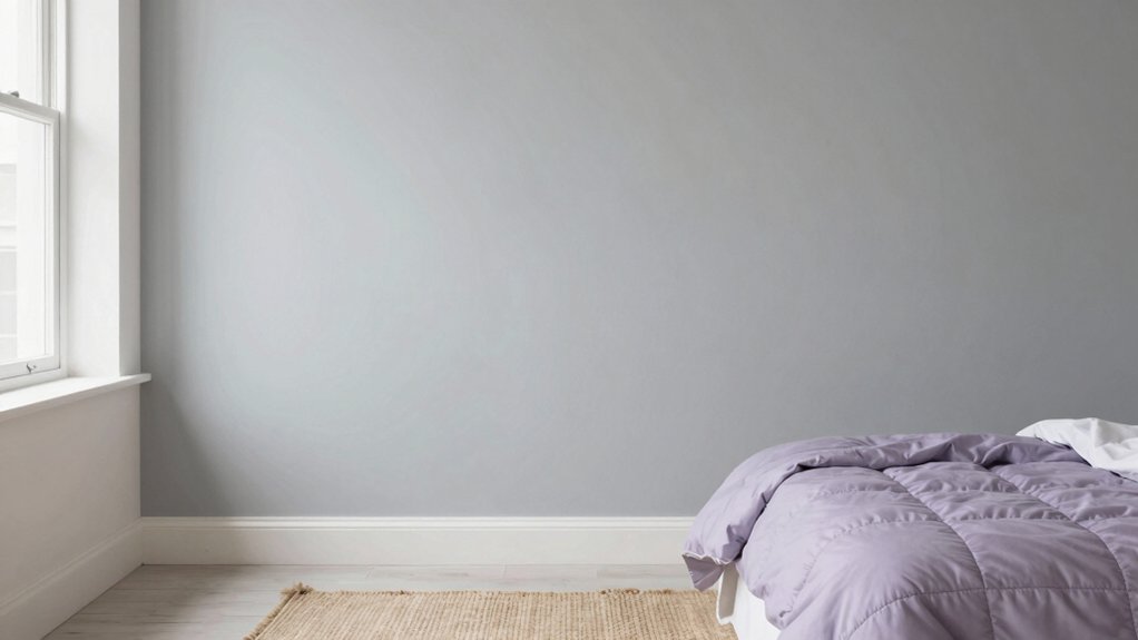
You’ll start with sleep-inducing hues that soften light without dulling energy, choosing tones that promote tranquility.
Pair calming colors with balanced contrasts to create a light, airy room ambience that still feels grounded.
Together, these choices—sleep-inducing hues, calm color combos, and an open feel—set a practical, effortless path to better rest.
Sleep-Inducing Hue Choices
Choosing the right bedroom hues can set the tone for rest, so opt for soft, muted tones that calm the mind and dim the senses. You’ll discover that sleep-friendly tones aren’t bland; they’re deliberate, influencing rhythm and mood.
Focus on soothing shades that gently cocoon your space, avoiding high contrast and harsh glare. In practice, select muted blues, warm grays, or creamy greens that promote quiet contemplation at night. Keep saturation low enough to feel cozy, not stimulating.
Pair these hues with breathable materials, dim lighting, and minimal clutter to sustain momentum toward relaxation. Your bedroom becomes a sanctuary when color serves calm, not drama.
Embrace soothing shades and sleep-friendly tones as intentional tools for nightly restoration.
Calming Color Combinations
Calming color combinations in a bedroom set the stage for restful sleep by balancing hue, saturation, and contrast. You’ll create a sanctuary where your brain decelerates as the walls recede.
Opt for muted pastels to soften edges and invite quiet focus, avoiding glare that stirs the senses. Pair those with soft monochromes for continuity across surfaces, so space feels unified rather than busy. Keep furniture finishes mid-toned and textiles in similar value ranges to preserve harmony.
Introduce subtle contrast through textiles or artwork rather than dramatic color shifts, preserving a sleep-friendly rhythm. Ground the palette with a calming base, then let gentle accents—lavender, sage, or blush—appear sparingly.
This approach fosters belonging, clarity, and a sense of retreat you’ll want to return to nightly.
Light, Airy Room Ambience
Light, airy bedrooms create a sense of buoyancy that makes sleep feel seamless and inviting. You deserve a calm, cohesive space, so choose tones that reflect natural light without washing out depth.
Emphasize wall textures to add subtle interest—soft plaster, linen-look finishes, or a matte glaze create tactile serenity without visual noise. Opt for pale neutrals with just a hint of warmth to reduce stress as you unwind.
Apply paint with deliberate technique: smooth, even coats for a clean foundation, followed by a light, controlled glaze or subtle texture in isolated areas to enhance depth. Prioritize paint application techniques that minimize glare and maximize softness.
This approach yields a room that feels breathable, cohesive, and belonging, supporting restorative sleep every night.
Bathrooms and Hallways: Durable Finishes That Stay Fresh
Durable finishes matter most in bathrooms and hallways, where moisture, traffic, and cleaning frequent the space. You deserve surfaces that stay fresh with minimal drama. Choose moisture resistant finishes that tolerate humidity, splashes, and rapid drying after showers.
Look for core traits: washability, scrubbability, and color retention under UV and bathroom heat. For baths, consider satin or semi-gloss sheens that wipe clean without showing every fingerprint.
In hallways, durability wins, so prioritize sturdy acrylic or epoxy protocols that resist scuffing. Mold resistant paints add value by defending against mildew, especially in shared bathrooms.
Pair these technical choices with a calm, neutral palette to maintain cohesion. You’ll enjoy homes that feel fresh, resilient, and inviting, room after room, year after year.
Pairing Paint With Furniture and Lighting for Cohesion
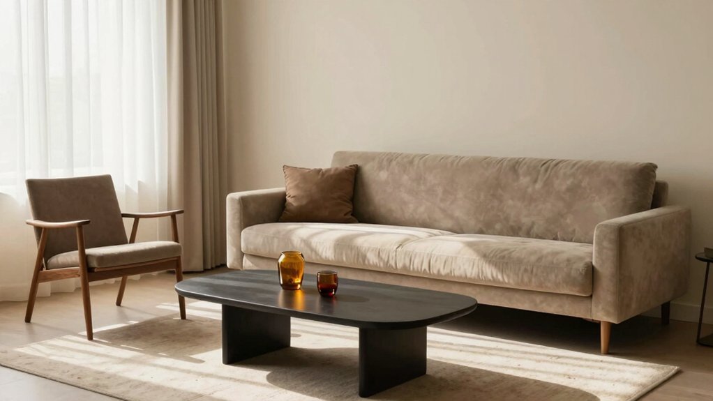
When you pair paint with your furniture and lighting, you create a unified mood rather than a collection of disparate rooms. Your goal is color matching that supports the space, not overrides it. Choose wall tones that echo the dominant hues in upholstery, wood, and metals, then let lighting reveal subtle shifts without surprises.
Prioritize furniture coordination by selecting finishes and tonal ranges that share undertones, so textures feel intentional rather than accidental. Use contrast sparingly to define zones without jarring the flow. Test swatches at both daytime and evening, observing how dim light shifts perception.
Align ceiling and trim with the broader palette to sustain continuity. With deliberate choices, you build a cohesive environment you’ll feel confident living in.
Frequently Asked Questions
How to Test Paint Colors Before Committing Long-Term?
Color sampling lets you trust your eye; you’ll confirm with light testing before guaranteeing. You test swatches in different spots, compare hues at various times, and ensure every shade feels like belonging, not guesswork.
Which Finishes Work Best in High-Humidity Spaces?
In high-humidity spaces, moisture resistant finishes perform best, delivering bathroom paint durability you can trust. You’ll choose options that resist mildew, maintain color, and wipe clean easily, reinforcing your sense of belonging in a well-protected, cared-for home.
Do Paint Colors Affect Perceived Room Size and Lighting?
Colors do affect perceived space and brightness; lighter shades visually expand rooms, while darker tones compress. Sure, colors modulate lighting effects—so you’ll notice size shifts, reflections, and ambiance instantly when you choose wisely, not accidentally.
How Many Coats Are Truly Necessary for True Color?
Coats needed vary by paint quality, but you’ll achieve true color with two to three stakes; use three for consistent color and ideal durability. Rely on proper prep, and consider paint durability and color consistency for lasting results.
Can Color Trends Influence Value or Resale Appeal?
Paint color psychology shows trends can influence appeal, but value stems from timeless, cohesive interior color schemes you curate. You’ll notice buyers respond to inviting spaces, not fleeting hues, so choose durable palettes that feel belonging and confident.