
Start by defining your refresh goals: how you want the room to feel and function, then audit what you already love—so you don’t overhaul everything. Set a realistic accessory budget and pick a unifying 2–3 color scheme. Prioritize textures over patterns for depth, layer personal touches without clutter, and plan seasonal swaps for easy updates. Consider lighting, greenery, and focal pieces to anchor the space. If you keep going, you’ll uncover practical steps you can apply now.
Define Your Living Room Refresh Goals
To define your living room refresh goals, start by pinning down what you want to feel and accomplish. You’re building a space where belonging happens—where conversations flow and you relax into ease after a long day.
Begin with color psychology: decide which hues set the mood you crave, then choose accents that reinforce those feelings. Next, map your furniture arrangement to support daily life—traffic paths, seating intimacy, and focal points that invite lingering.
Prioritize versatility: a single item should serve multiple moments, from work to hosting. Define measurable goals, like “soften the space,” “improve dialogue,” or “increase natural light perception.”
Write them down, revisit them weekly, and adjust as you experiment with small changes. Clarity guides action; clarity creates belonging.
Audit What You Already Love About the Space
You’ll start by identifying what already works in your living room, then double down on those elements. This audit helps you feel seen and connected, not overwhelmed. Focus on pattern, lighting, and how space flows. Your goal is to honor comfort while inviting fresh energy.
Consider how furniture placement guides conversation and movement. Note window treatments that soften daylight and add texture. If a favorite rug anchors the room, preserve it and build around it.
Pinpoint pieces that consistently spark joy and reliability. Then translate findings into leverage for new accents, not overhaul.
- Furniture placement that favors easy conversation
- Window treatments that control light and mood
- Beloved textures and colors to repeat or echo
- Lighting priorities that support film, work, and winding down
Set a Realistic Accessories Budget
Then allocate leftover funds to accents. Keep it practical, revisiting the plan as you shop to avoid overspending.
Set Realistic Budget
How much should you spend on accessories? You should set a realistic budget that fits your space, your goals, and your social vibe. This is about smart allocation, not splurging.
Think in layers: foundation pieces first, then accents, so you don’t overshoot. Use budget planning to map costs against the room’s scale and lighting, and leave a small cushion for unexpected finds.
Track prices, compare materials, and prioritize items that bring cohesion and comfort. Keep your eye on accessory trends, but tailor them to your home’s vibe, so you feel you belong, not overwhelmed.
- Define a ceiling based on 1–2 months of living costs and adjust as needed
- Prioritize versatile, timeless pieces over fleeting trends
- Compare prices and materials before buying
- Reserve a small fund for accessories that complete the look
Prioritize Necessary Pieces
When you’re prioritizing necessary pieces, start with the essentials that support daily living and the room’s core function. First, set a realistic accessories budget that covers basics like lighting, storage, and seating accents, then allocate a small portion for personal touches.
Focus on quality over quantity; a single, well-chosen item often outshines several filler pieces. Incorporate Vintage accents to add character without clutter, and reserve space for artistic displays that reflect your personality rather than trends.
Prioritize pieces that enhance usability and flow, ensuring you can move freely and entertain comfortably. Revisit the budget after shopping; swap impulsive buys for versatile items that mix well with existing furniture.
With intention, your refreshed room feels grounded, welcoming, and distinctly yours.
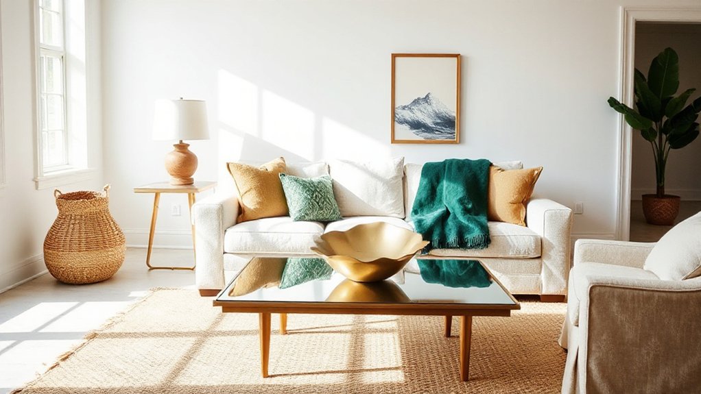
Choose a Unifying Color Scheme for Accessories
Start by choosing a unified color palette that ties your accessories together, using a dominant hue with one or two supporting tones.
Balance with neutrals to keep the room cohesive and calm, so bold accents don’t overwhelm.
Use an accent color elevation to hint at personality—introduce it in a few key pieces to create focal points without clutter.
Unified Color Palette
A unified color palette ties your accessories together by repeating a few key shades throughout the room, from pillows and throws to artwork and decor. You’ll create cohesion by selecting 2–3 core colors and letting them anchor every item.
Let color harmony guide choices, ensuring tones are related on the color wheel and vary in saturation for depth. Prioritize a consistent mood—calm neutrals with accent pops, or richer tones for warmth.
Use deliberate accessory placement to reinforce the scheme, placing rugs, cushions, and art where the eye travels. Balance scale and texture to prevent repetition from feeling dull.
- Choose 2–3 core colors and repeat them across textiles, art, and small decor
- Vary lightness and saturation for depth
- Align tones with the room’s lighting and finishes
- Position items to guide the eye through the space
Balance With Neutrals
To balance a living room with neutrals, start by choosing a unifying color scheme that keeps the palette calm and cohesive. A neutral palette anchors your accessories, letting texture and form take center stage.
Select two or three core neutrals—warm beige, cool greys, or soft whites—and repeat them across textiles, furniture, and accents. Keep contrast gentle by varying lightness rather than color intensity, so the room reads as one cohesive surface.
Aim for accessor balance: distribute items evenly, layer finishes, and combine matte and subtle sheen to add depth without shouting. Use pattern sparingly, like a single repeat motif, so variety enhances rather than competes.
This approach invites comfort, belonging, and effortless coordination.
Accent Color Elevation
- Pick a dominant accent color that echoes your neutrals to create color harmony without shouting.
- Use varying shades of that hue for depth, contrast, and cohesion.
- Introduce one contrasting pop color sparingly to energize focal points.
- Tie hardware, textiles, and decor patterns back to the unifying scheme for lasting belonging.
Prioritize Textures Over Patterns for Balance
Textures create depth without overwhelming patterns. When you refresh, prioritize tactile variety to anchor the room without shouting in color or print.
Aim for textural contrast—mixing a soft velvet, a rough weave, and a sleek leather creates visual interest that feels cohesive. Let pattern emphasis stay small and deliberate, using them as accents rather than the room’s center of gravity.
You’ll get balance by pairing a quiet, solid sofa with layered textiles: a knit throw, a linen curtain, a textured rug. Subtle sheen or matte finishes can also help the eye travel naturally.
Keep the palette cohesive so contrasts read as intentional details, not competition. This approach invites belonging, inviting guests to touch, notice, and relax.
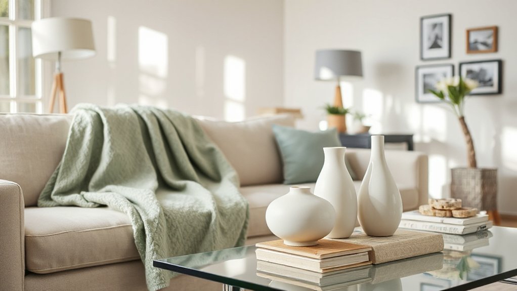
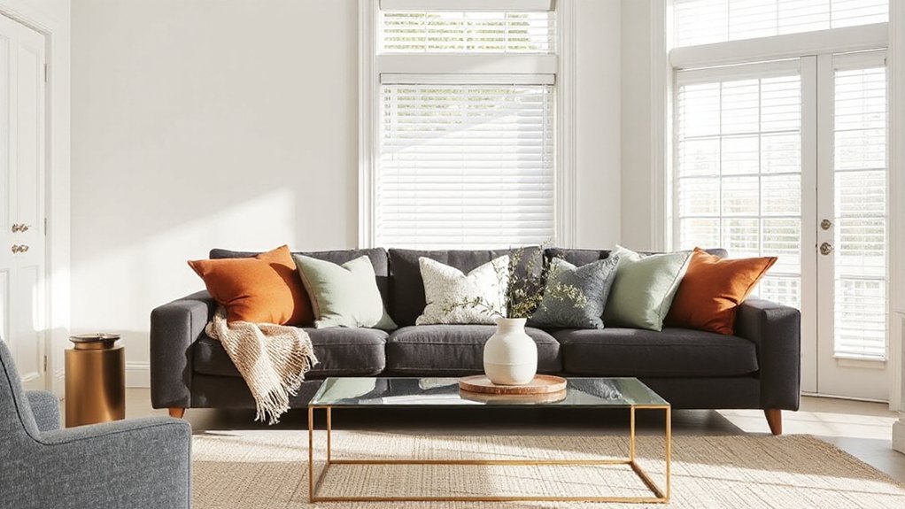
Curate Cushions and Throws for Cozy Cohesion
Layer your cushions and throws to create texture and depth, using a mix of soft neutrals and a bold accent color to tie the room together.
Let throws add warmth and tactile contrast, while color-driven cushions anchor the palette and guide visual flow.
Keep scale and layering in mind, so each piece feels intentional rather than cluttered.
Texture Through Throws
Texture is where comfort starts, so curate cushions and throws to create cozy cohesion without clutter. You’ll mix textures for depth, focusing on Textural contrast and thoughtful Throw layering to invite touch and linger.
- Pair chunky knits with smooth velvets to emphasize contrast
- Layer throws from light to heavy across seating for balance
- Vary weave directions to add subtle texture without busy patterns
- Choose a cohesive color base and then inject small tonal accents
The goal is approachable warmth, not perfection. You want a space that says “you belong here,” where textures invite conversation and daily rituals. Keep edges clean, folds intentional, and storage nearby to maintain calm.
When done well, every throw feels purposeful, comforting, and easy to refresh.
Color-Driven Cushions
Cushion placement matters: group cushions in alternating sizes and textures to create inviting pockets on sofas and chairs. Balance color bursts with calmer tones so you don’t overwhelm the eye.
Color coordination isn’t about matching every square inch; it’s about a thoughtful rhythm that feels intentional. Mix solids with subtle patterns to add texture without chaos.
Keep a few throw cushions per seating area for easy refreshes. You’ll enjoy a cohesive, welcoming space that invites conversation and belonging.
Refresh Artwork Without Overwhelming the Wall
If you want to refresh artwork without cluttering the wall, start with one strong focal piece and build from there. You’ll create a calm rhythm that invites belonging, not competition.
- Choose wall art with a cohesive color palette that echoes existing textiles.
- Curate a small gallery arrangement instead of a wall full of random pieces.
- Vary frame styles subtly to maintain unity while adding texture.
- Lean a statement piece on a dresser or console for flexible display.
Keep spacing generous and align centers at eye level. Swap in one piece at a time to test balance before committing.
When you add more, mirror shapes or motifs across the wall so the gallery feels intentional, not cluttered. Wall art becomes a welcoming, curated signature rather than a crowded display.
Gallery arrangements foster connection and ease.
Add Lighting Layers to Elevate the Mood
Layer lighting in layers to set the mood, not just brighten the room. You’ll create depth by combining ambient, task, and accent lights.
Start with a dimmable ceiling source to soften the space, then add a floor or table lamp for task brightness where you read or chat.
Include a wall sconce or picture light to highlight art and add warmth without glare. Choose bulbs with a warm color temperature to foster comfort and belonging.
Introduce vintage accents through aged lamps, brass bases, or retro glass—these pieces ground the room and tell your story.
A statement lighting fixture can serve as a focal point, drawing eyes and sparking conversation.
Keep cables tidy, and adjust layers seasonally to maintain balance.
Bring in Greenery for Freshness and Depth
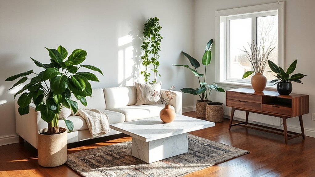
Start with fresh foliage to instantly lift the room’s feel. Mix light and dark greens, textures, and leaf shapes to add depth without clutter.
I’ll share simple care tips so your greenery stays vibrant and low-maintenance.
Pick Fresh Foliage
Fresh foliage instantly brightens a room, and you don’t need a big budget to make it work. You’ll feel connected by choosing greenery that resonates with your space and season. Pick pieces that reflect your lifestyle, then mix textures for depth. Focus on balance, not clutter, and let natural shapes guide placement.
- Choose botanical arrangements that echo your color story
- Mix seasonal foliage with sturdy stems for lasting appeal
- Vary heights and containers to create quiet rhythm
- Refresh weekly with a small update to keep it alive
Keep care simple: trim regularly, avoid direct sun, and water as needed. This approach helps you craft a welcoming, alive space without fuss. Belonging grows from thoughtful, practical touches you can maintain.
Layer Different Greens
To add depth and importance, mix greens of different shapes, textures, and heights. You’ll create visual rhythm by pairing sculptural ferns with glossy pothos or compact succulents, then balance bold leaves with delicate filler greens.
Practice botanical layering: place taller, airy greens toward the back or corners and lower, dense ones in sightlines for fullness without clutter. Consider greenery placement that follows natural flow—entryways, tabletops, shelves—so the eye travels through the room.
Keep a coherent palette: two or three leaf tones max to avoid jarring contrasts. Elevate interest with varying pot heights and textures, but avoid crowding.
Rotate pieces seasonally to refresh vibes without buying new clutter. Your space feels intentional, welcoming, and alive because thoughtful greenery anchors belonging.
Care Tips For Plants
Add simple upkeep to keep that greenery feeling intentional. You’ll sustain vitality by matching care to each plant’s needs, not the calendar. Observe growth, not excuses, and adjust quickly.
- Plant watering: water when the top inch dries; avoid soggy soil by using a tray and good drainage.
- Foliage placement: group by light needs and rotate weekly for even exposure.
- Light clues: place sun-loving varieties near bright windows and shade-tolerant ones farther back.
- Health checks: wipe leaves, trim dead growth, and inspect for pests to keep your space feeling thriving and cared for.
Introduce Statement Accessories in Moderation
Statement accessories can punch up a room, but they shine best when kept in check: choose one or two bold pieces and use them to anchor a simple color palette. You’ll feel confident curating with intention, not impulse, so your space stays cohesive.
Start with vintage accents that speak to you—an unexpected lamp, a sculptural vase, or a textured throw—then balance them with calmer surroundings. Focus on timeless “statement pieces” rather than clutter; let them guide your color choices and patterns.
Keep scale in mind: one oversized item or two smaller, well-placed accents do the trick. Rotate pieces seasonally, and you’ll refresh the room without chaos.
Belonging grows when your home reflects your personal story with restraint and clarity.
Create Focal Points That Echo Your Style
Start by picking a couple of standout elements that reflect your color story and the key shapes you love. Place them where they’ll be noticed—like a bold throw, a sculptural lamp, or a geometric wall art—so they set the tone at a glance.
Keep surrounding pieces simple to let these focal points echo your style without shouting.
Echo Your Color Story
To echo your color story, pick a few key hues and let them define focal points throughout the room. You’ll create a cohesive vibe by repeating those tones in furniture, textiles, and art, so every element feels connected. This is color harmony in action, guiding your eye with intentional contrast and balance.
When you place accessories, think rhythm over clutter—vary scale, but align color echoes to anchor each area. Prioritize visual flow, not perfection, and invite warmth through subtle repetition rather than loud statements.
- Select 2–3 core colors and repeat them in pillows, throws, and a single art piece
- Position a bold accent item where your eye lands first
- Balance warm and cool tones across surfaces
- Consider proportion and negative space for quiet moments
Highlight Key Shapes
Bringing attention to key shapes is how you give your echoed color story a tangible anchor. You don’t need a full overhaul—just echo shape language across pieces. Choose a couple of defining forms—rounds, rectangles, or sculptural silhouettes—and repeat them in vintage accents and lighting.
When a lamp shade mirrors a coffee table curve or a framed print echoes a console’s squared edge, the room reads cohesive. Introduce geometric motifs through textiles, ceramics, or wall art, ensuring repetition feels intentional, not gimmicky.
Keep scale varied: a bold centerpiece, smaller accessories, and a few subtle line breaks prevent sameness. By curating shapes that resonate with your style, you create focal points that feel personal, grounded, and inherently welcoming.
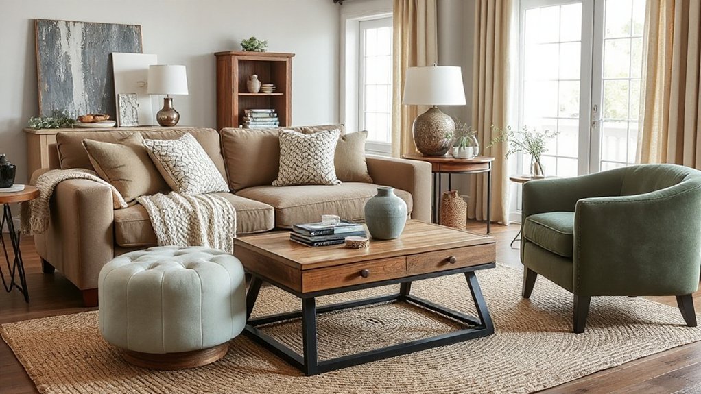
Mix Metals and Finishes With Purpose
Mixing metals and finishes adds depth without clutter. You can create a cohesive look by choosing a dominant finish and supporting tones that echo it. Focus on subtle contrasts, not uniform bling, so your space feels intentional and welcoming.
When you plan metal pairing, balance warm and cool tones to avoid visual fatigue, and use finish coordination to tie accessories together.
- Choose a unifying metal or finish as your anchor
- Vary textures rather than colors for contrast
- Repeat the accent metal in lighting, hardware, or frames
- Keep scale consistent to preserve harmony
This approach invites belonging, helping you feel grounded in a purposeful, curated roomscape. Practical choices here reduce fuss while elevating style with quiet confidence.
Ground the Room: Rugs and Flooring Considerations
Rugs and flooring establish the room’s foundation, grounding your refreshed look after you’ve balanced metals. You choose a rug size and placement that invite comfortable traffic flow, so seating feels anchored and easy to move around. Consider textures that add warmth without overwhelming, and align fibers with your room’s light and color palette.
Decorative borders on rugs or runners subtly define zones, while wall colors and finishes influence perceived space. If you favor a calm, cohesive feel, extend a single shade across rug and flooring to knit furniture together.
For contrast, pair a neutral floor with a statement rug and minimal patterns to avoid busy clutter. Wall mounted accents can emphasize rug edges without competing with flooring, reinforcing a grounded, welcoming atmosphere.
Plan Accessories for Everyday Use
Start by prioritizing everyday practicality: choose accessories that you’ll actually use, move easily, and clean without hassle. You’ll build a room that feels effortless and inviting, not cluttered or finicky.
- Select seasonal flowers as a simple weekly lift, avoiding high maintenance choices.
- Place decorative candles where they won’t drip or scorch surfaces, preserving safety and simplicity.
- Favor compact, multiuse trays and bowls for quick styling and easy cleanup.
- Keep a small, rotating rotation of textiles (throws, cushions) to refresh without overstocking.
Focus on items that travel with your daily routine, so you don’t waste time cleaning or rearranging. Seasonal flowers and decorative candles add mood without demanding commitment, helping you belong in a space that works.
Test Proportions Before Finalizing the Look
Before you lock in the final look, test your proportions in real life settings and adjust as needed. Proportion testing isn’t about perfection; it’s about feeling balanced and intentional.
Start with a central anchor piece—lamp, sofa, or art—and compare neighboring items for scale. Place accessory sizing in groups that echo room shape: low profiles for smaller nooks, taller accents for empty wall space, and a mix of textures to create depth.
Move pieces around to see how groups read from different angles, and don’t hesitate to trim or add until the rhythm feels right. Use a simple rule of thirds and leave space for breathable calms between objects.
The goal is cohesion you can sense, not crowding.
Build a Swap-Ready Display Plan
To keep your refresh flexible, map out a swap-ready display plan that you can repeat seasonally. You’ll outline a core display zone, note where faux finishes or vintage accents shine, and assign a simple rotation cadence. Use a small set of interchangeable pieces so swaps feel intentional, not random.
Create a quick checklist for re-styling sessions: evaluate balance, keep scale in mind, and preserve sightlines. Label storage bins by category and season, so you can pull items without guesswork. Build in a few focal accents that cue your mood shifts, like a textured throw or a classic vignette.
- Define a core grid of pieces that travel well between rooms
- Schedule seasonal swaps to maintain flow and meaning
- Tag items by material, color, and era for easy pairing
- Reserve space for faux finishes and vintage accents to shine
Layer Personal Touches Without Clutter
Personal touches add warmth without piling on clutter by focusing on a few meaningful pieces and keeping the rest deliberately simple. You layer in personality by selecting items that tell your story, not everything you own. Choose a small collection: a favorite photo, a well-loved plant, and one meaningful sculpture or textile.
Arrange them thoughtfully on a tray or shelf to create a focal point, not a vignette of excess. Practice clutter management by rotating pieces seasonally, which keeps the room fresh without accumulating unused items. When you add something new, assess its value and function—does it spark joy, or just fill space?
If it complicates daily use, pass it on. Subtle, purposeful touches yield comfort, not chaos.
Schedule Seasonal Refreshes Without Overhauling
Seasonal refreshes work best when you schedule them rather than react to every impulse. You create rhythm by small, deliberate changes that fit your space and lifestyle. Use a simple calendar, rotating one or two elements each season, so updates feel intentional, not chaotic.
Focus on seasonal scenting to evoke mood without overpowering the room, and adjust furniture placement to enhance flow rather than rewire the whole layout.
- Schedule landmark swaps on a predictable cadence
- Introduce scents subtly through textiles and decor
- Shift a piece or two in seating for new traffic patterns
- Pair scent changes with a soft color or texture tweak
Assess How the Refresh Affects Light and Space
As you refresh, take a quick read of how light and space shift with the new accents. You’ll notice natural light friendships deepen when you position lighter textiles near windows and choose mirrors that reflect rather than multiply glare.
Space feels more intentional when furniture silhouettes aren’t crowded; allow clear pathways and consider scale relative to room size. Observe how contrasts—warm throws against cool walls, matte against glossy surfaces—guide the eye and redefine spatial perception.
With fewer bulky pieces, corners breathe, and you gain a sense of openness that invites gathering. If a target area feels cramped, swap a compact piece for a lower-profile option.
Your room should read welcoming, balanced, and alive to everyday activities.
Create a 30-Minute Maintenance Routine for Longevity
To keep your refreshed living room looking intentional and durable, dedicate a 30-minute routine a few times a week.
A simple, practical maintenance habit keeps longevity front and center. Focus on Cleaning tips and assess Furniture arrangements as you go, quick and purposeful. You’ll notice small issues before they grow, and you’ll reinforce a feeling of belonging by showing care for shared space.
- Quick wipe-down and dusting of surfaces
- Refresh accent cushions and throws
- Reassess furniture layout for flow
- Tidy cords and outlets, then rug alignment
This routine quietly reinforces your space’s purpose, energy, and comfort, so you feel settled and connected every time you step in.
Consistency beats intensity, and intention sustains the look you refreshed.
Frequently Asked Questions
How Can I Refresh a Living Room on a Tight Timeline?
You can refresh quickly by swapping wall art and adding indoor plants, plus a throw or new cushions. You’ll feel instantly cozier, organized, and connected; choose pieces you love, keep colors cohesive, and enjoy a welcoming, belonging-filled space.
What Accessories Create Height Without Clutter?
A surprisingly 70% of viewers notice height cues first. You can achieve this with decorative vases or wall art that rise above eye level, avoiding clutter while guiding focus. You feel connected, organized, and stylish with intentional accents.
Which Textures Balance Bold Patterns Effectively?
Textural contrast helps balance bold patterns, you’ll find comfort in pairing them with solids or nuanced weaves. Pattern balancing comes from varying scale and texture, so you feel cohesive rooms rather than overwhelmed—you belong, and everything reads connected.
How Do I Choose Budget-Friendly Statement Pieces?
Honestly, you’ll find budget-friendly statement pieces by mixing artistic vignettes and vintage accents, then prioritizing timeless shapes; you’ll save money, feel purposeful, and join a welcoming circle of stylish remember-ers who actually live with their buys.
What’s a Quick Test for Color Harmony?
A quick test for color harmony: use the color wheel and pick complementary shades that balance each other. You’ll notice harmony when accents pop without clashing, and your room feels inviting, cohesive, and inclusive to everyone who visits.
Conclusion
As you refresh, imagine your living room waking up—sunlight spills across cushions, colors whisper, textures ripple like a quiet tide. You’ve tuned goals, trimmed clutter, and chosen a unifying palette that feels like a familiar song. Accessories breathe with balance, not bravado, while personal touches glow softly, telling your story. With a simple maintenance routine, the space stays calm and inviting. When objects align, the room becomes a reliable refuge you can trust to refresh again tomorrow.